¯
Oskar Wettergren is working independently towards start-ups and small to medium companies, studios and agencies. Helping manage and develop brands through strategic visual communication. He has worked in the advertising, music and design-business with brands and artists like ABBA, Nissan, Tove Lo, Adidas, Avicii, Clas Olsson and Beko.
![]()
¯
Bauer Display
Oklart Type Foundry
Typefaces
John Bauer’s illustrations had a very soft and naturally mystical quality to them, but at the same time there was often a darkness and a sense of danger present. I wanted to represent both these opposites in the Bauer font.
See full case →


¯
Quermy Display
Oklart Type Foundry
Typefaces
Quermy Display is a limited edition experimental display typeface built for expression and not legibility, it’s ment to feel alien at first glance but once you ‘see it’ it’s suddenly easy to read.
Buy here →


¯
Petra Monospace
Oklart Type Foundry
Typefaces
Petra Mono is a retro futuristic typeface inspired by old science fiction books and films. It is also a homage to my partner. Petra comes in 13 different widths, all caps and numbers.
The different widths are made to make Petra more adaptable to both space and context. The narrower weights give readability and works well small, while the wider have more expression and work well in bigger sizes.
Typefaces


¯
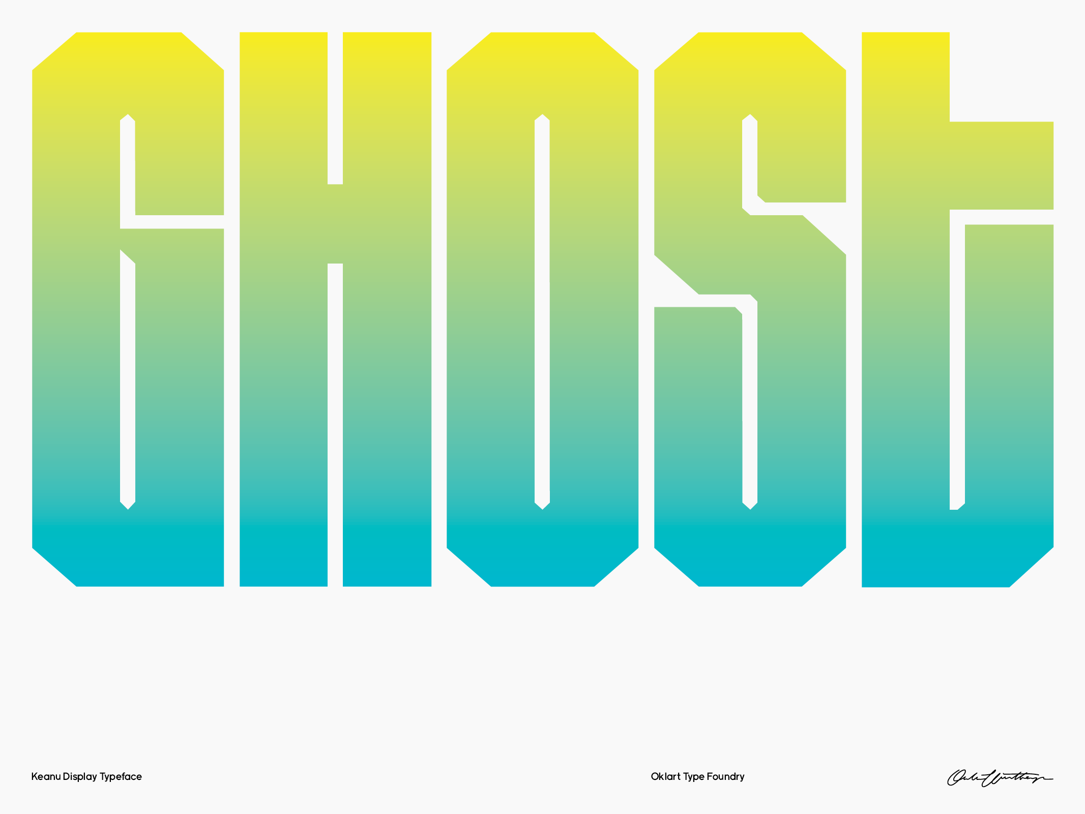
Keanu Display
Oklart Type Foundry
Typefaces
Oklart Type Foundry
Typefaces
Keanu is a display typeface inspired by west coast graffiti & chicano lettering.
Keanu [keˈjɐnu] From ke (the) + anu (coolness); coolness is a symbol of happiness and romance in the warm Hawaiian climate. I wanted something blackletter-esque that works big, with long stems and sharp angles.
Keanu [keˈjɐnu] From ke (the) + anu (coolness); coolness is a symbol of happiness and romance in the warm Hawaiian climate. I wanted something blackletter-esque that works big, with long stems and sharp angles.


¯
Eskatos
Oklart Type Foundry
Typefaces
Typefaces
Eskatos is a experimental decaying typeface in six different weights/ shades of decay. I like the idea of things falling apart but wanted to explore the concept digitally rather than physically. It’s also interesting how little information you really need once the eye get’s used to it’s clues in the higher weights.


¯
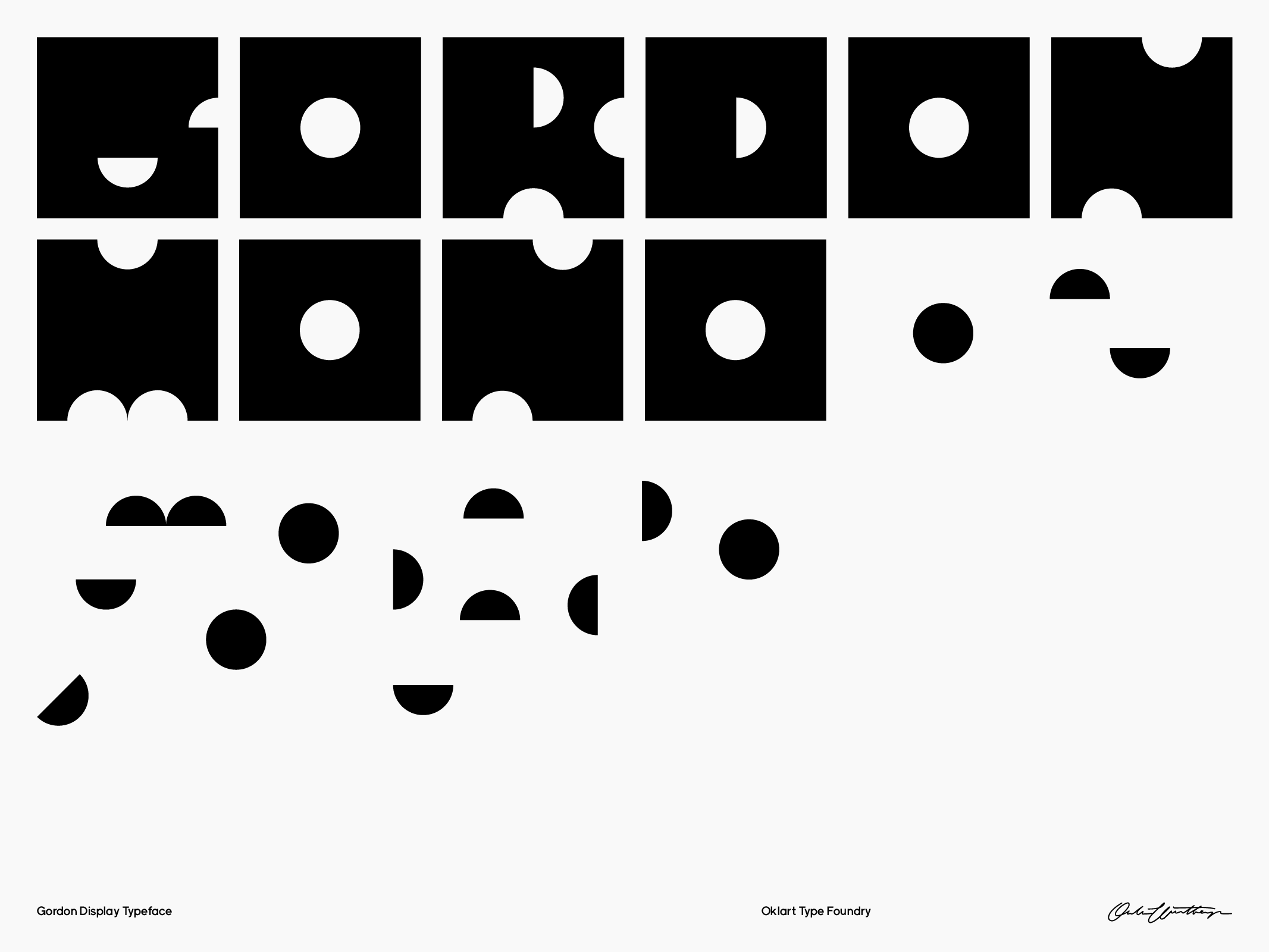
Gordon Display
Oklart Type Foundry
Typefaces
Typefaces
In publishing and graphic design, Lorem ipsum is a placeholder text commonly used to demonstrate the visual form of a document or a typeface without relying on meaningful content. Lorem ipsum may be used as a placeholder before final copy is available.


¯
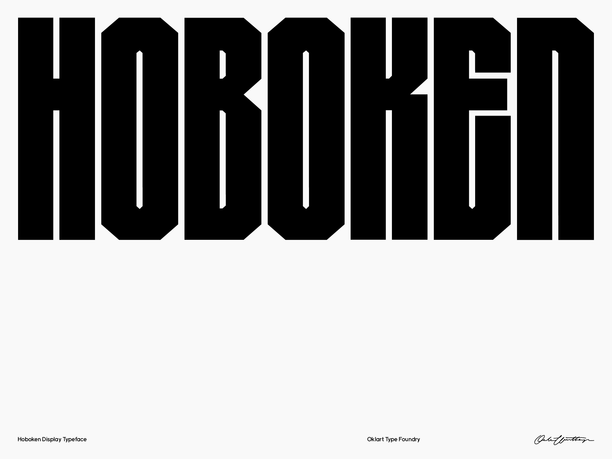
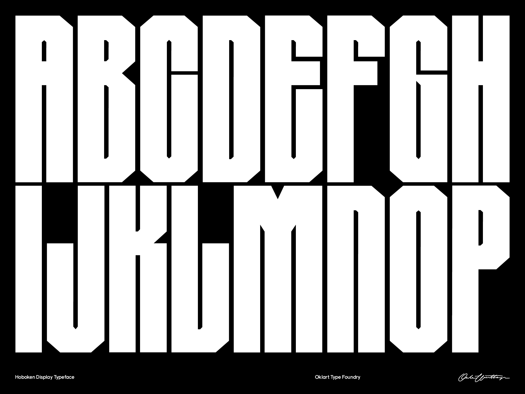
Hoboken
Oklart Type Foundry
Typefaces
Typefaces
Hoboken is a thick and blocky display typeface loosely inspired by graffiti. I wanted a typeface I could use really big and would work well on its own but formost work with incapsuling splashes of colour, gradients or images. It comes in one weight (chunky) with A-Z, numbers and some punctuation.
Free Download →