¯
For over two decades, I have created, maintained, and refined brands across various industries. Collaborating with companies, agencies, and artists such as Mojang (Minecraft), Universal Music, NO GA, Hammarby Fotboll, ABBA, Tombras, Nissan, and Solana.
I work closely with clients to shape brands into lasting, cohesive, and scalable systems that create a strong first impression, reinforce trust, and cultivate lasting relationships.
Contact me at:
oskarwettergrendesign(at)gmail.com
![]()
I work closely with clients to shape brands into lasting, cohesive, and scalable systems that create a strong first impression, reinforce trust, and cultivate lasting relationships.
¯
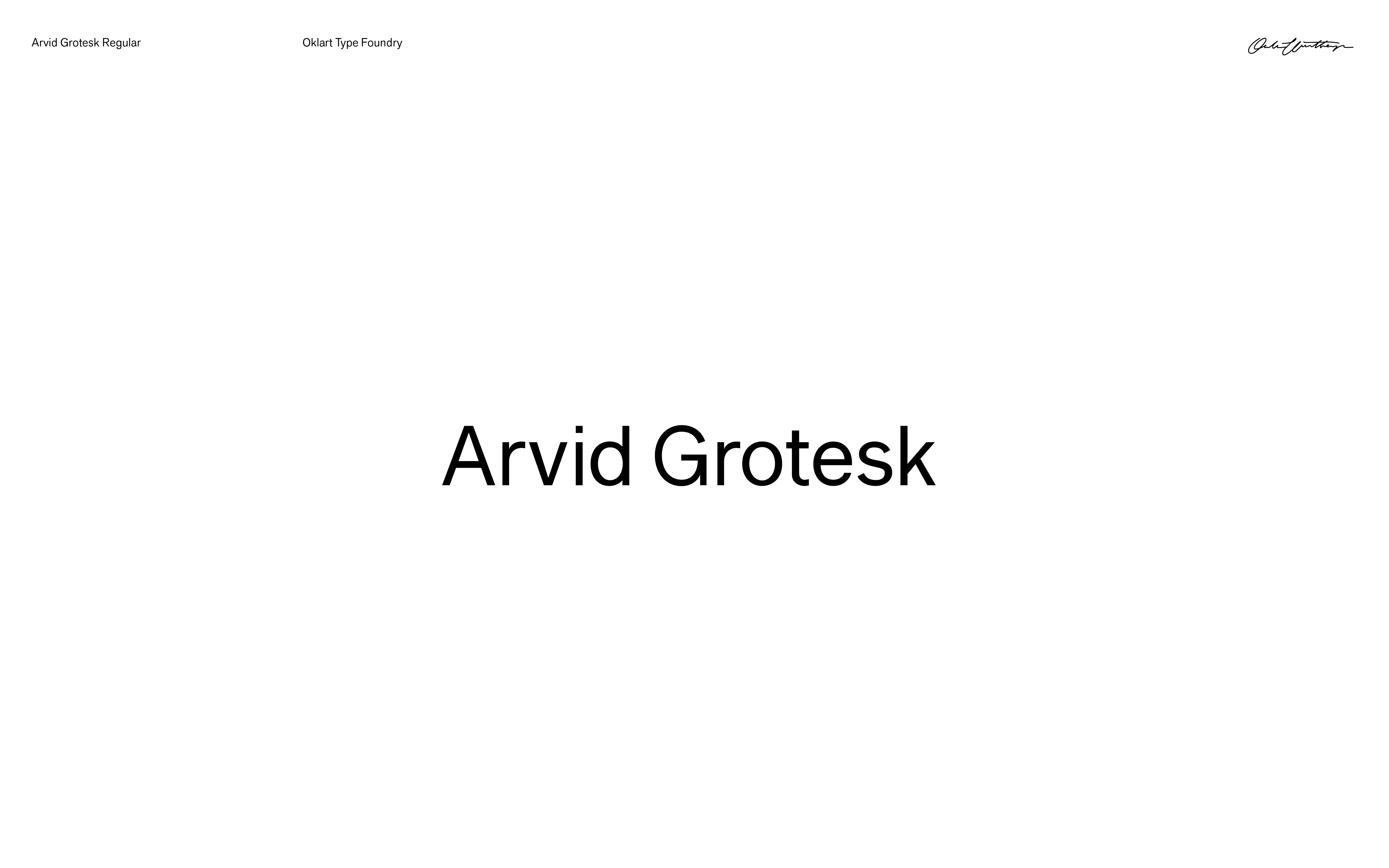
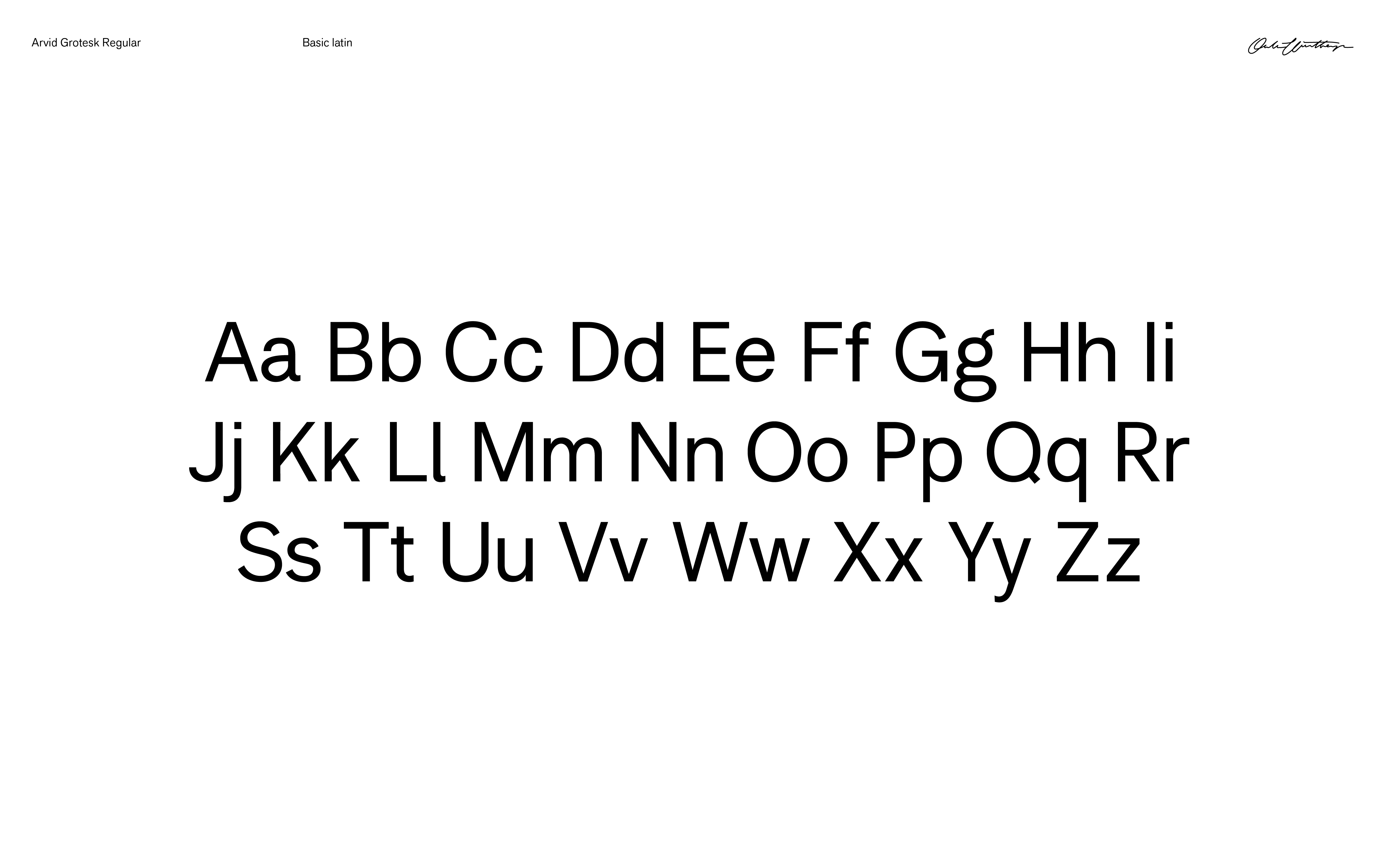
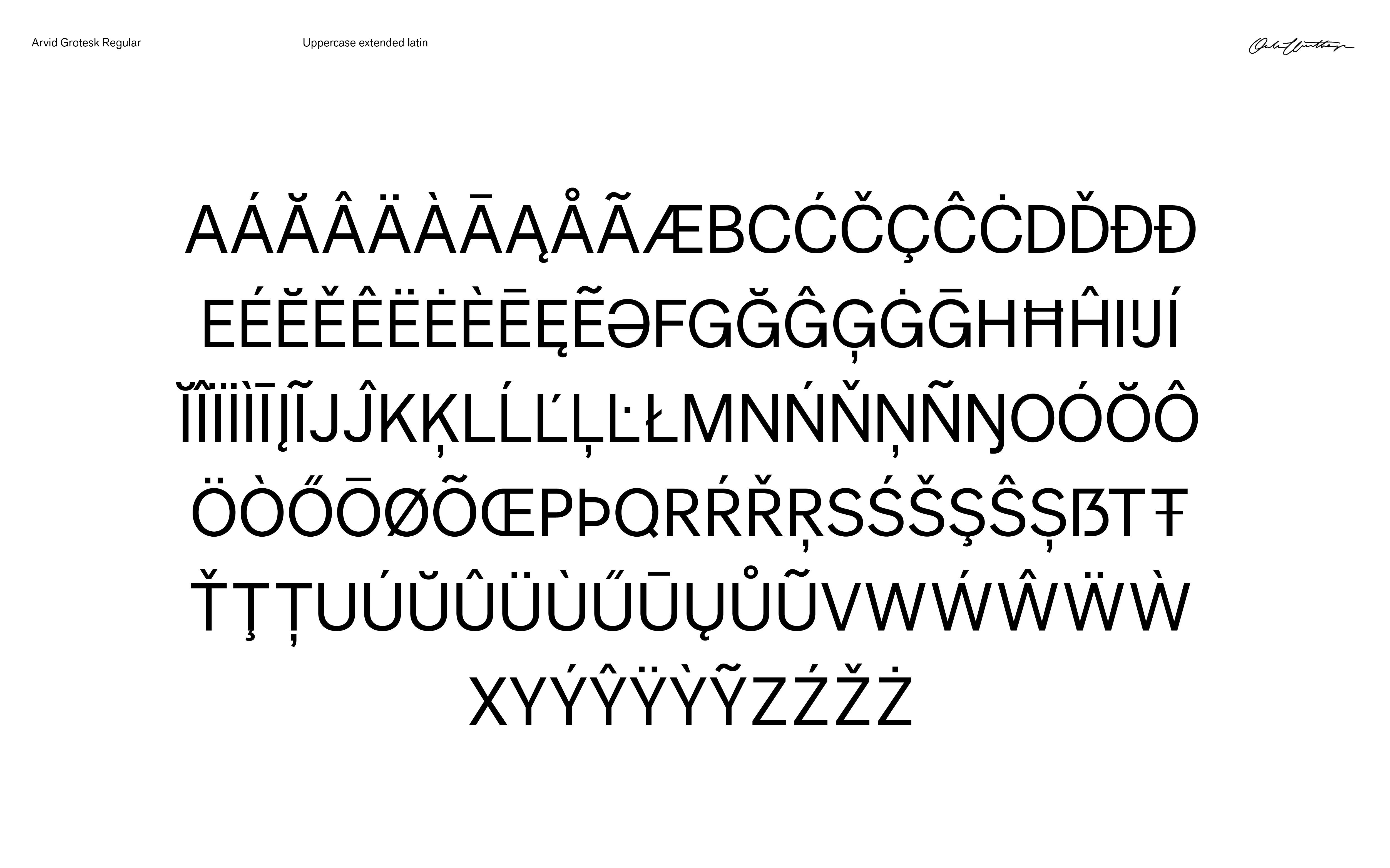
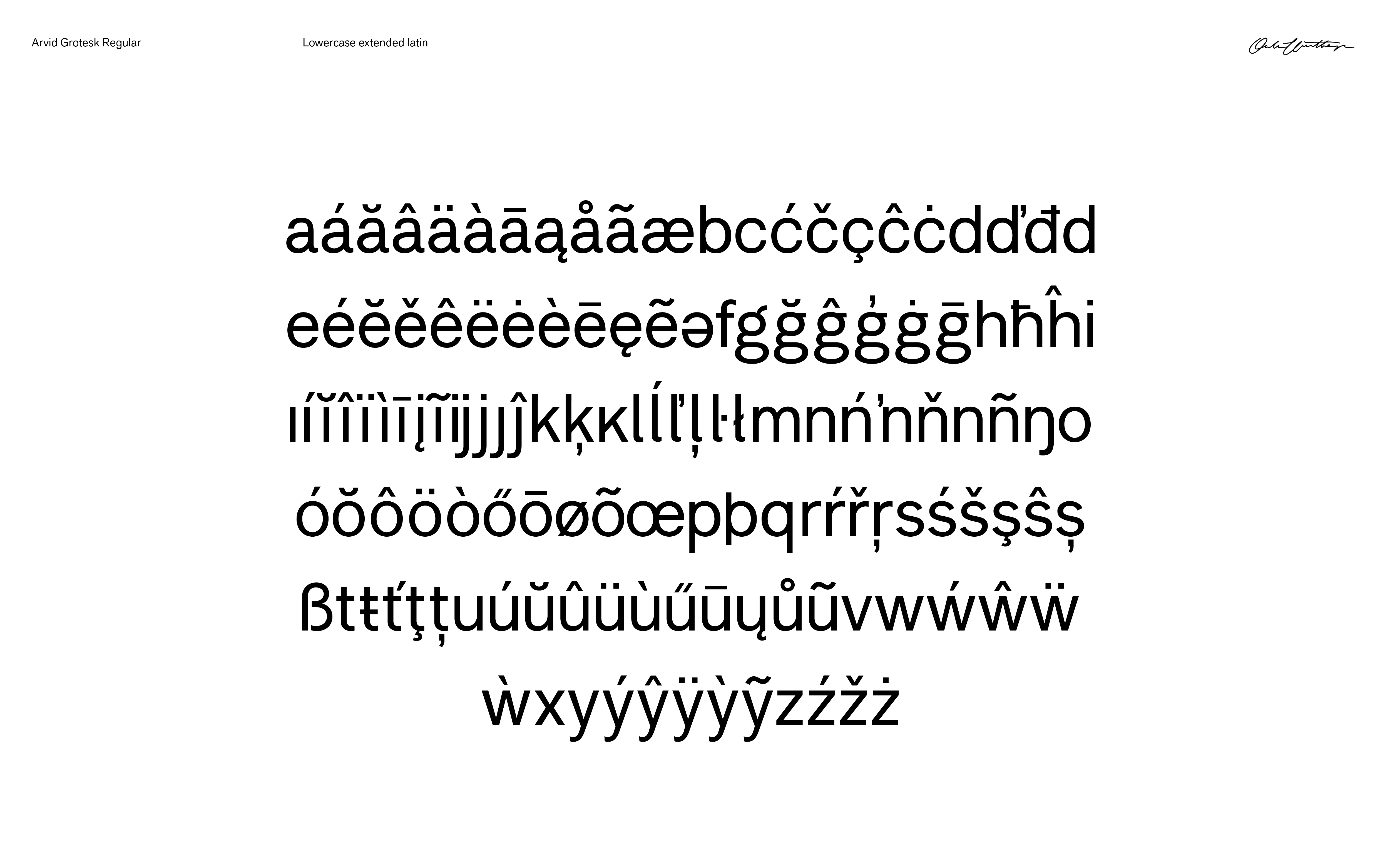
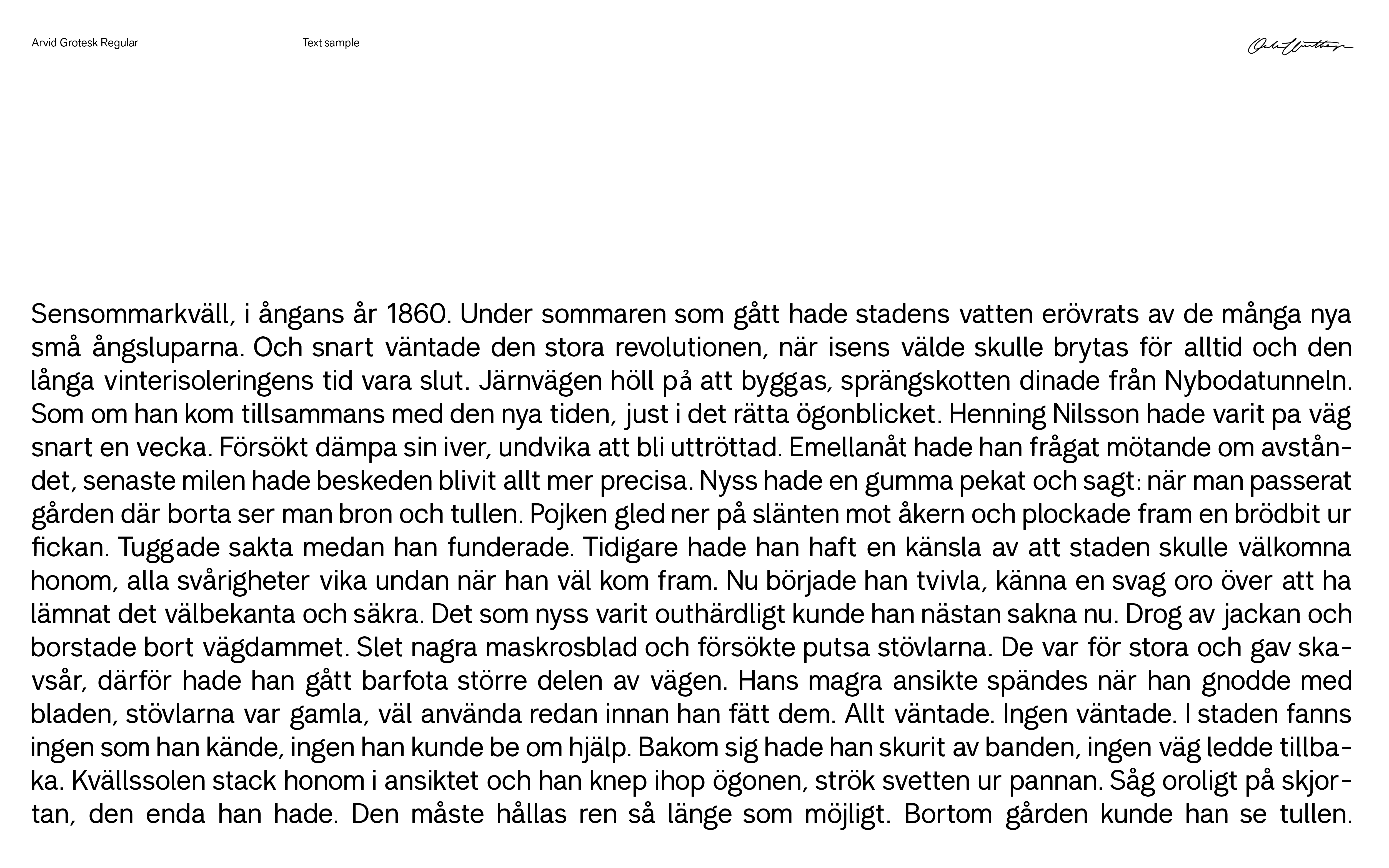
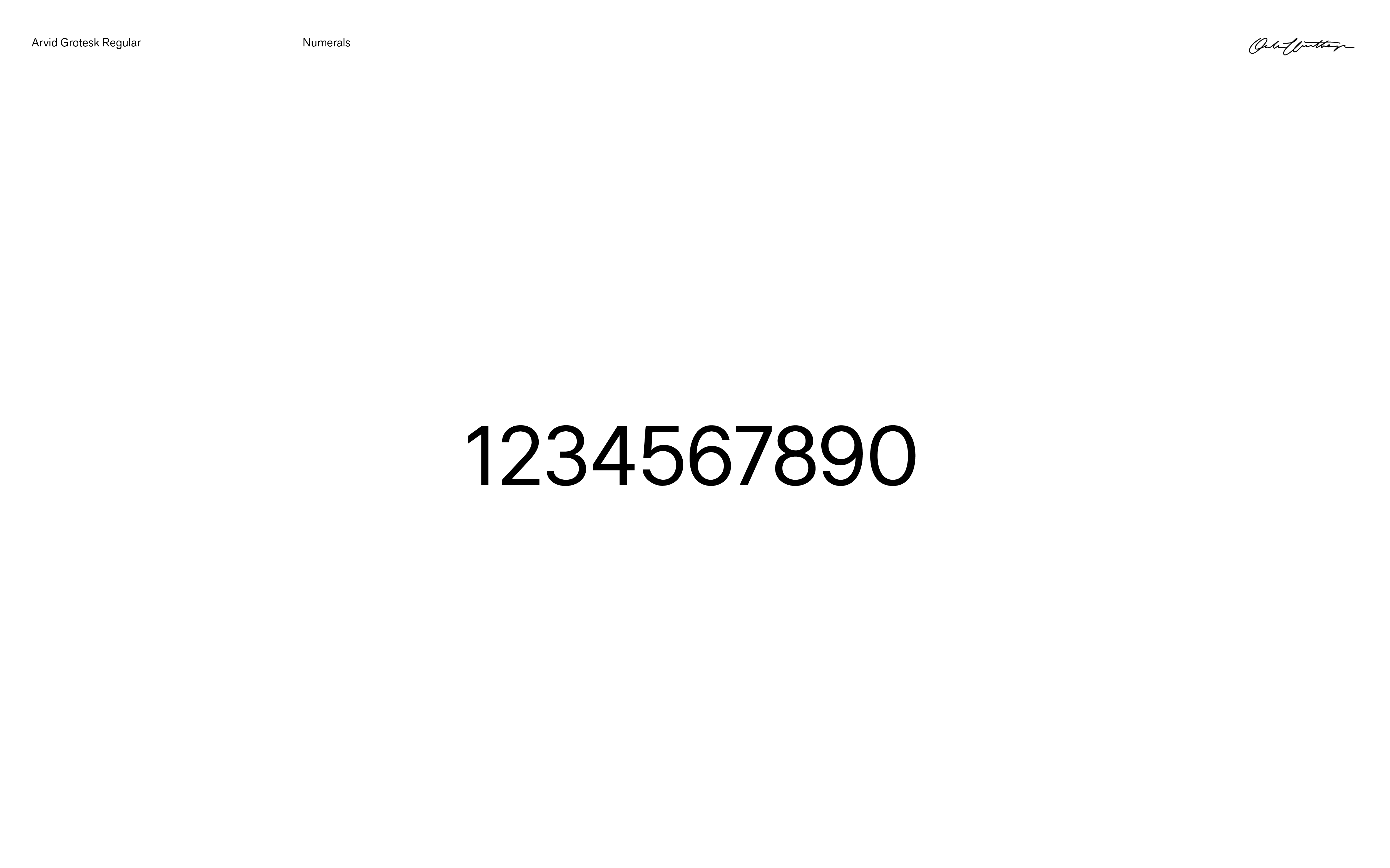
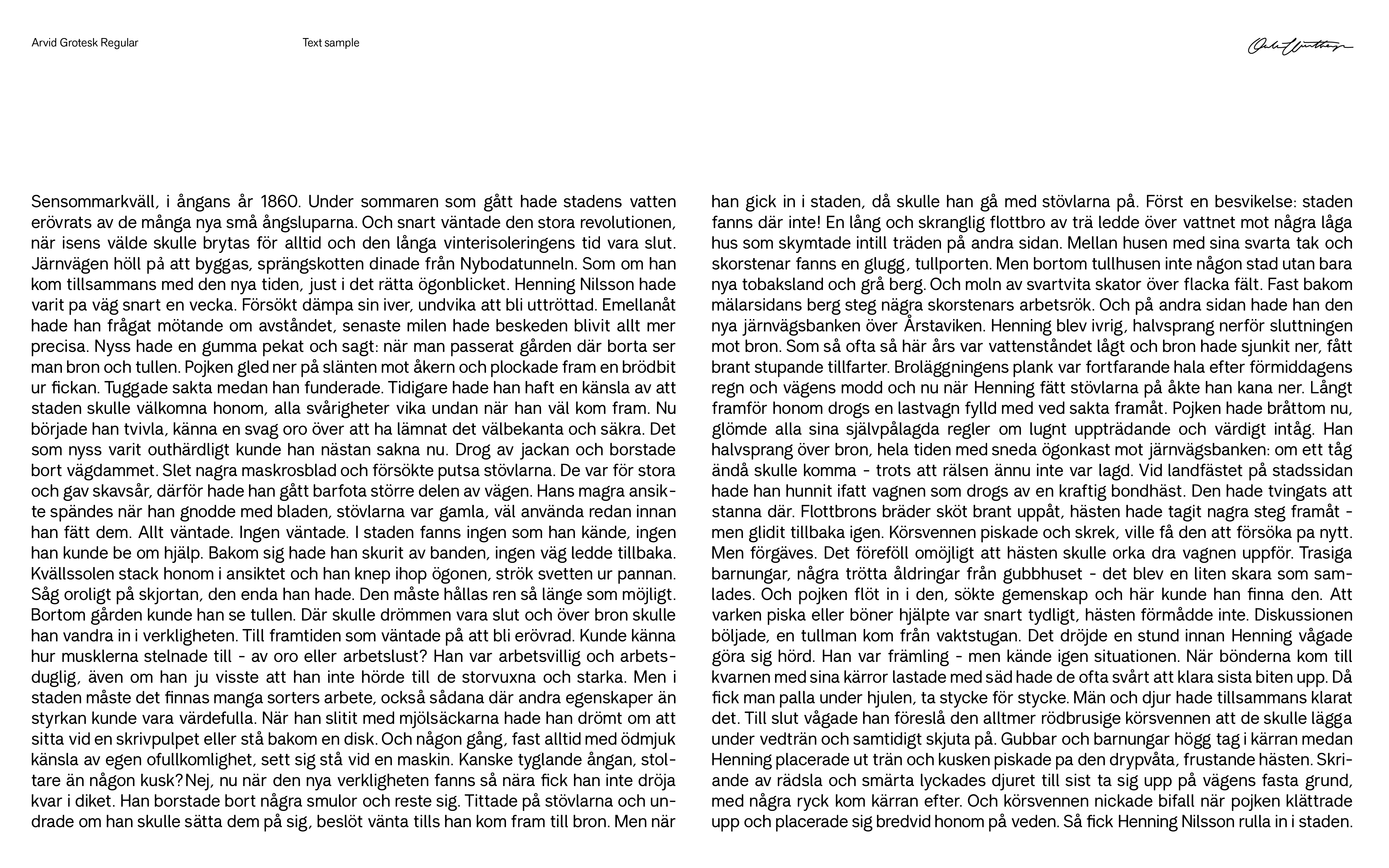
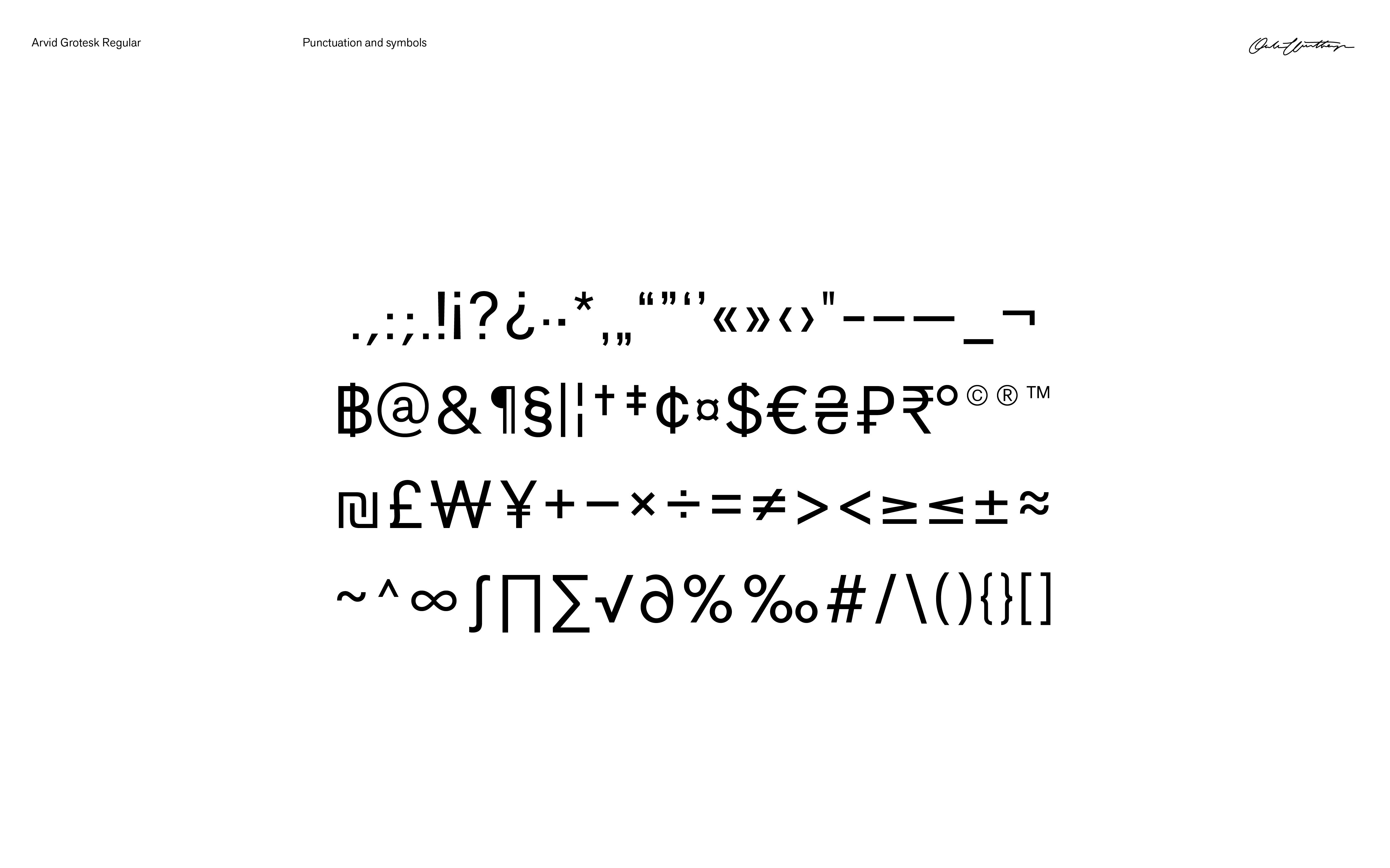
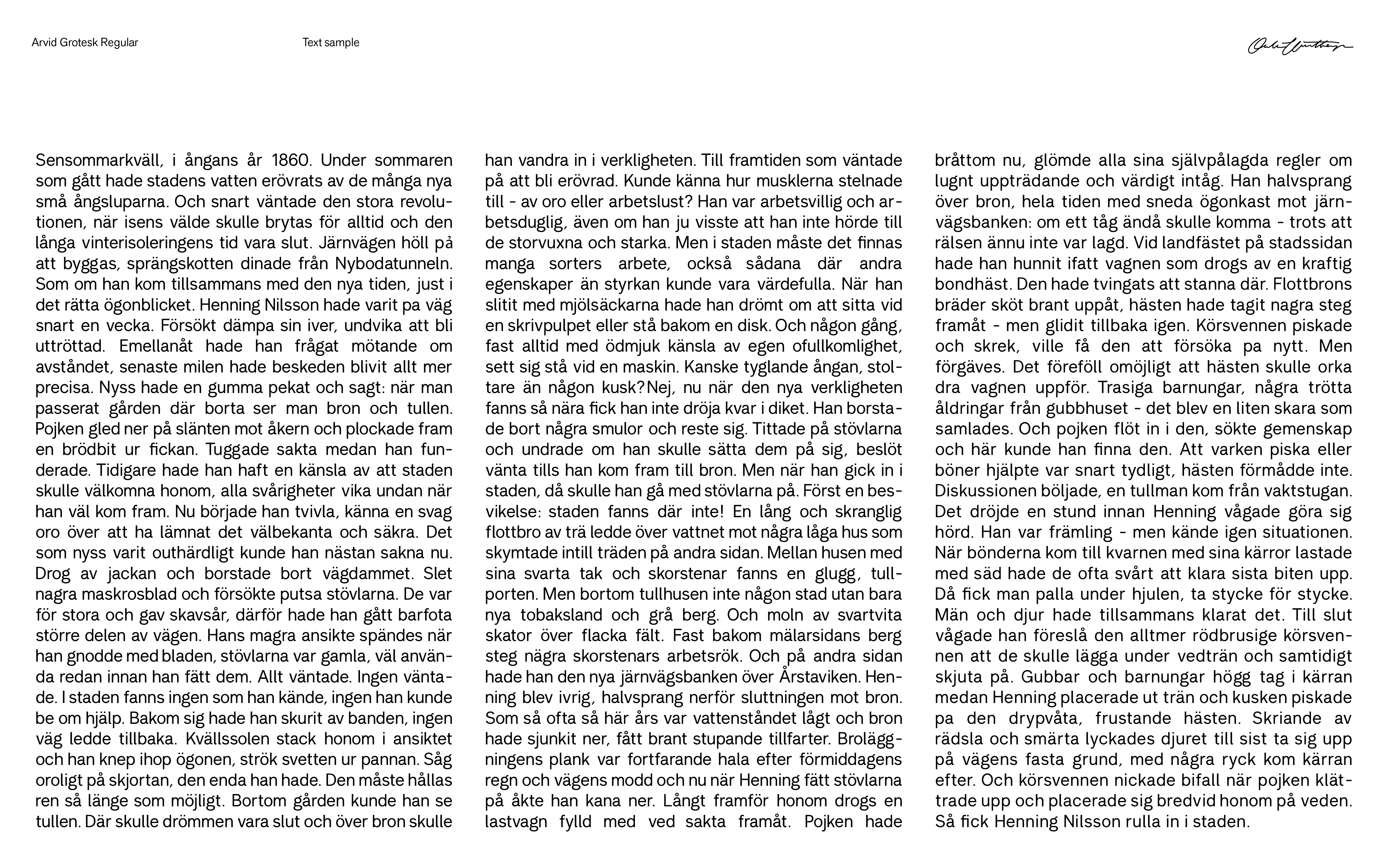
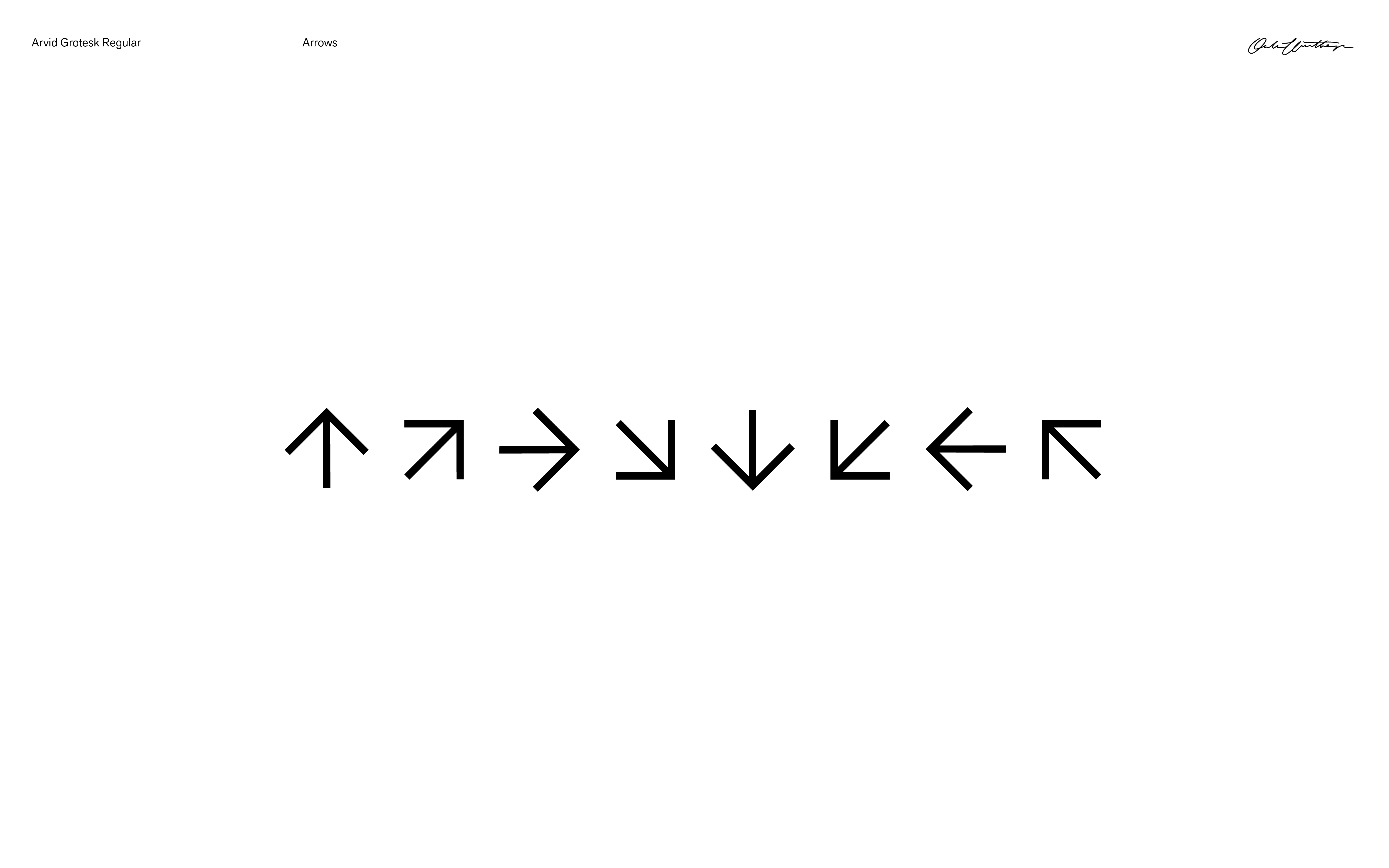
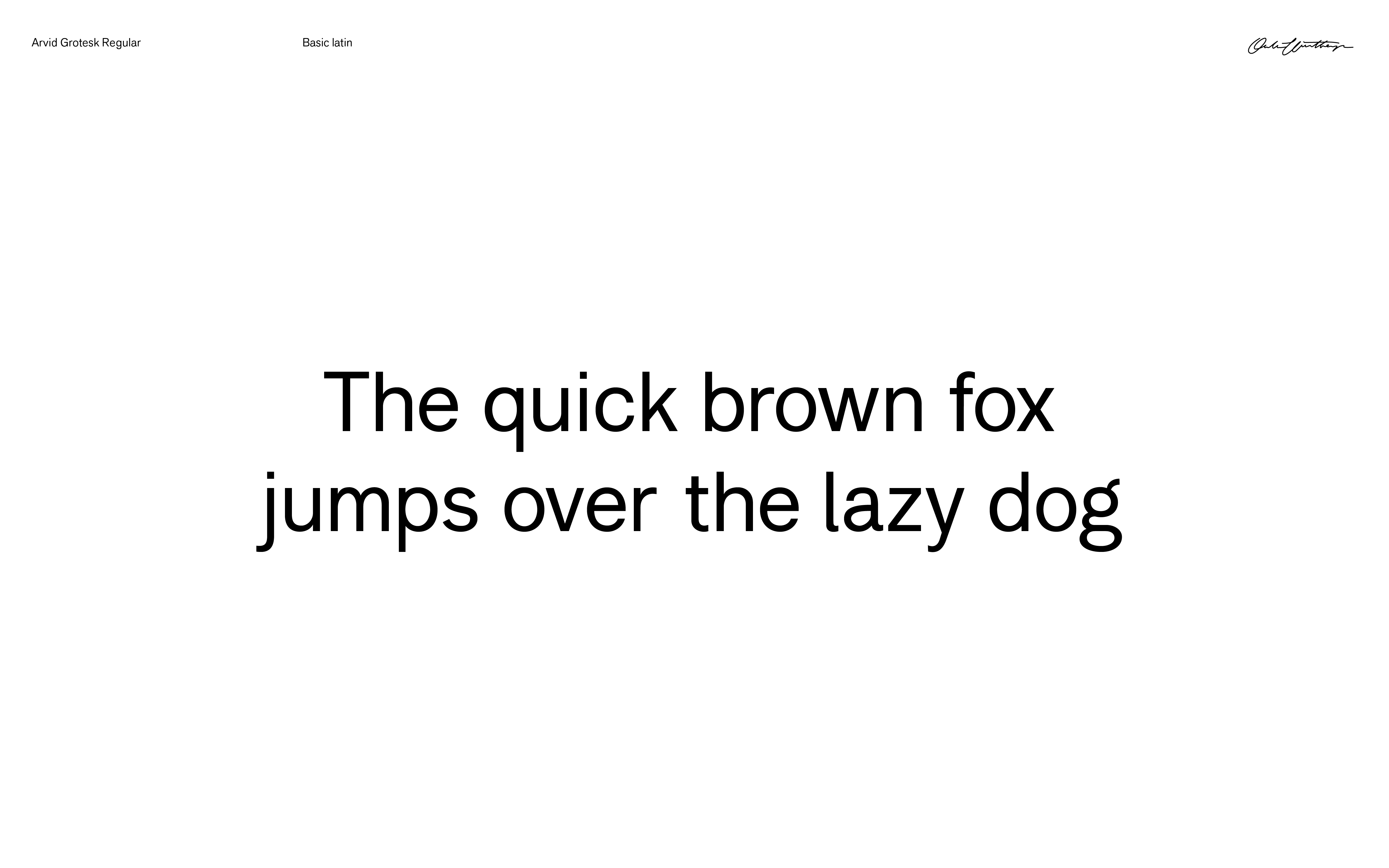
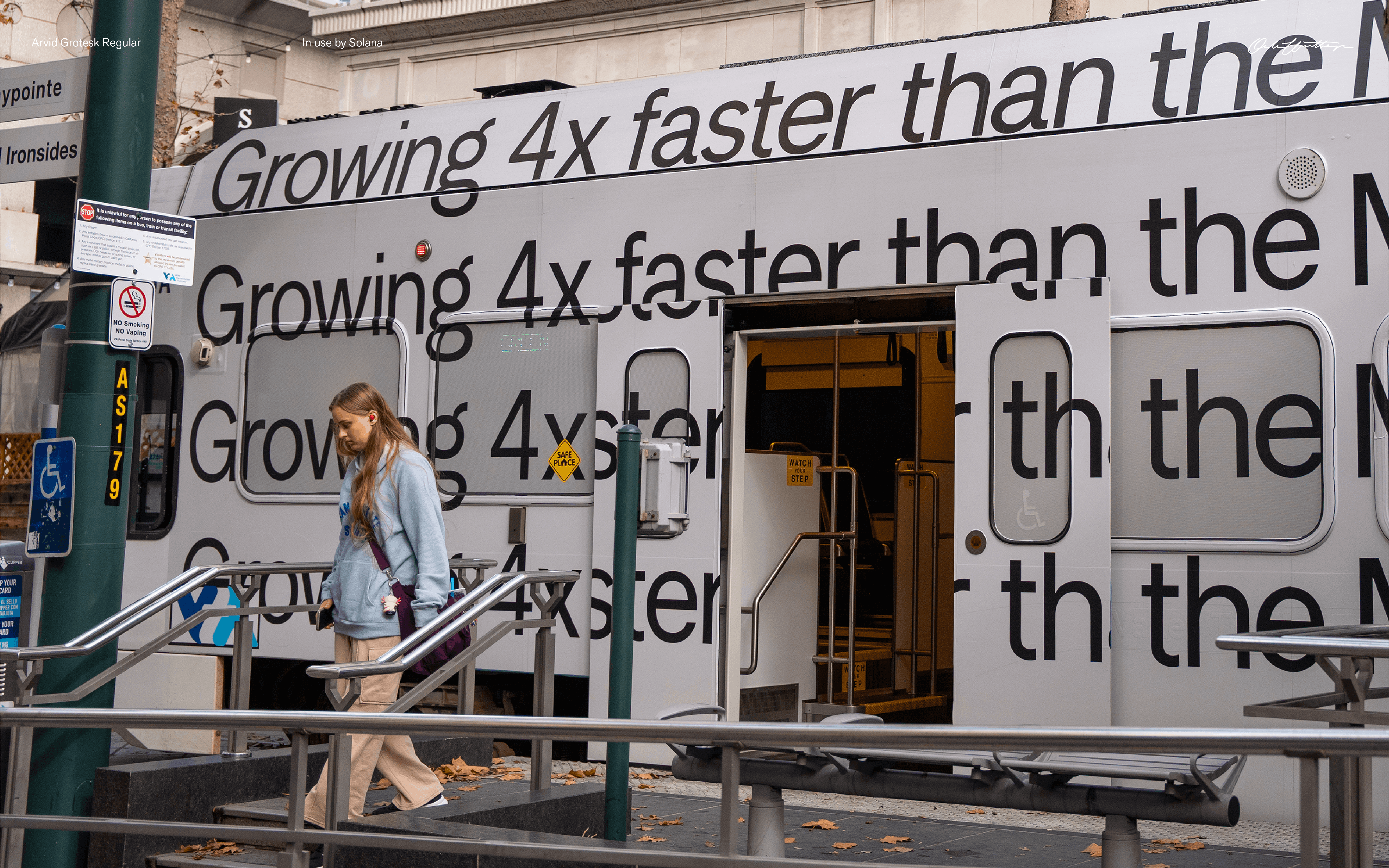
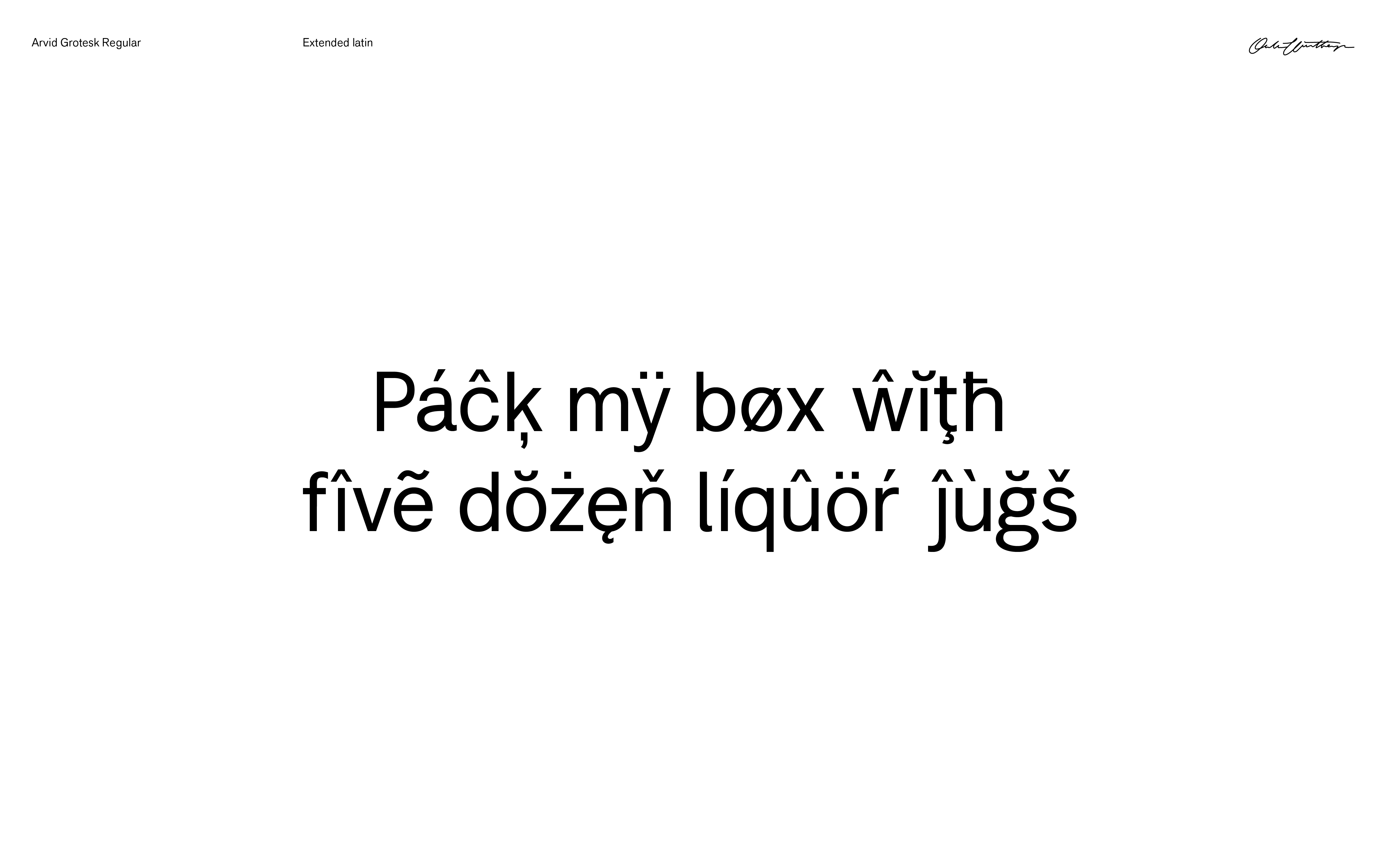
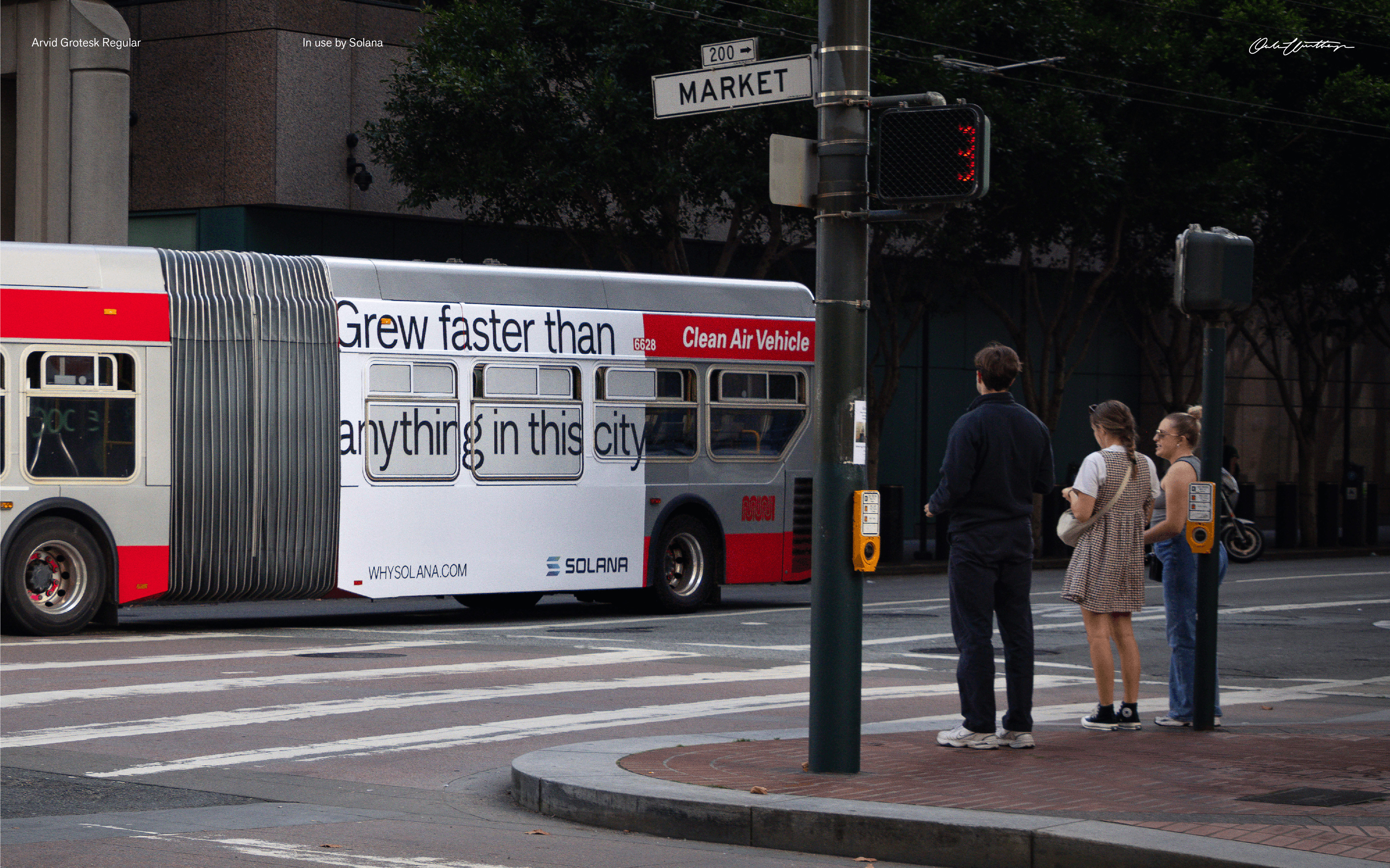
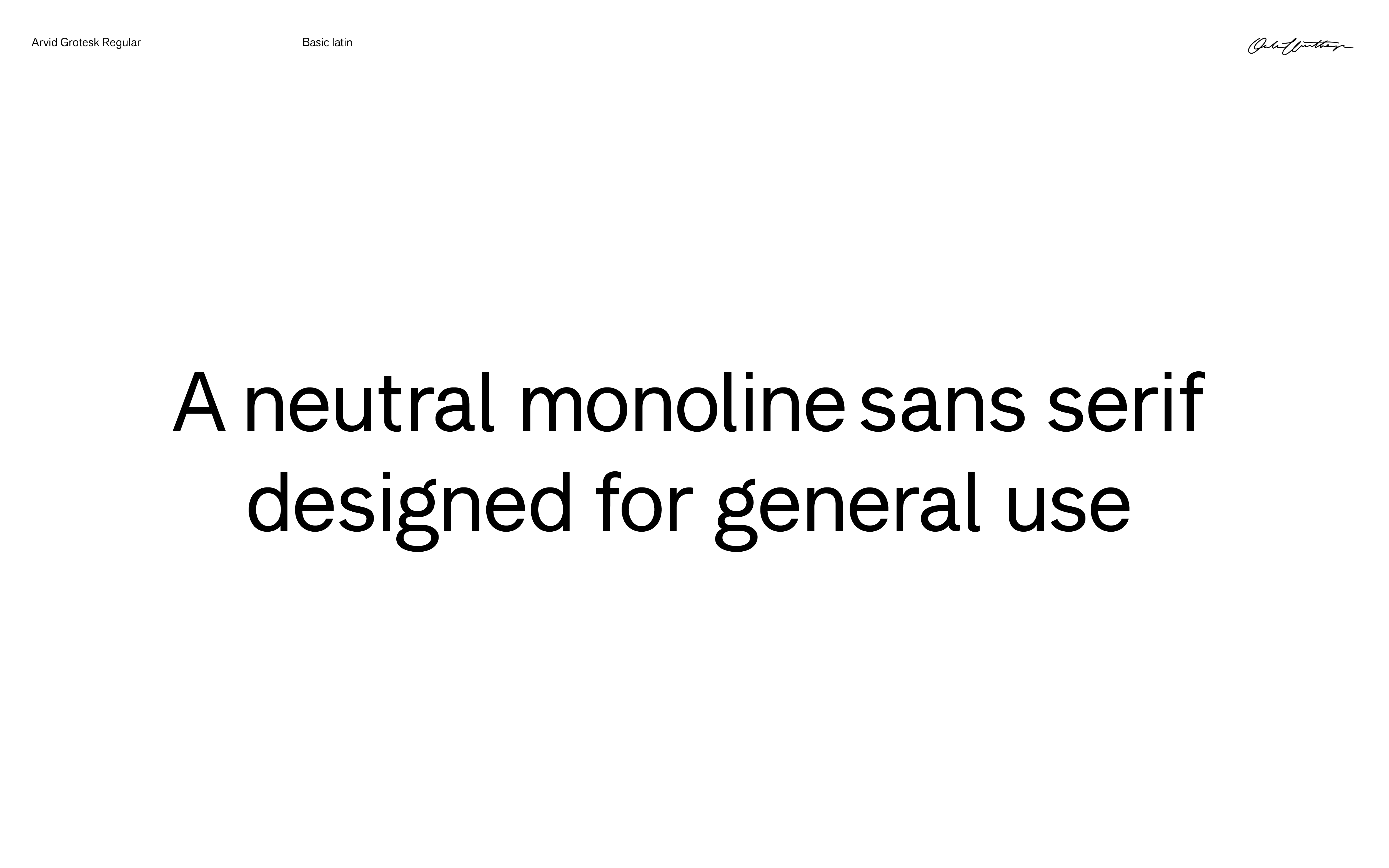
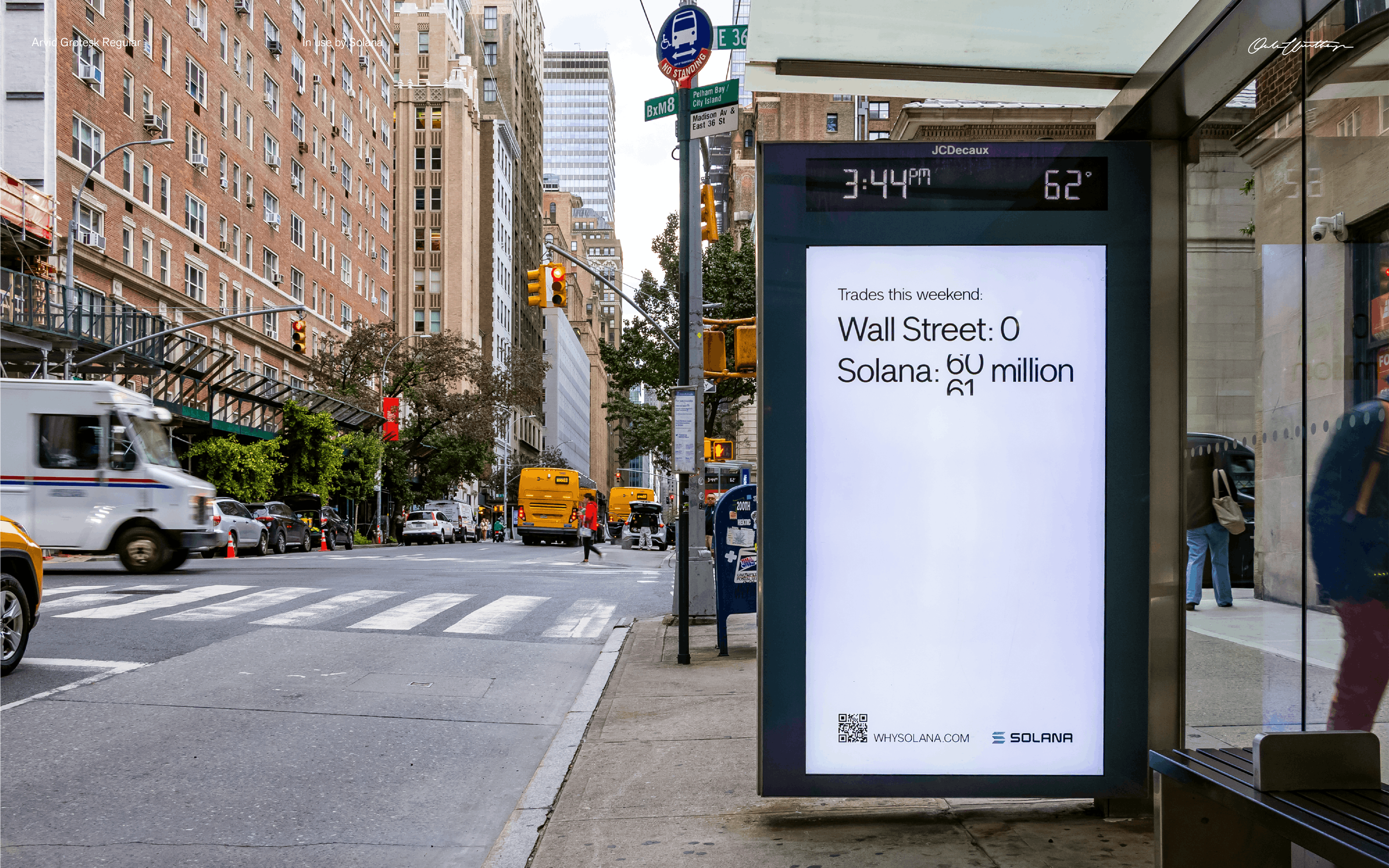
Arvid Grotesk
Oklart Type Foundry
Type design
Arvid is a neutral monoline sans serif font designed for general use. It comes in an extended latin glyphset including ligatures and arrows. Will be available early 2026.
Examples of use →
¯
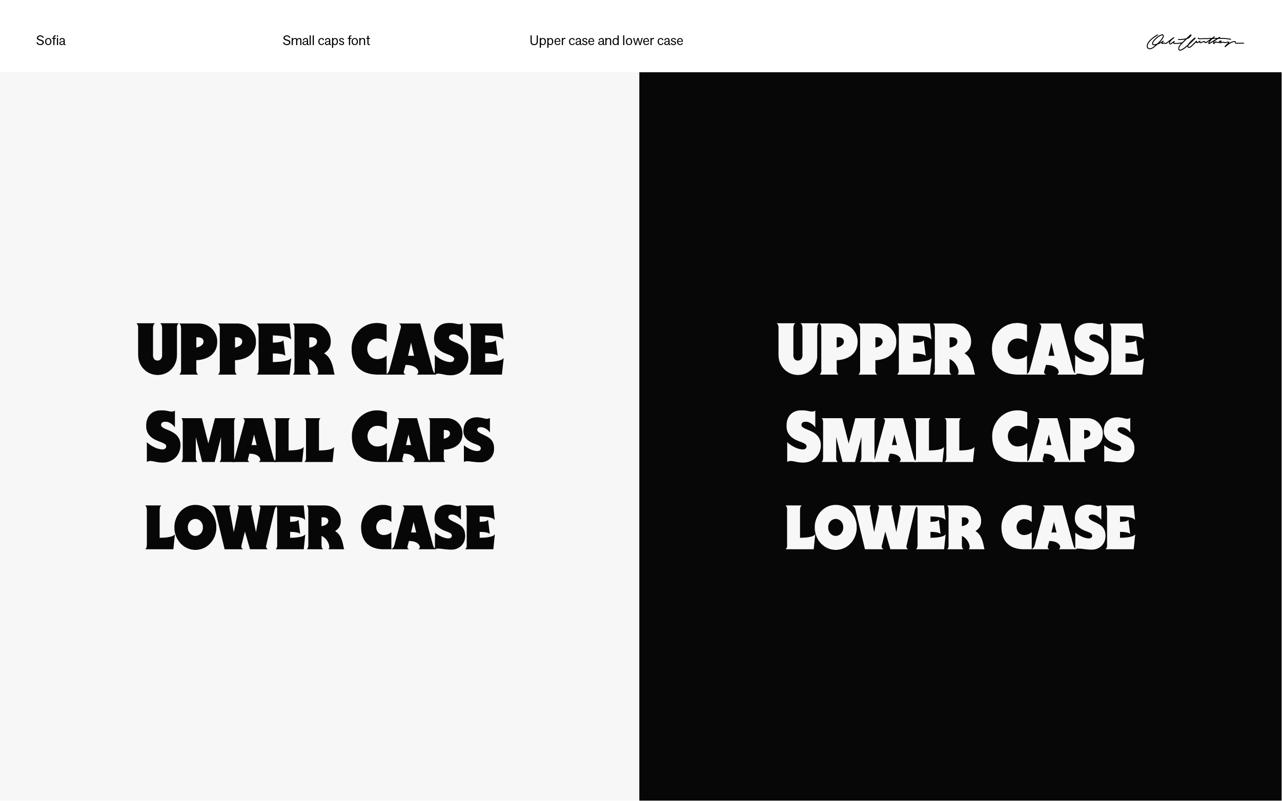
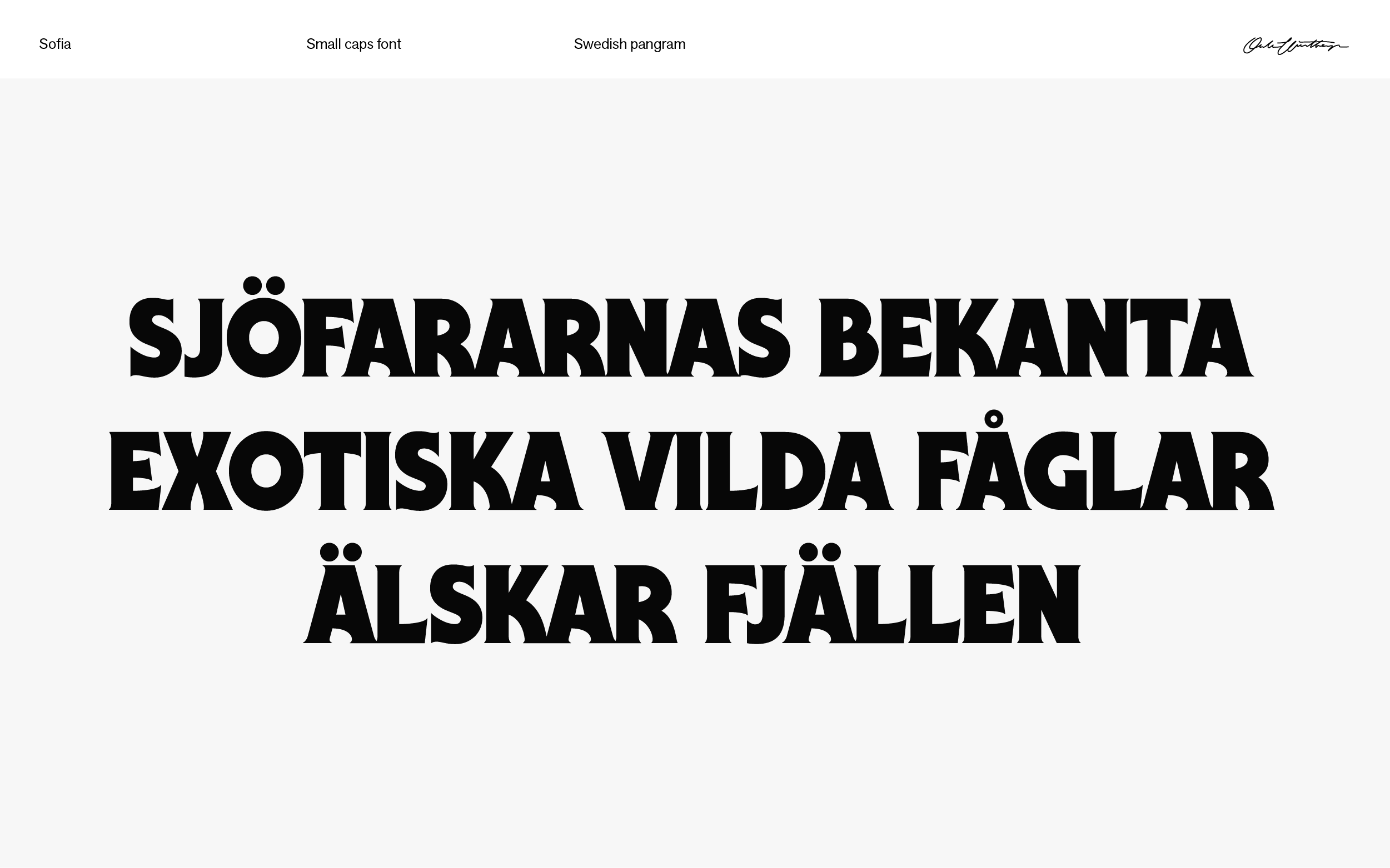
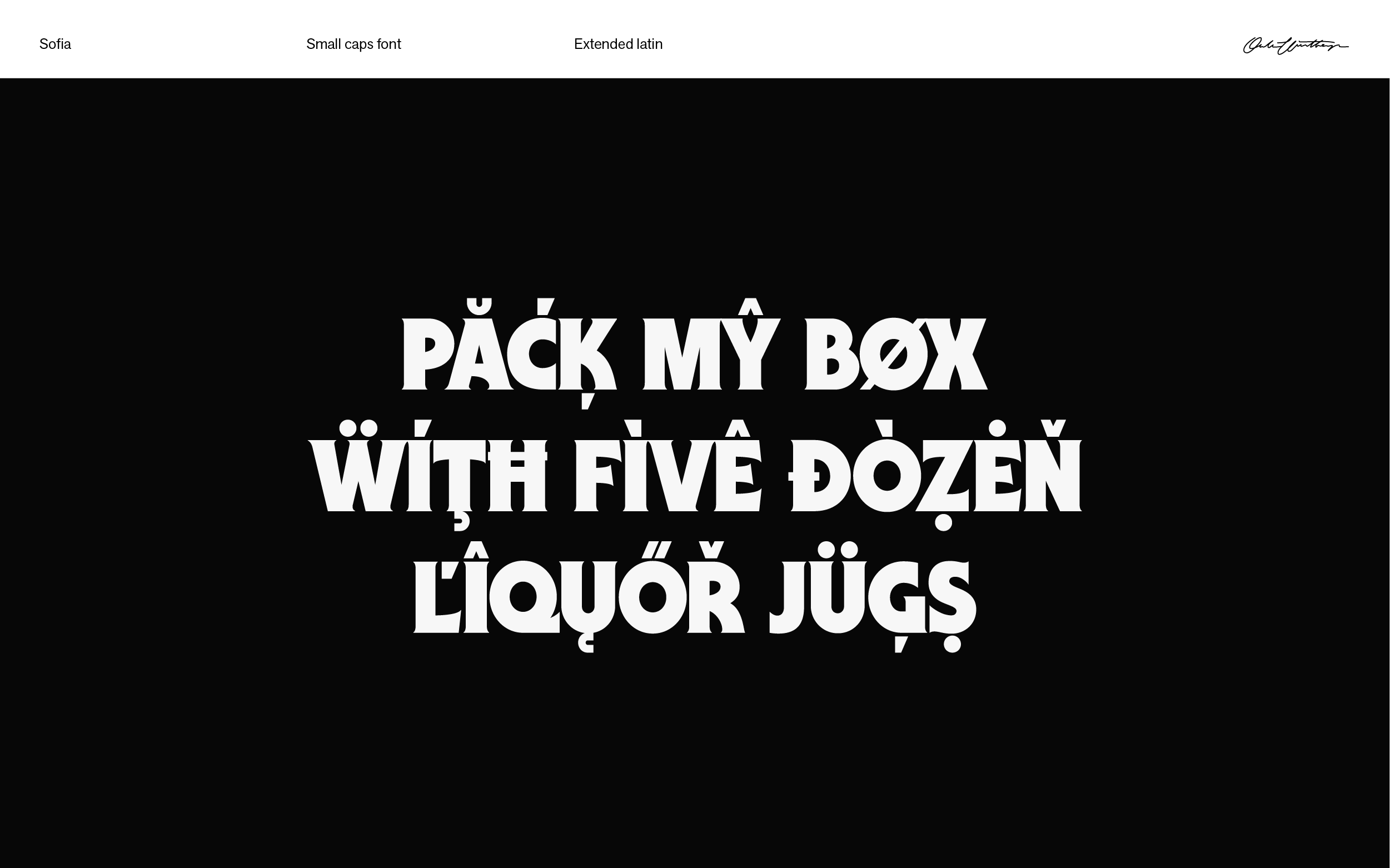
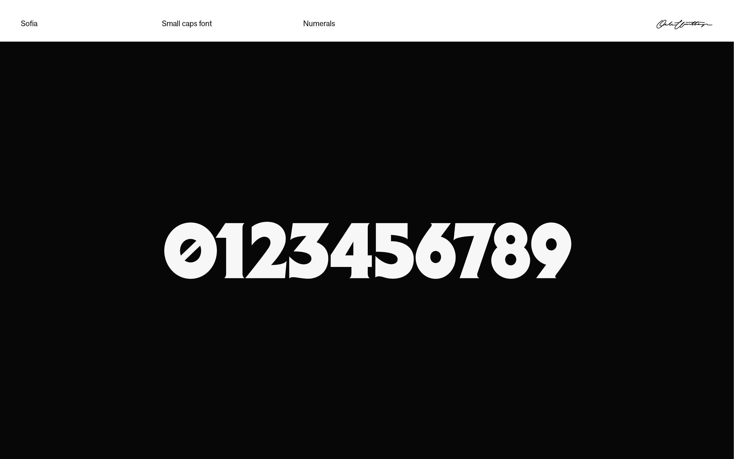
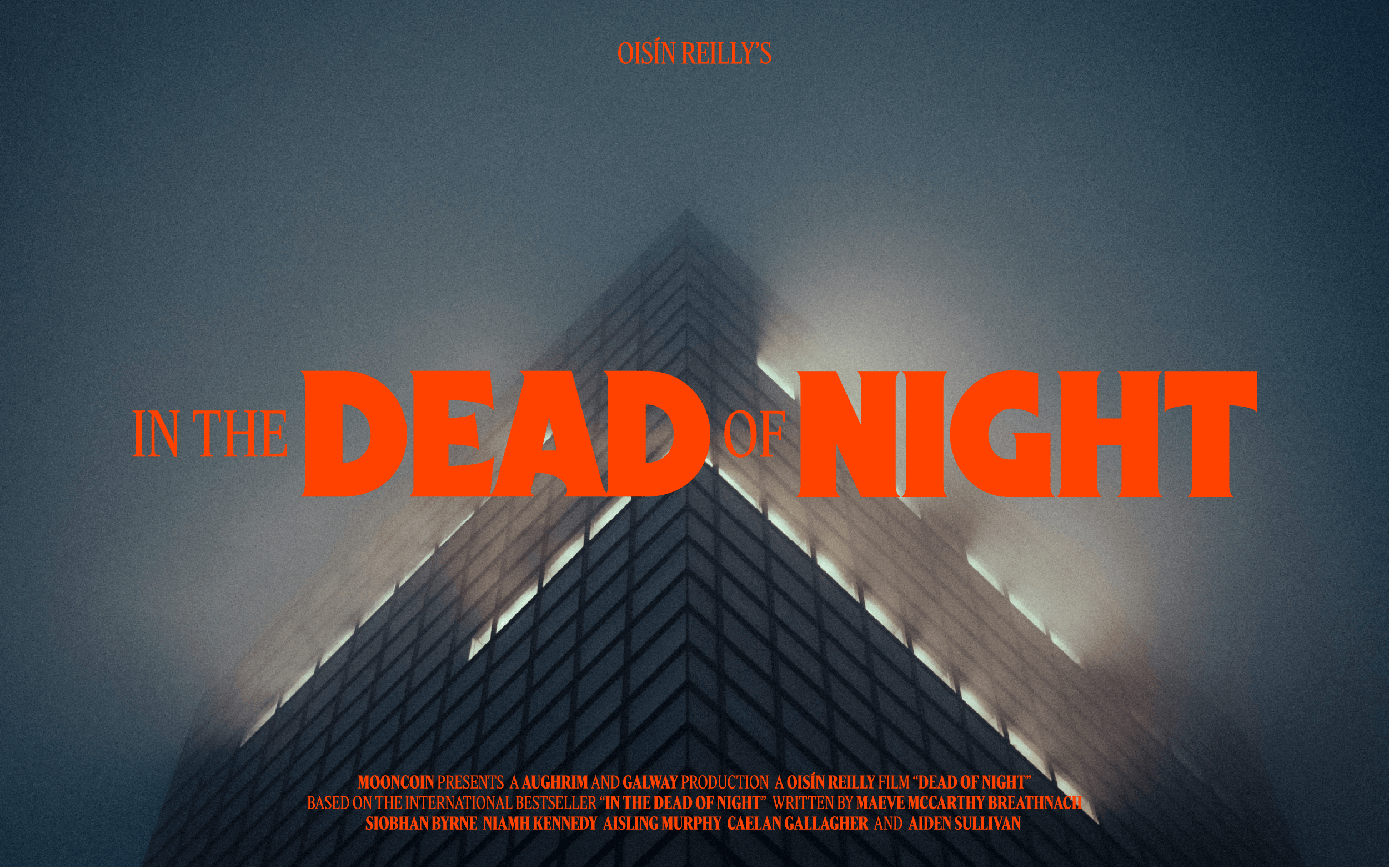
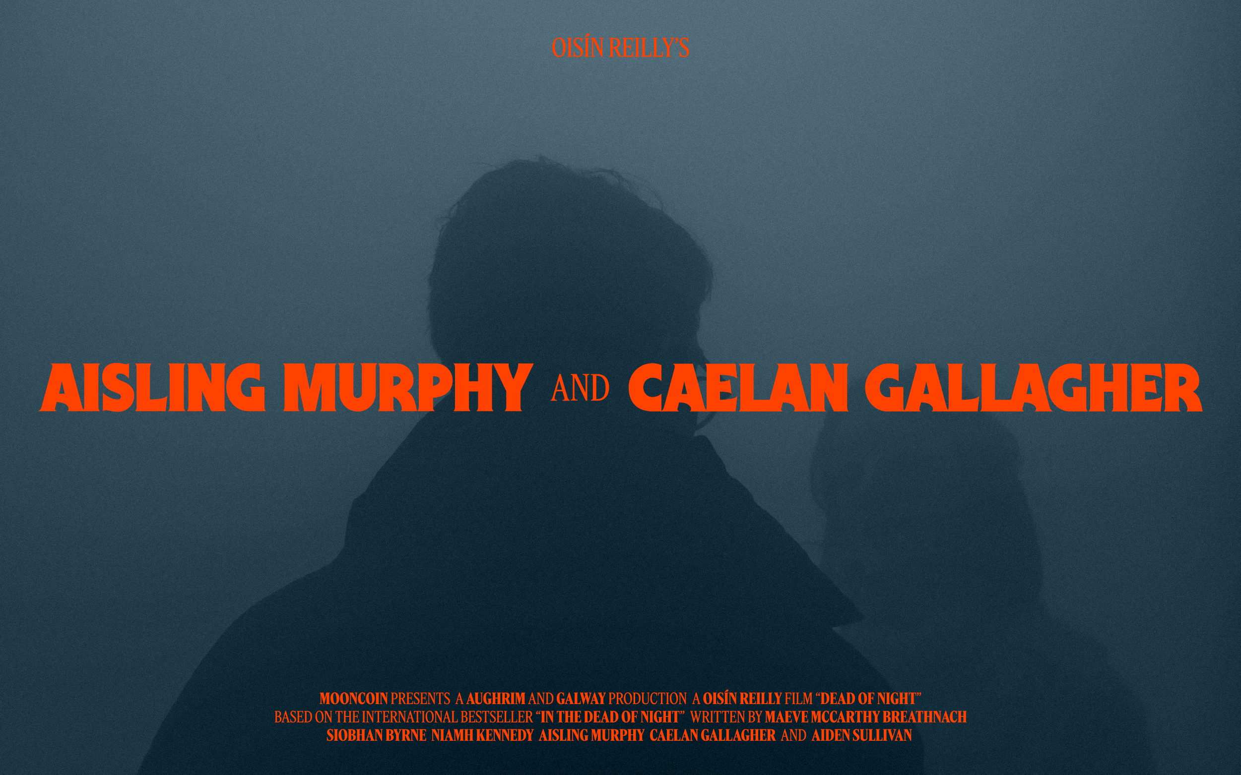
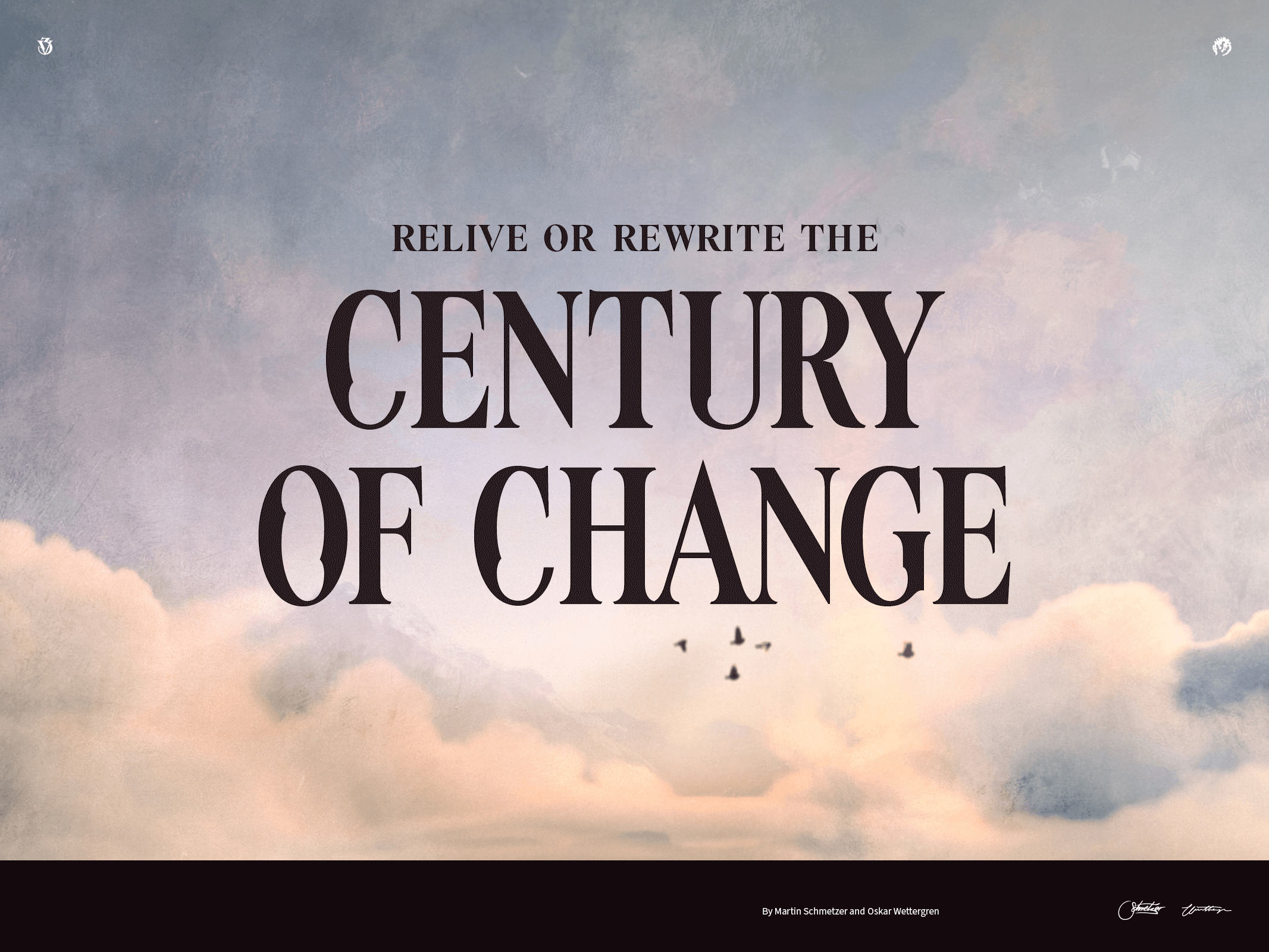
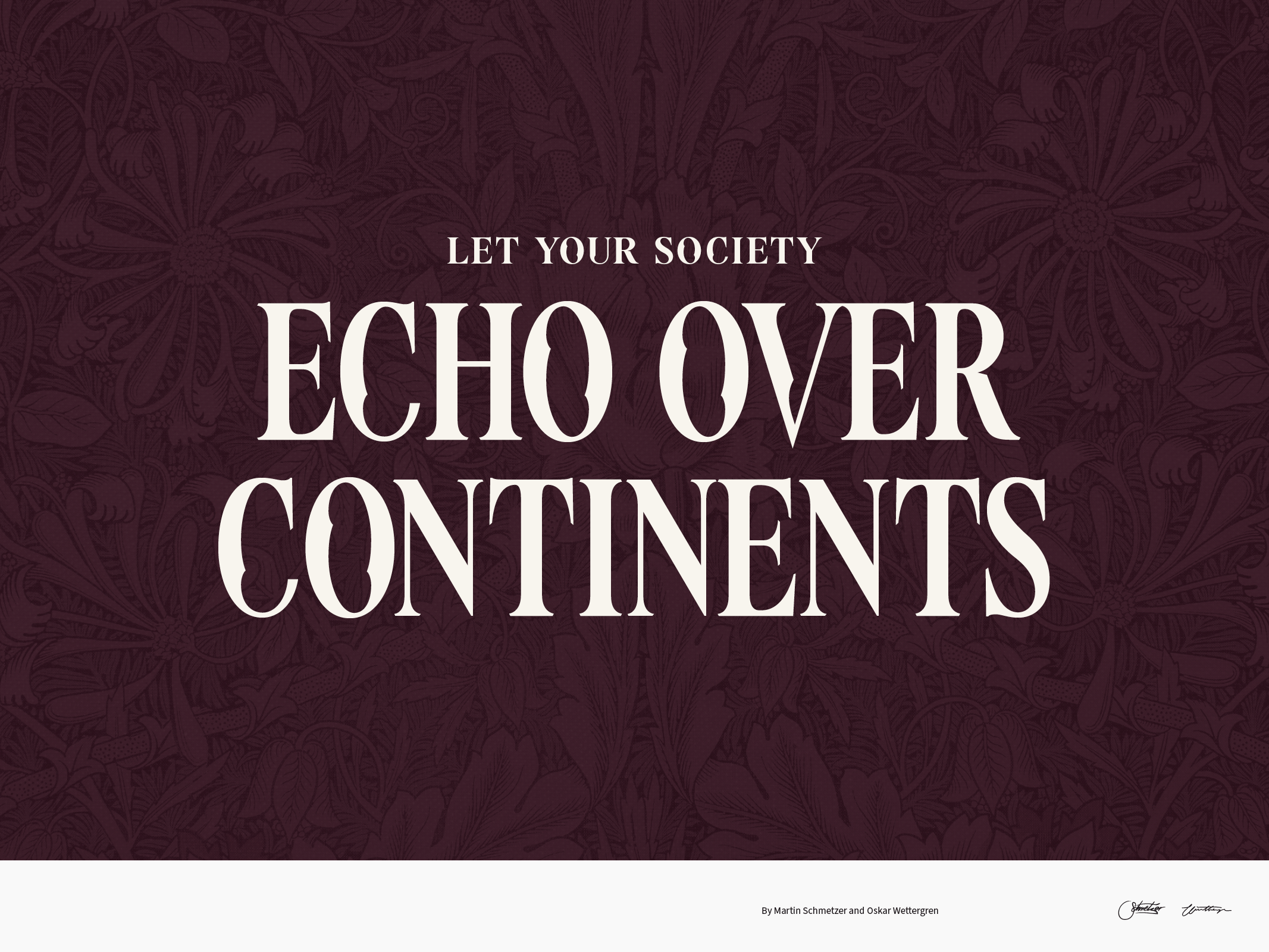
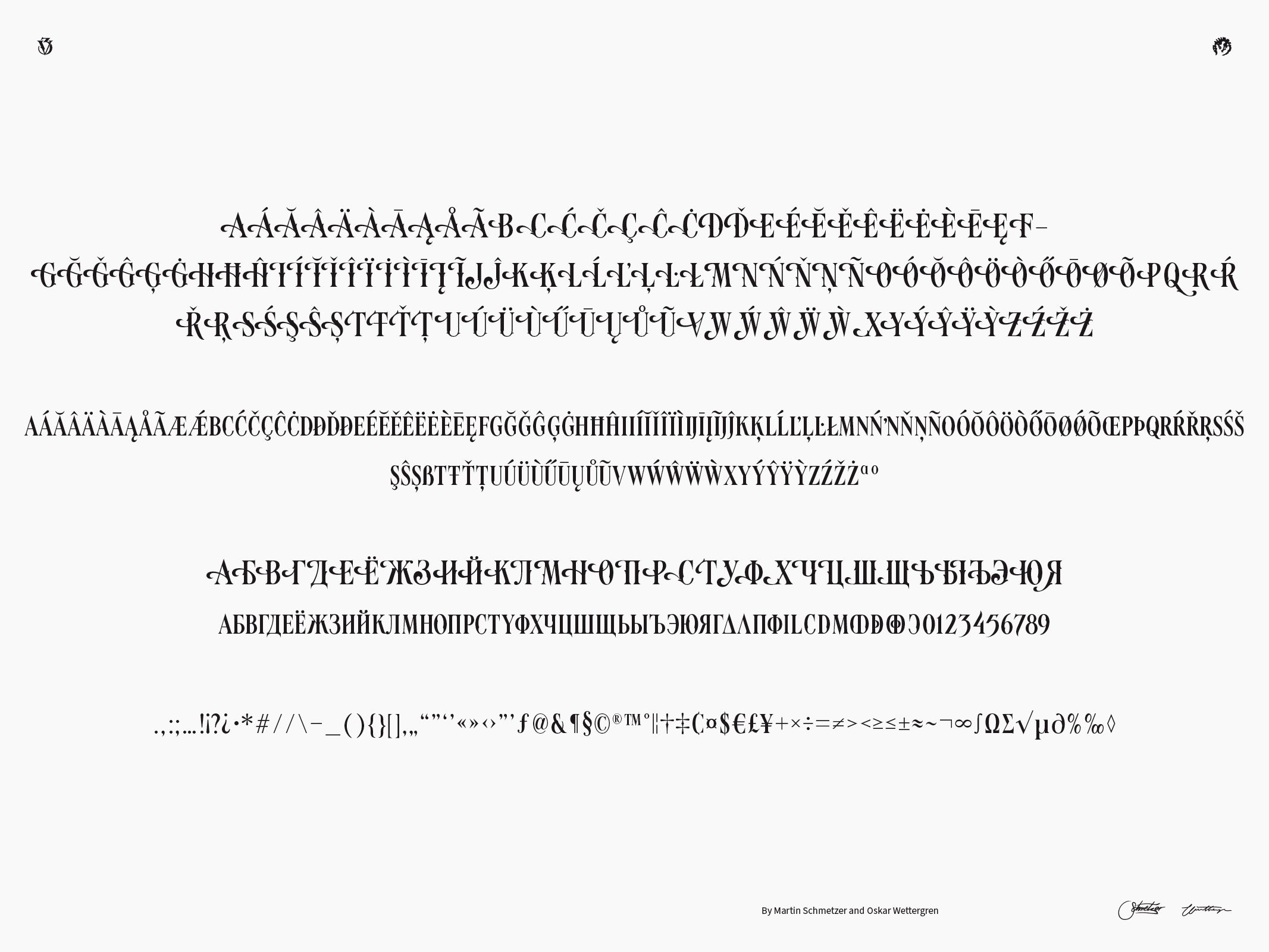
Sofia
Oklart Type Foundry
Type design
Sofia is a bold and expressive display serif small caps font, with a extended latin glyphset and ligatures. It is inspired by the science fiction and thriller typography of the 70’s and 80’s and is full of bold cinematic flavour.


¯
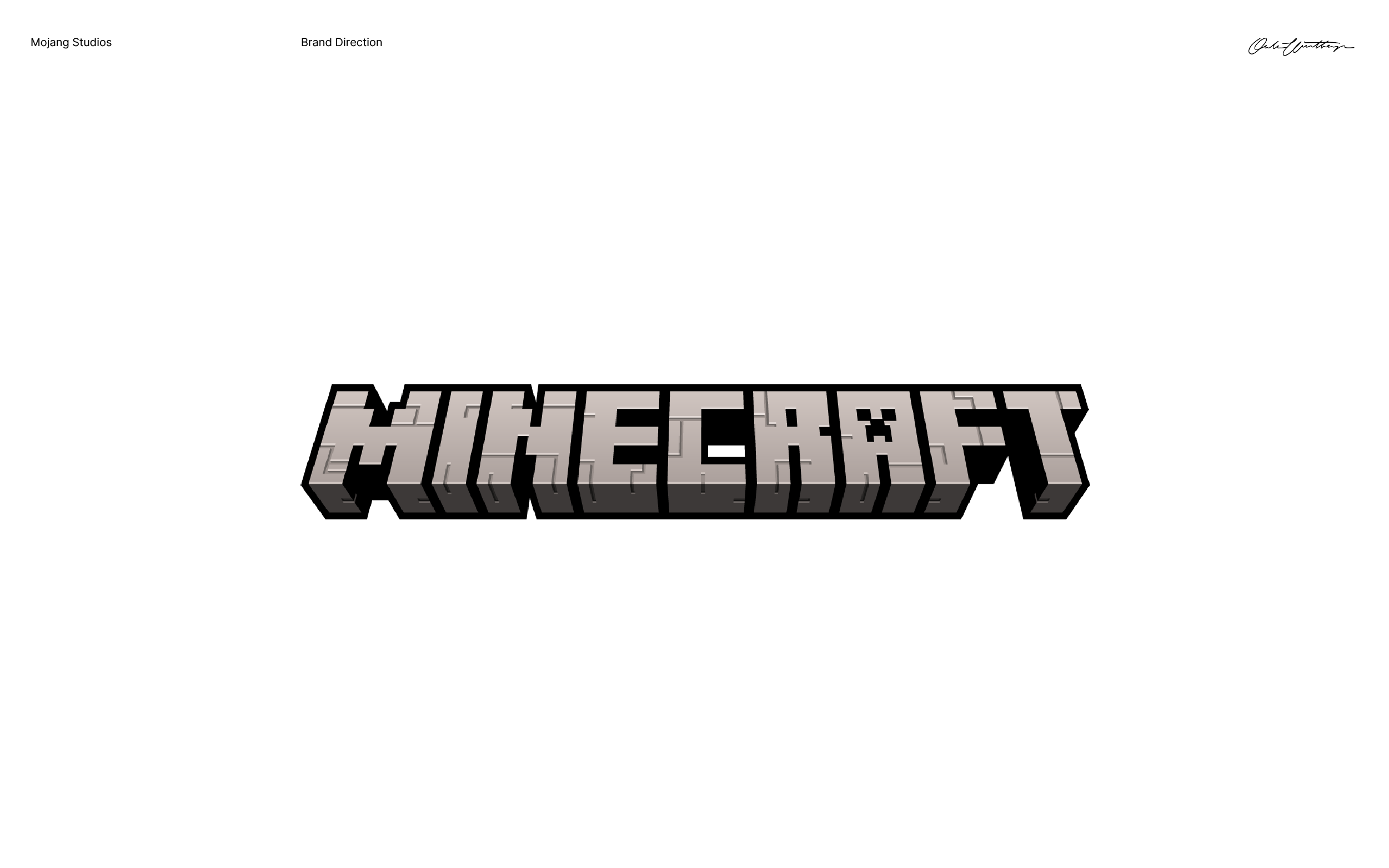
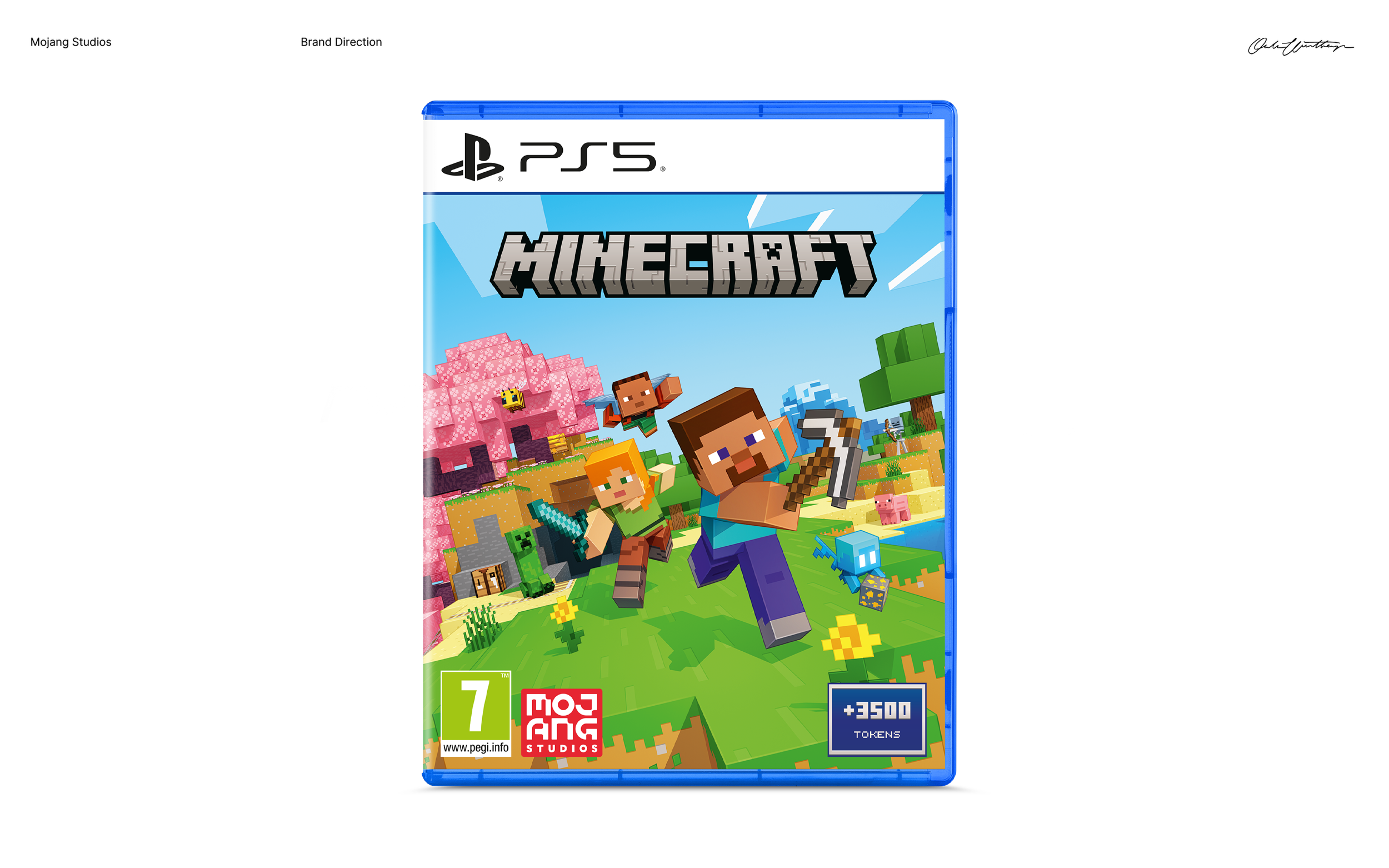
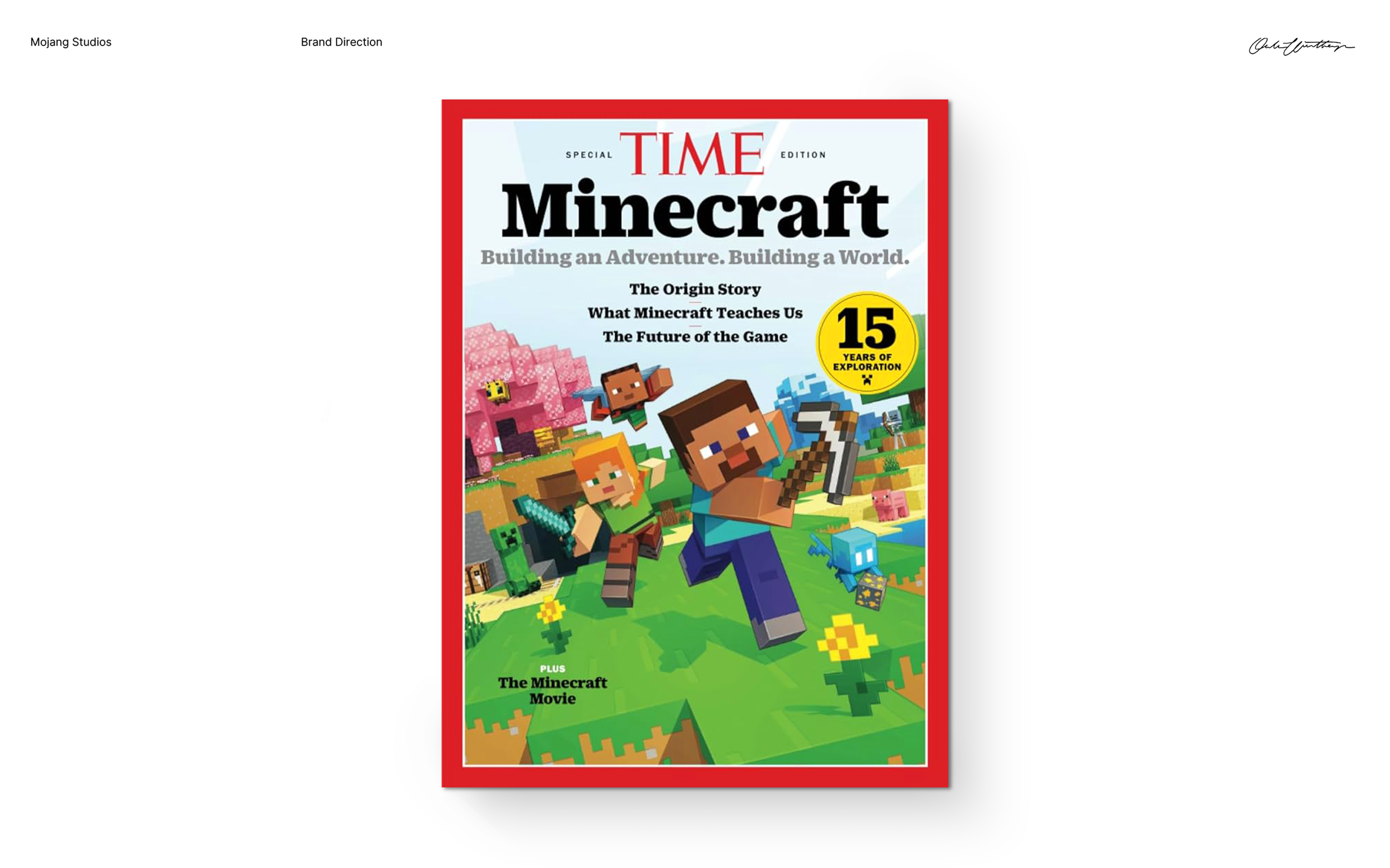
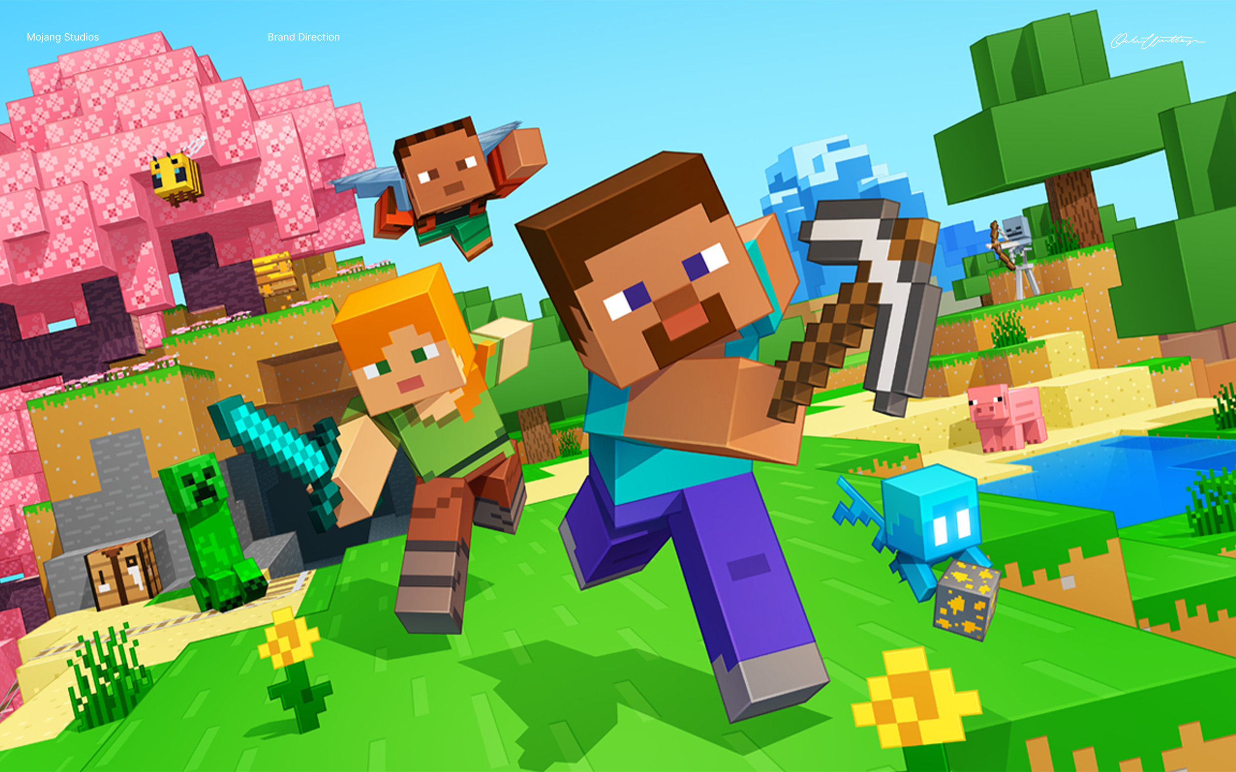
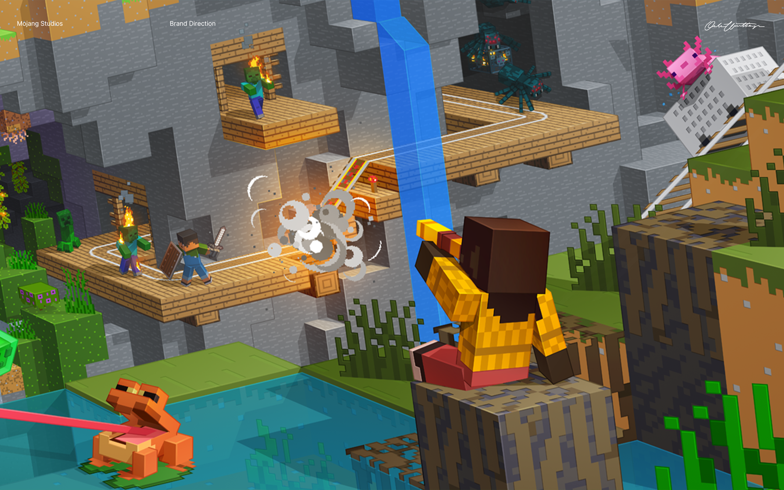
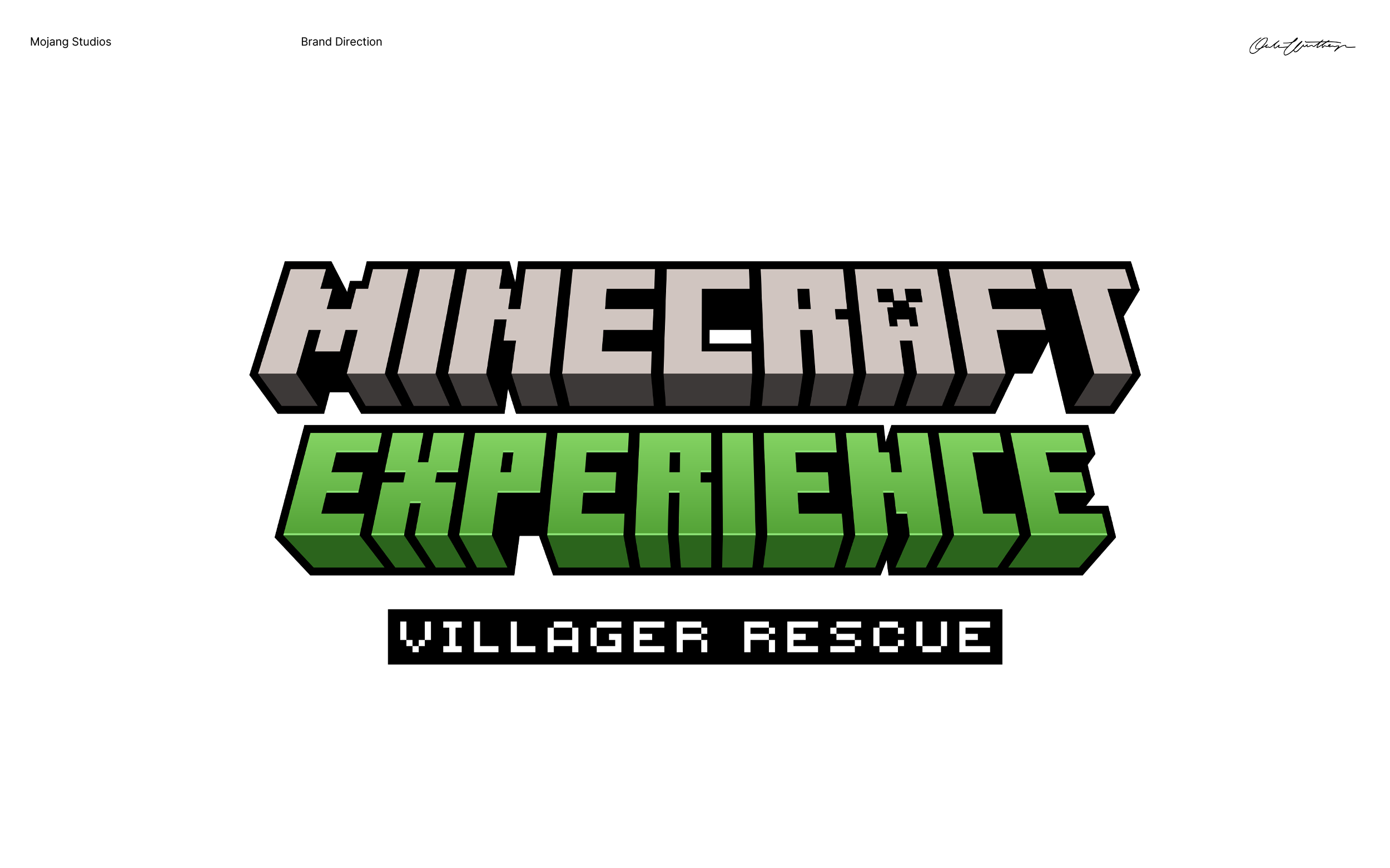
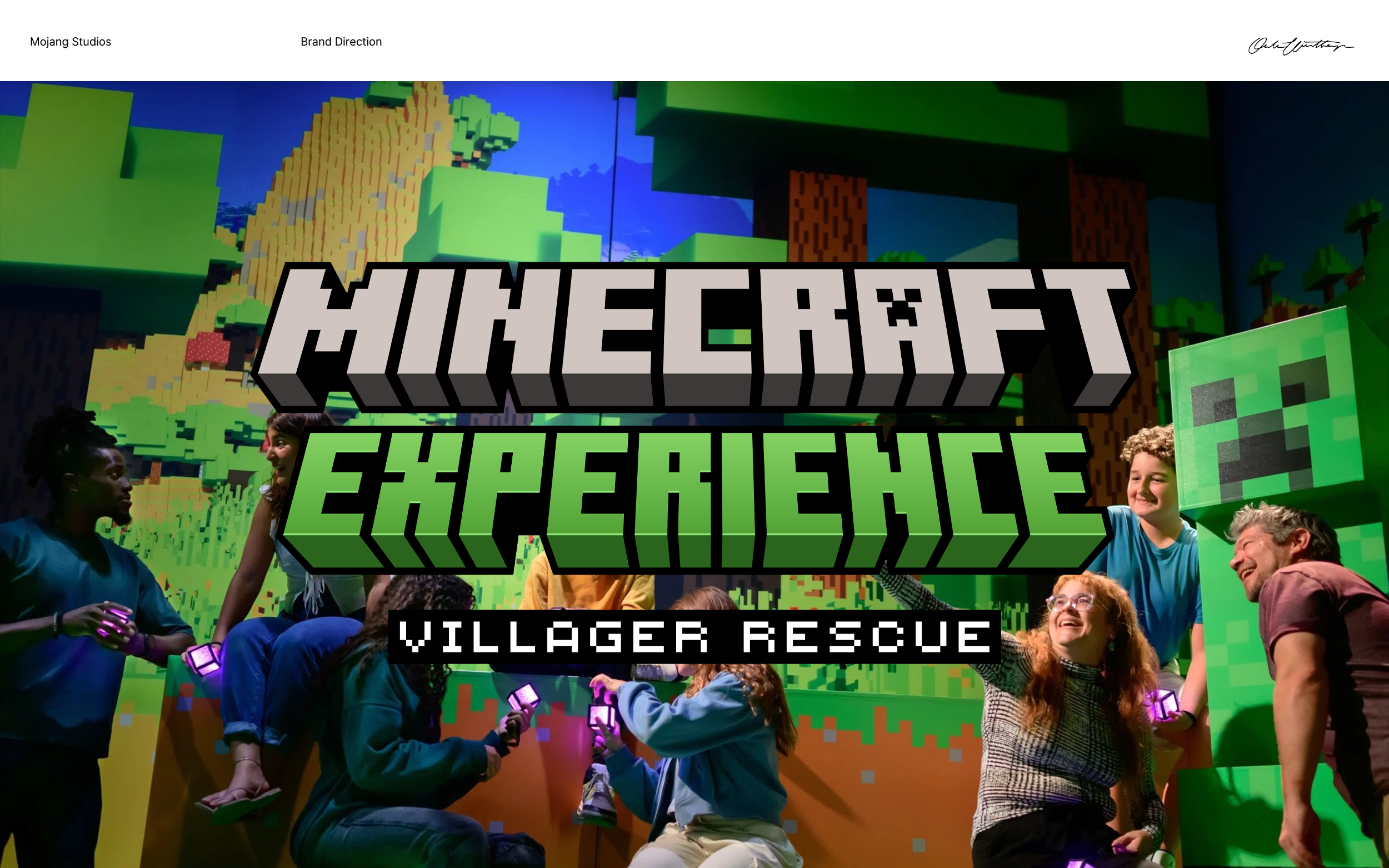
Minecraft
Mojang Studios
Branding / Art Direction
Mojang is a game studio most famously known for creating Minecraft, the (by far) most sold video game of all time. During a 18-month contract I worked in the Brand Direction team, contributing to a dynamic brand during a pivotal time. My work spanned from, amongst other things, creating the wordmark for Minecraft Experience to being part of the art direction of the new key art, all together with brilliant collegues.


¯
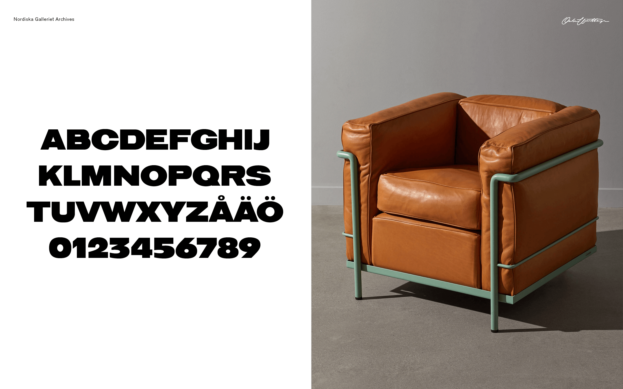
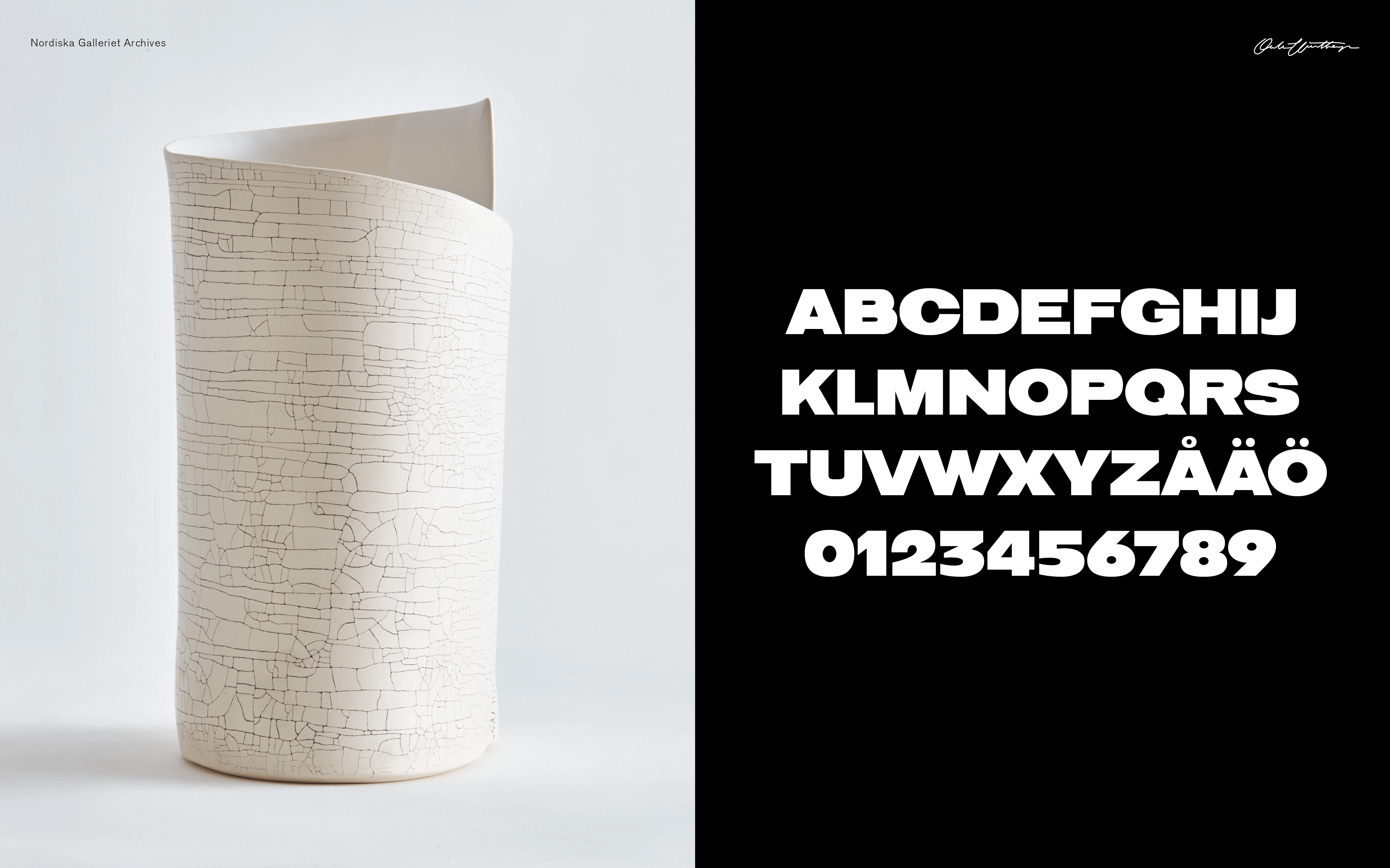
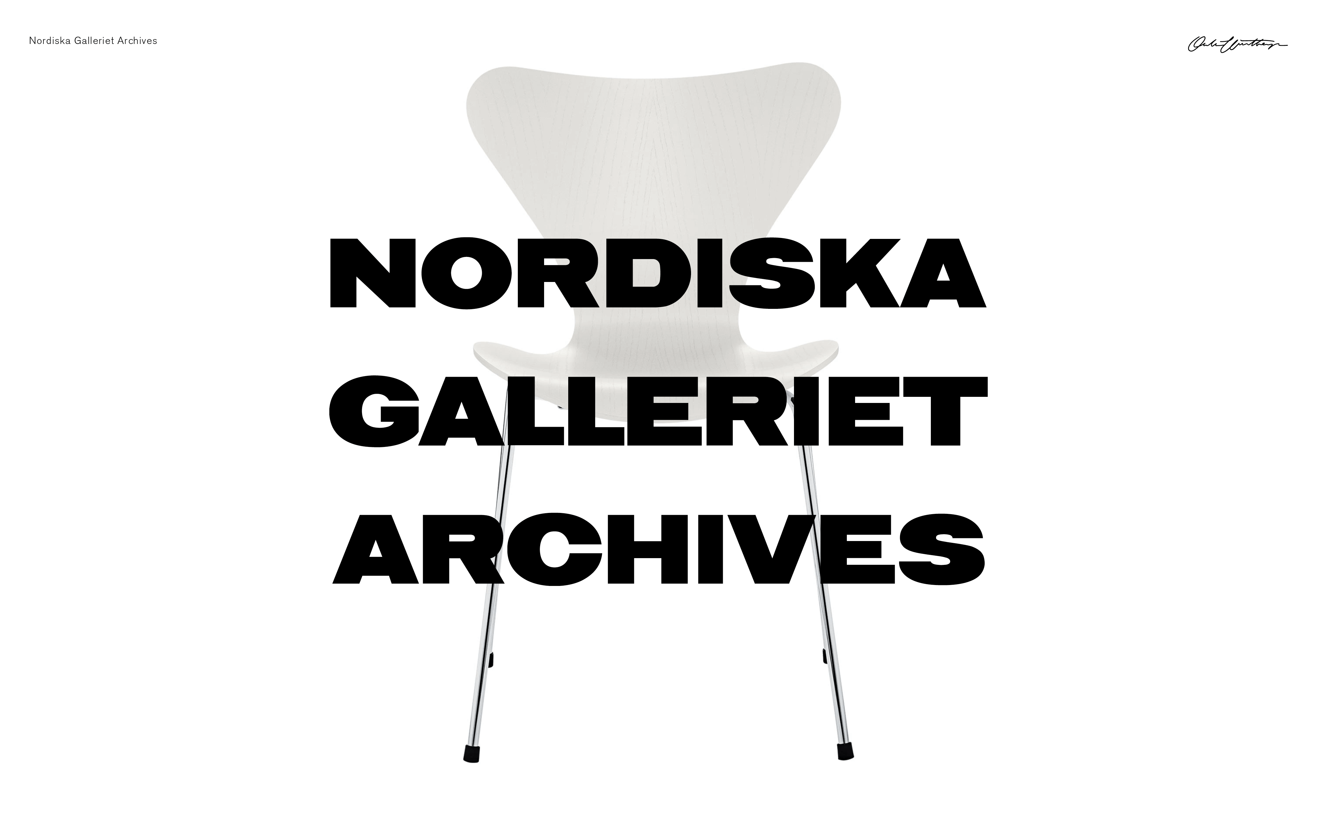
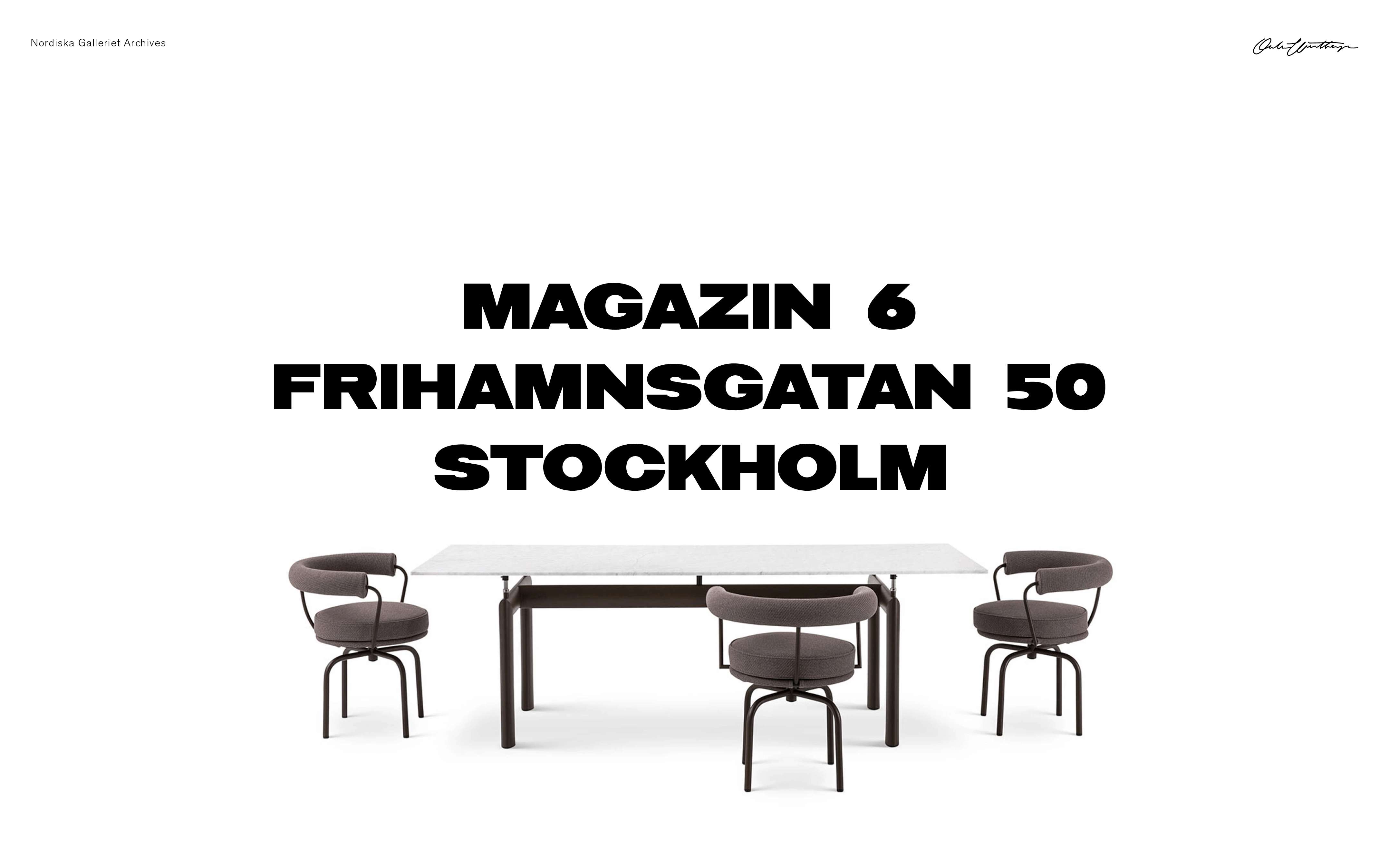
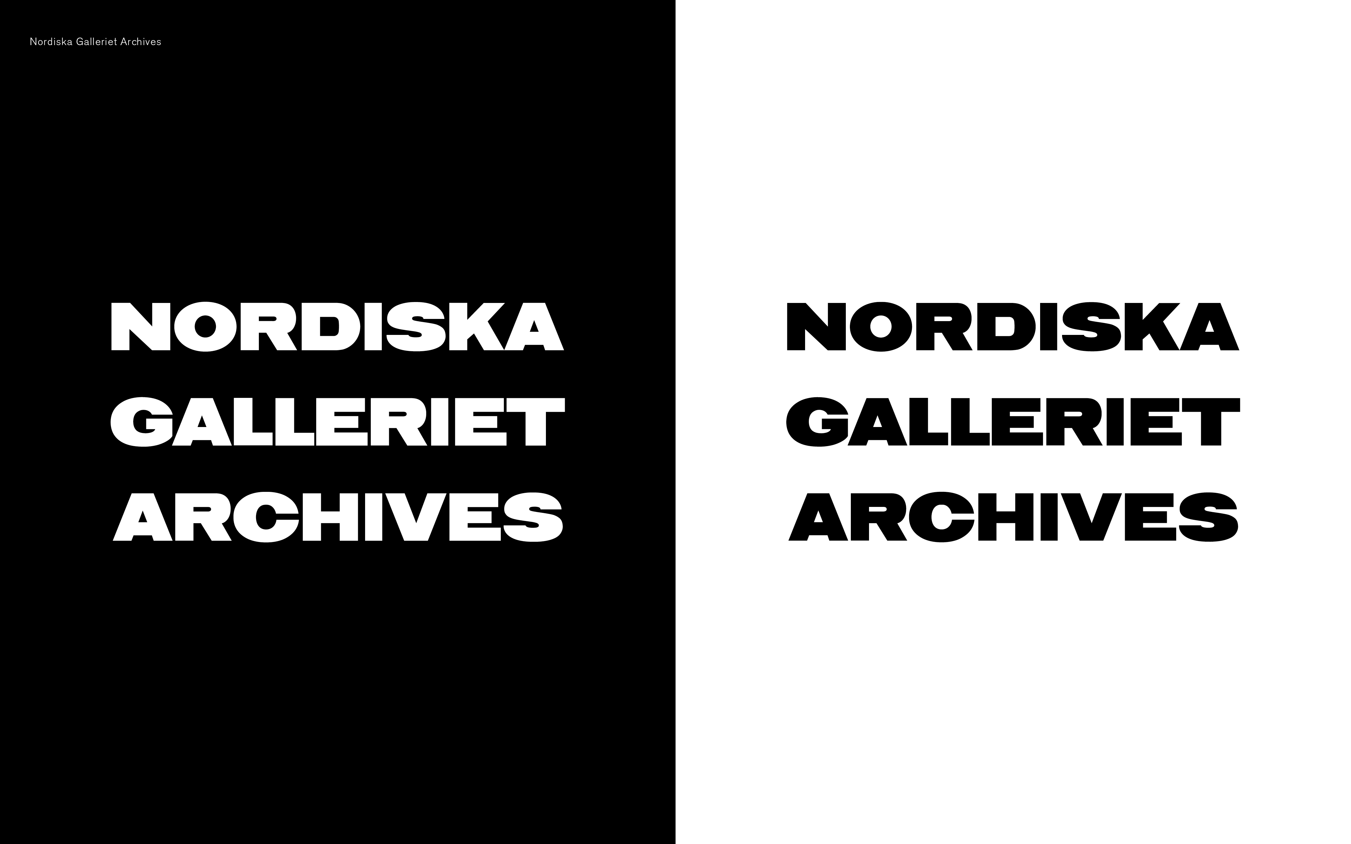
Nordiska Galleriet
Nordiska Galleriet (NO GA)
Branding / Type design
Nordiska Galleriet is one of the world's most prominent destinations for design furniture. I was tasked to create a wordmark for their new sister store Nordiska Galleriet Archives. We decided to, considering the nature of the work (Archives), base our work off of Jörgen Höj’s wordmark drawn in 1954, that display the heritage that build a sense of trust in the company. On top of the creation of the Archives wordmark I also created a custom, extended latin, font and assisted in the creation of the NO GA wordmark for the brands launch abroad. Nordiska Galleriet also reverted to Jörgen Höjs wordmark for the Swedish market.
Examples of use →


¯
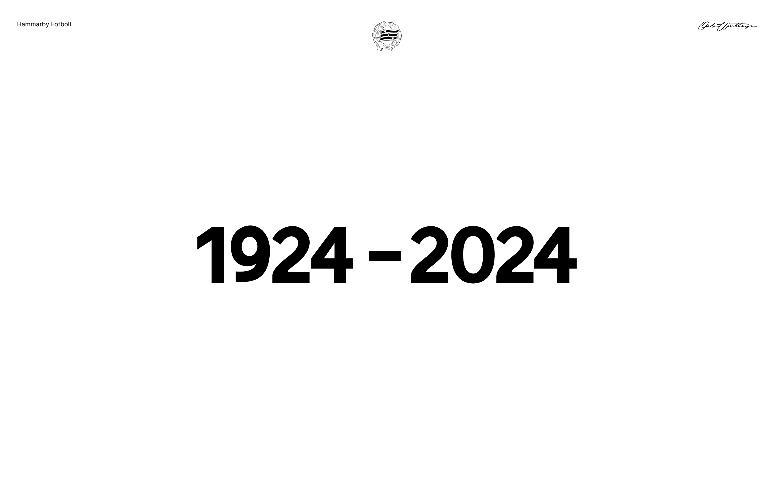
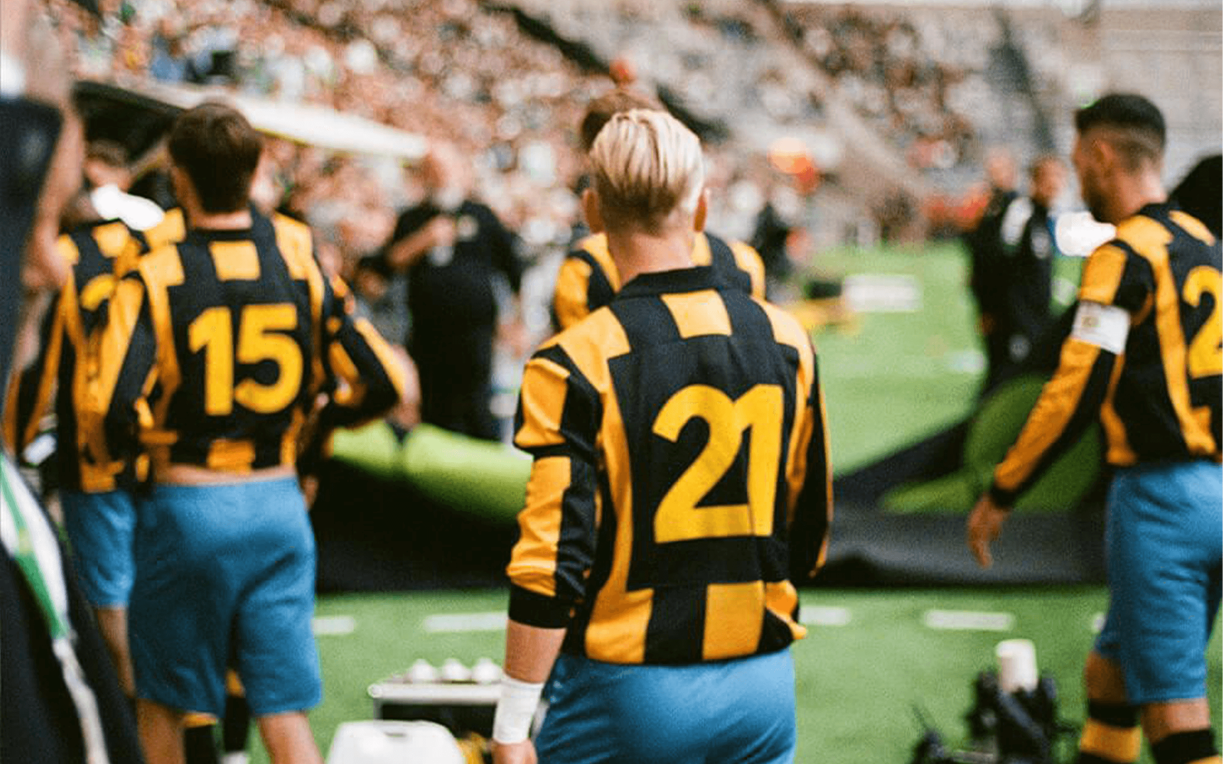
Anniversary Numerals
Hammarby Fotboll
Branding / Custom typography
To commemorate the 100th anniversary of Allsvenskan, Sweden's top football league, all clubs in the 2024 edition were asked to play a home match in a specially designed kit. Together with Kat.Ban, I was tasked with creating numerals for Hammarby, as the 1924 version lacked them. Drawing inspiration from typography typical of the time, purposefully keeping some of its quirks, I crafted numerals that felt of the time and blended naturally with the kit's design, including condensed versions for double digits.
See all pictures→


¯
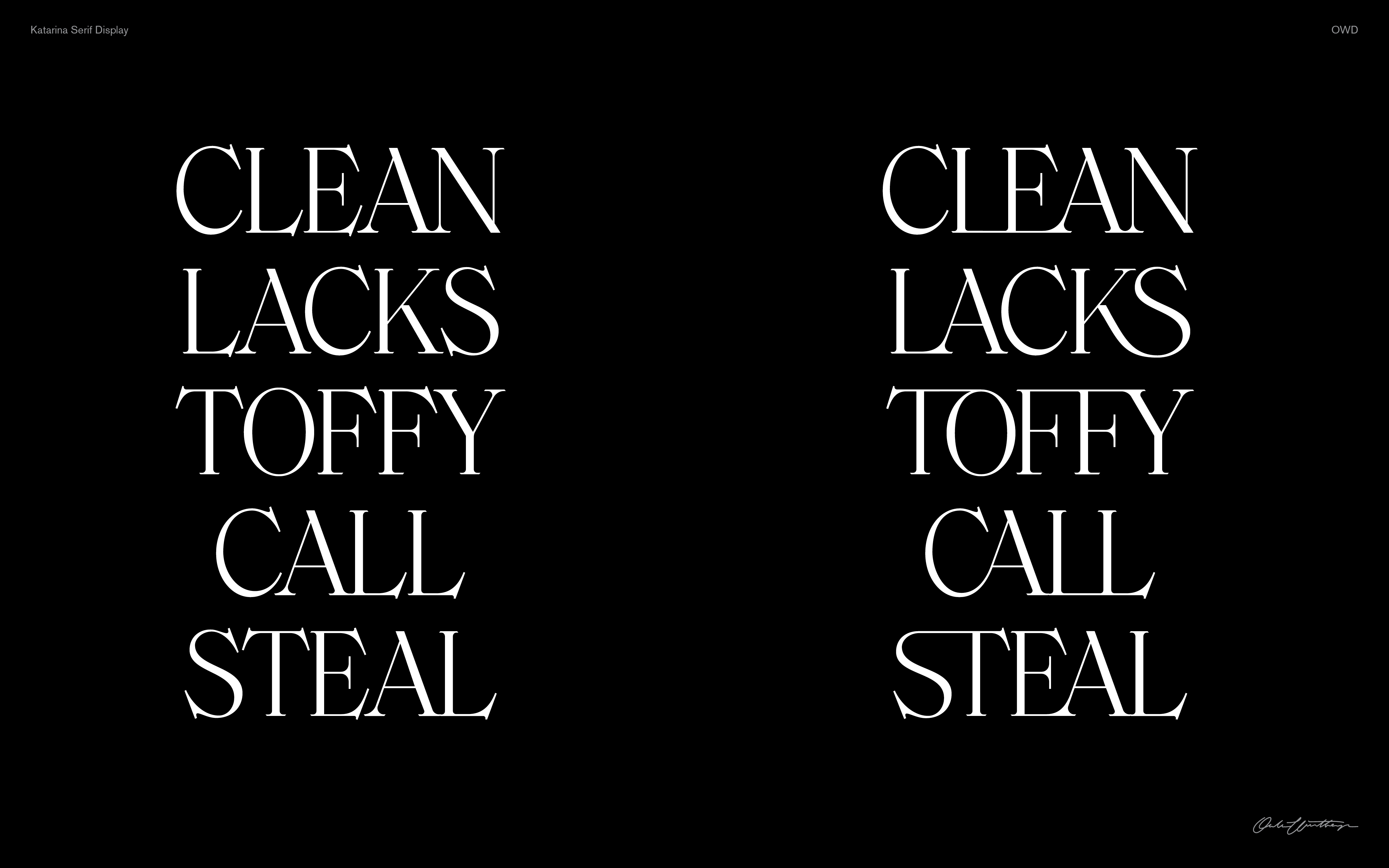
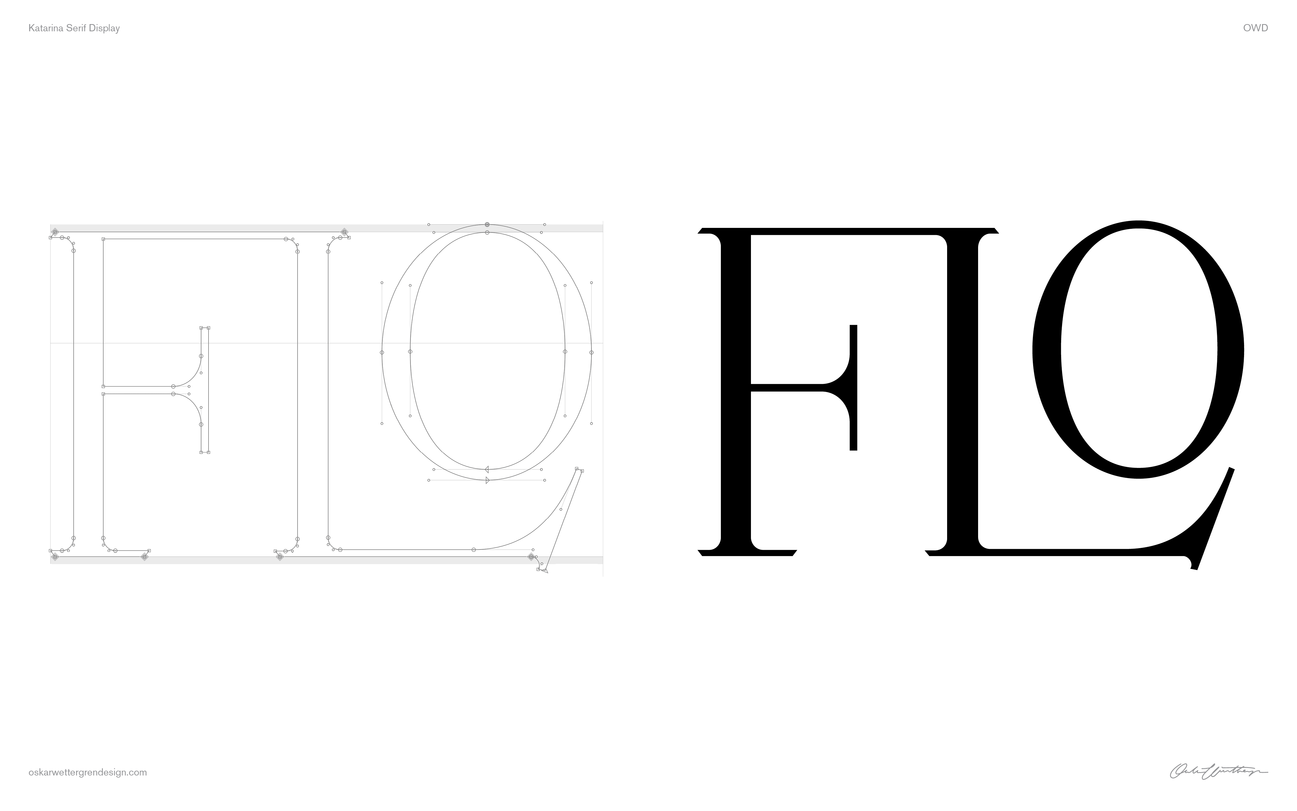
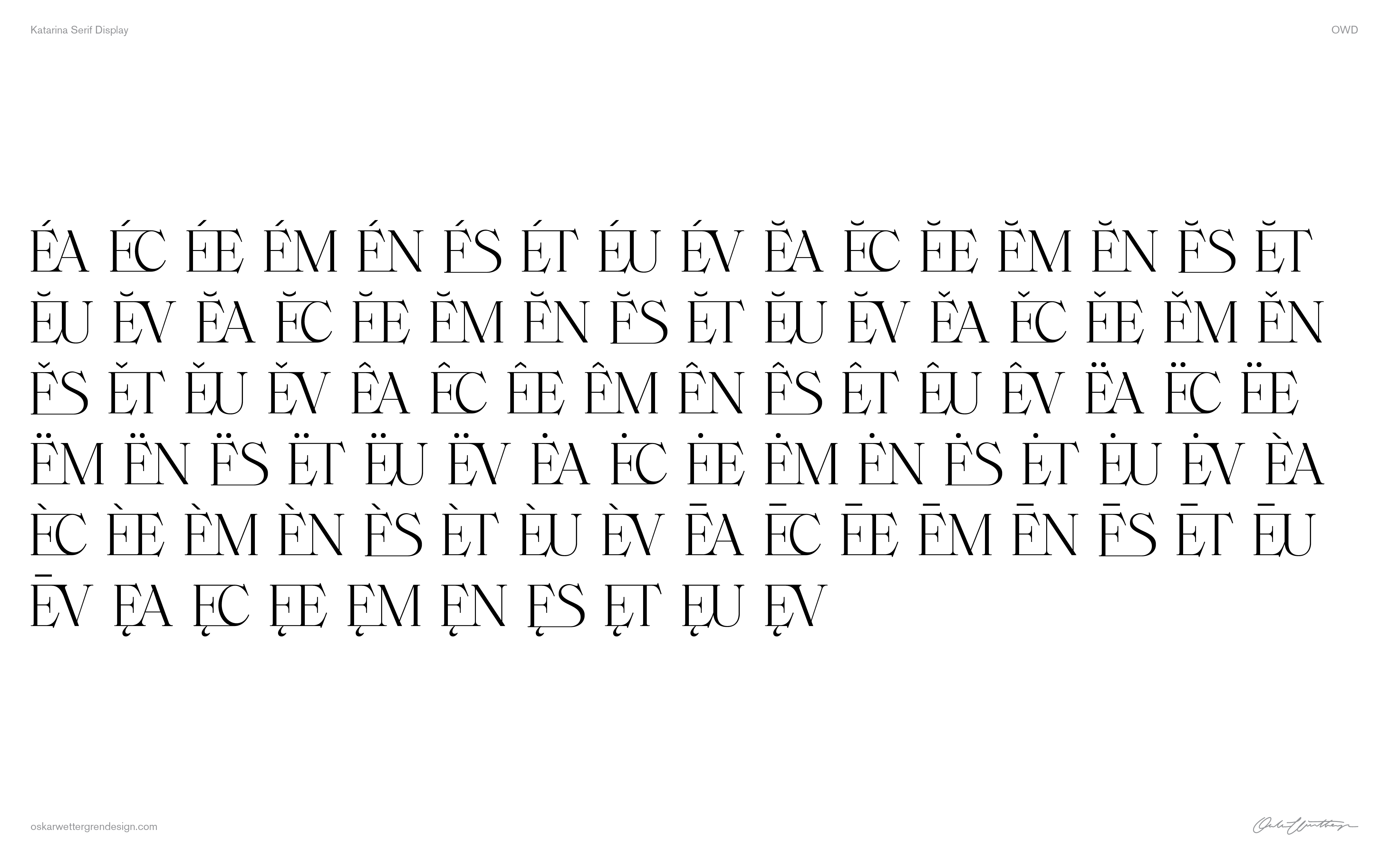
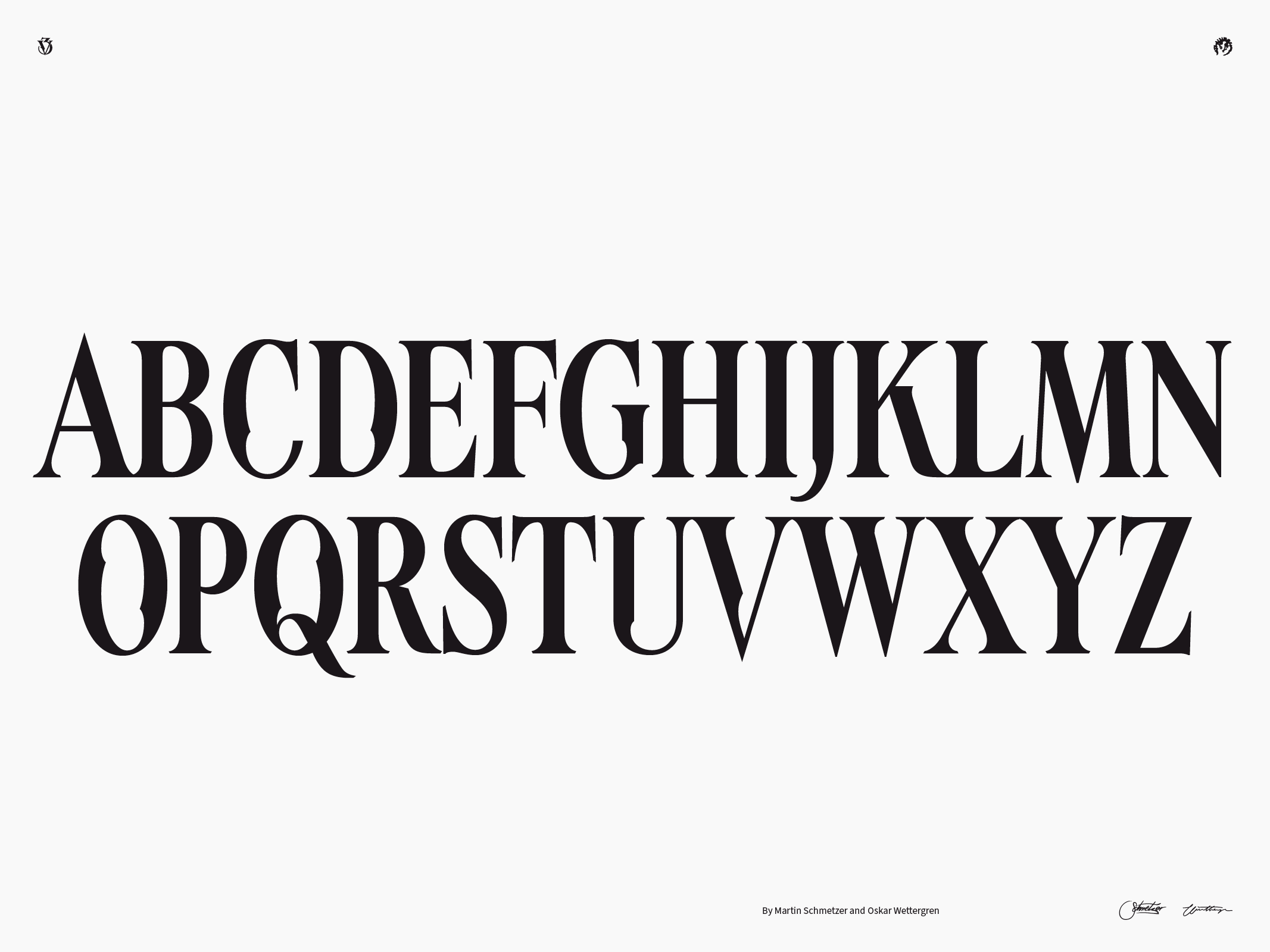
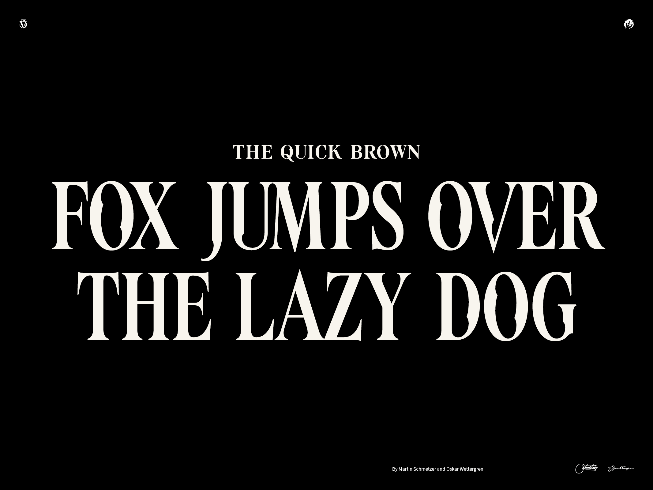
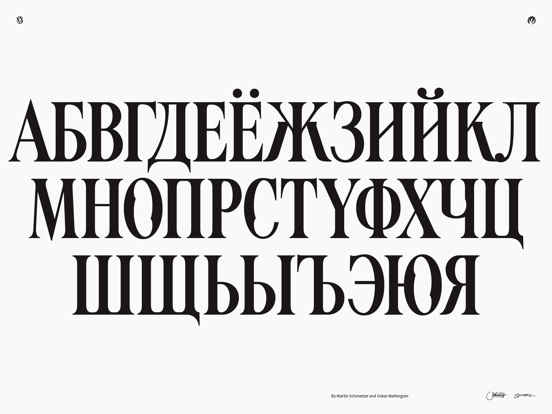
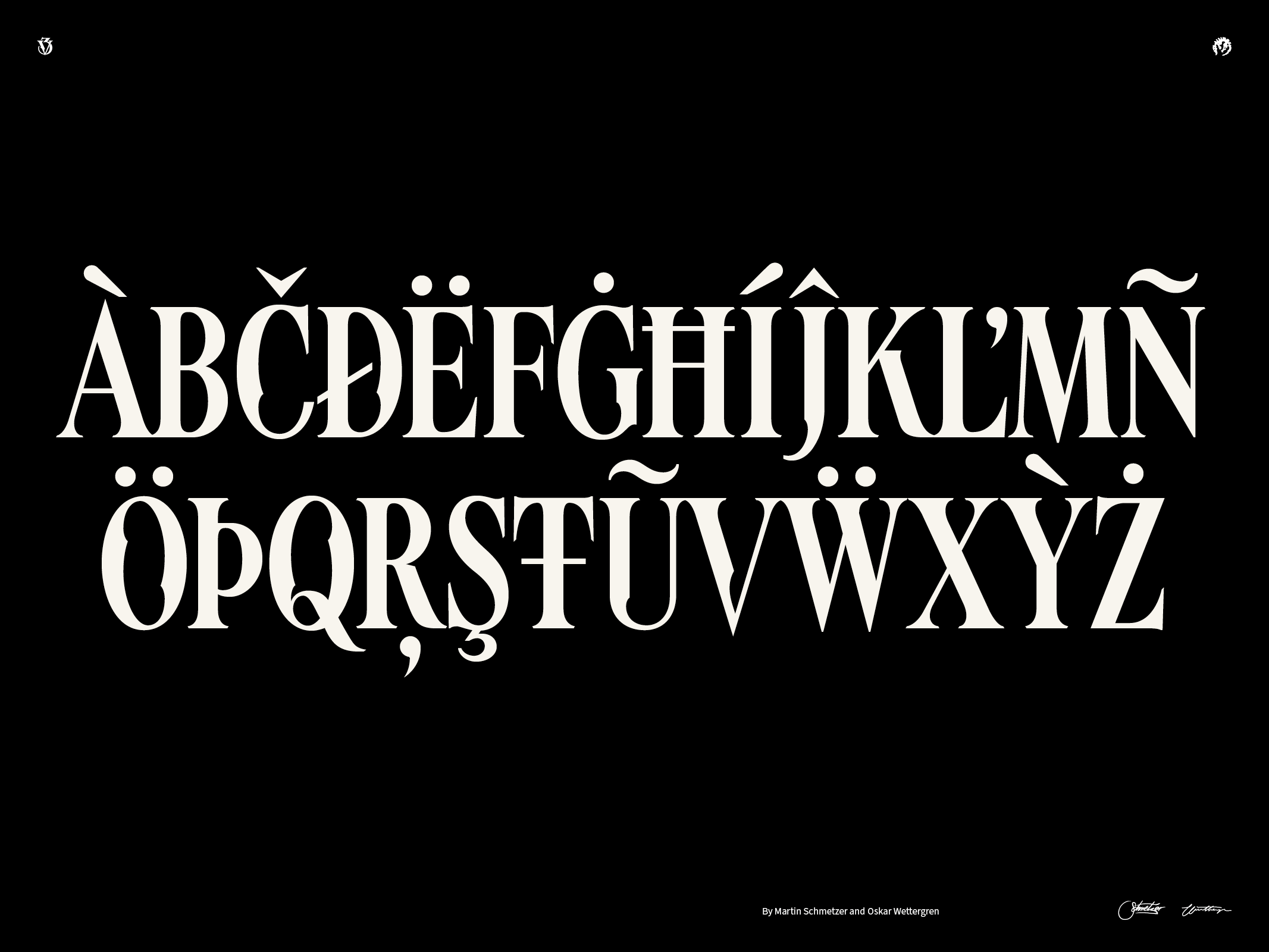
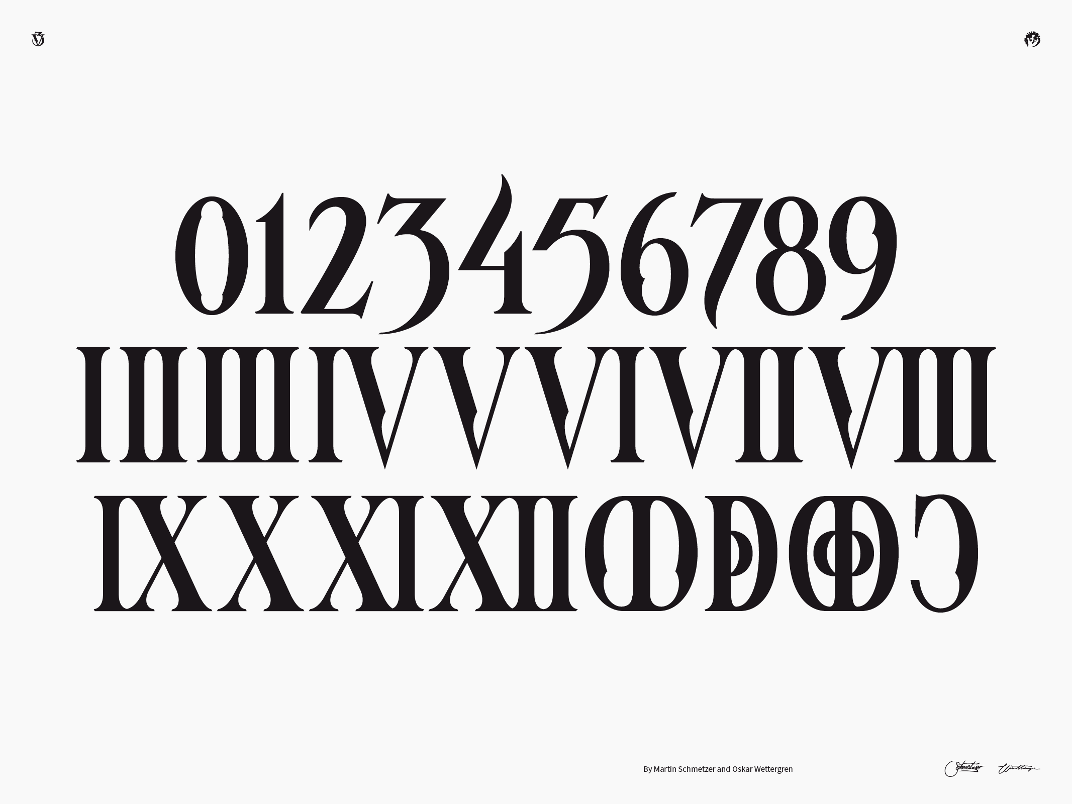
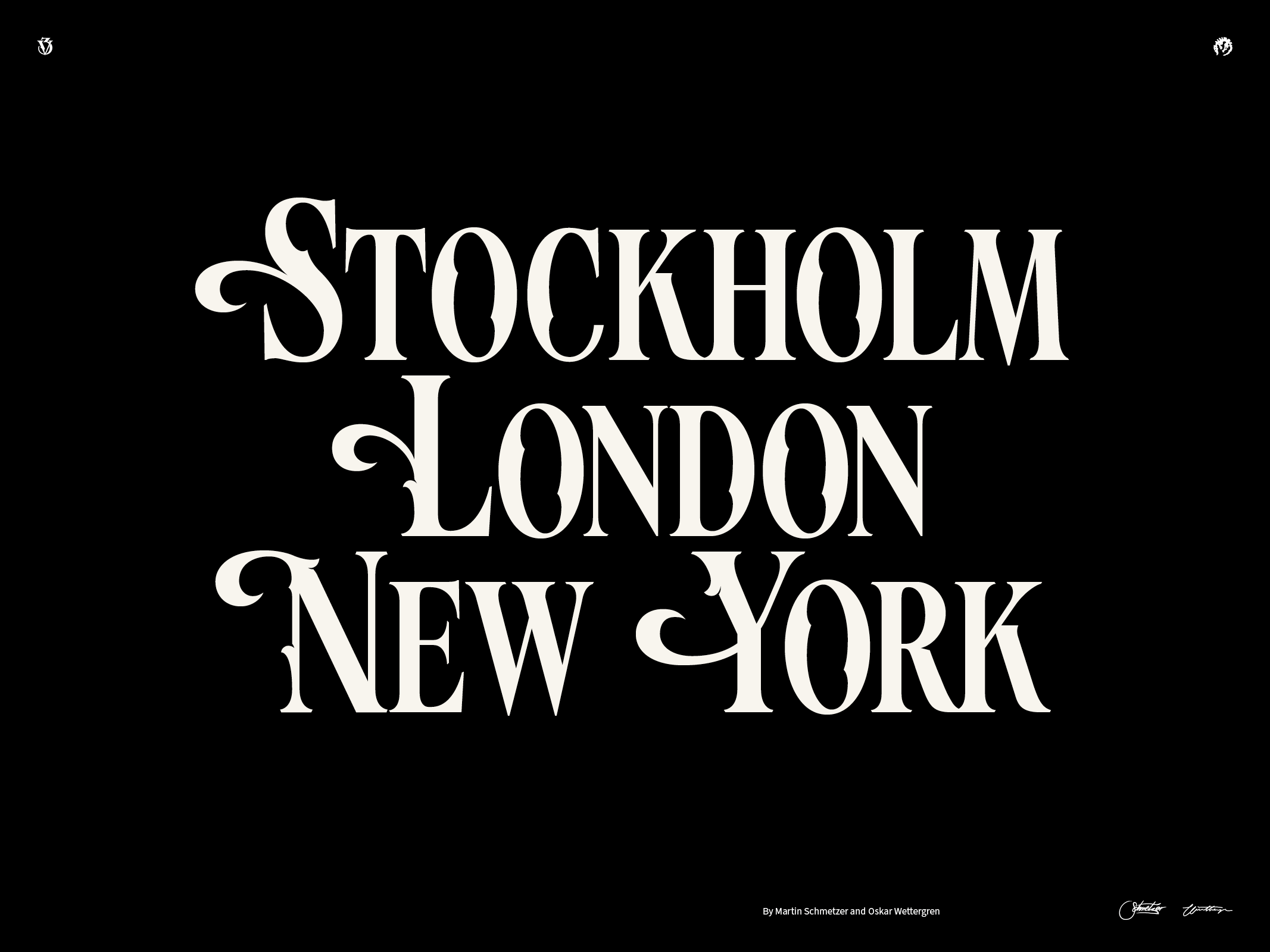
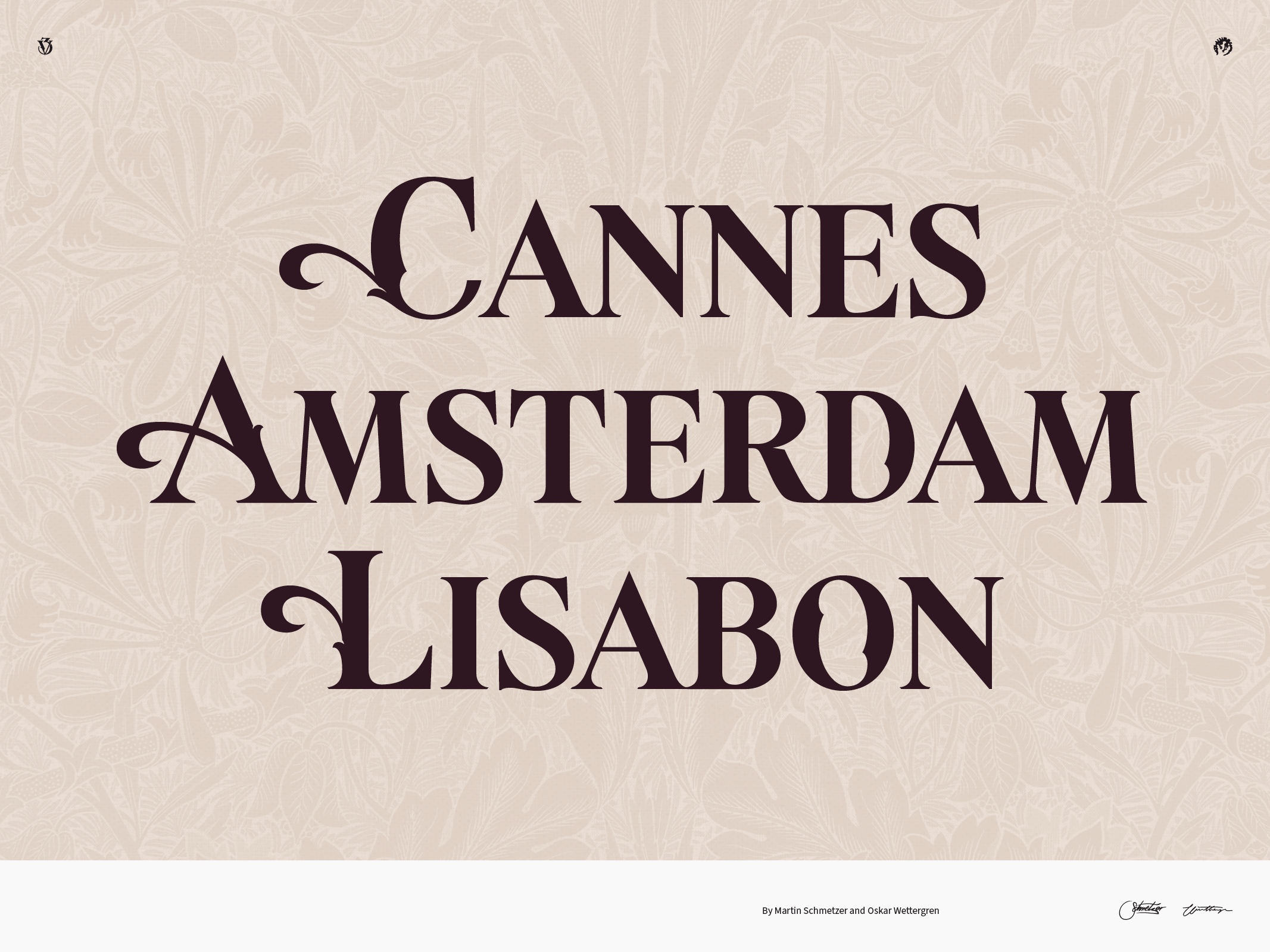
Katarina Serif
Oklart Type Foundry
Type design
Katarina is a sharp and elegant modern display serif with extended Latin characters, accompanied by a vast collection of 339 ligatures. This to infuse each written word with a touch of human artistry, offering a slightly different expression every time you use it.
See full presentation →
Examples of use →


¯
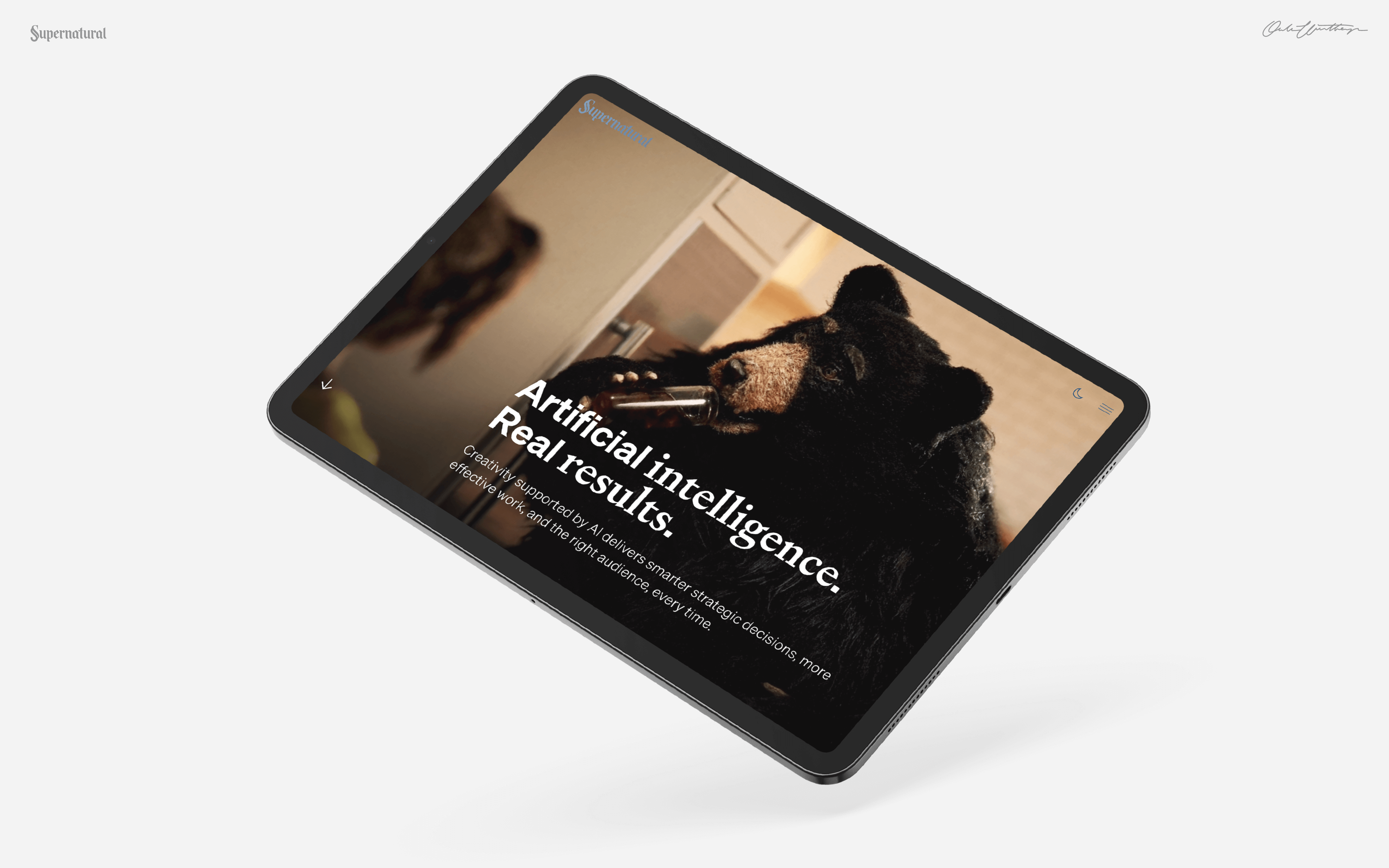
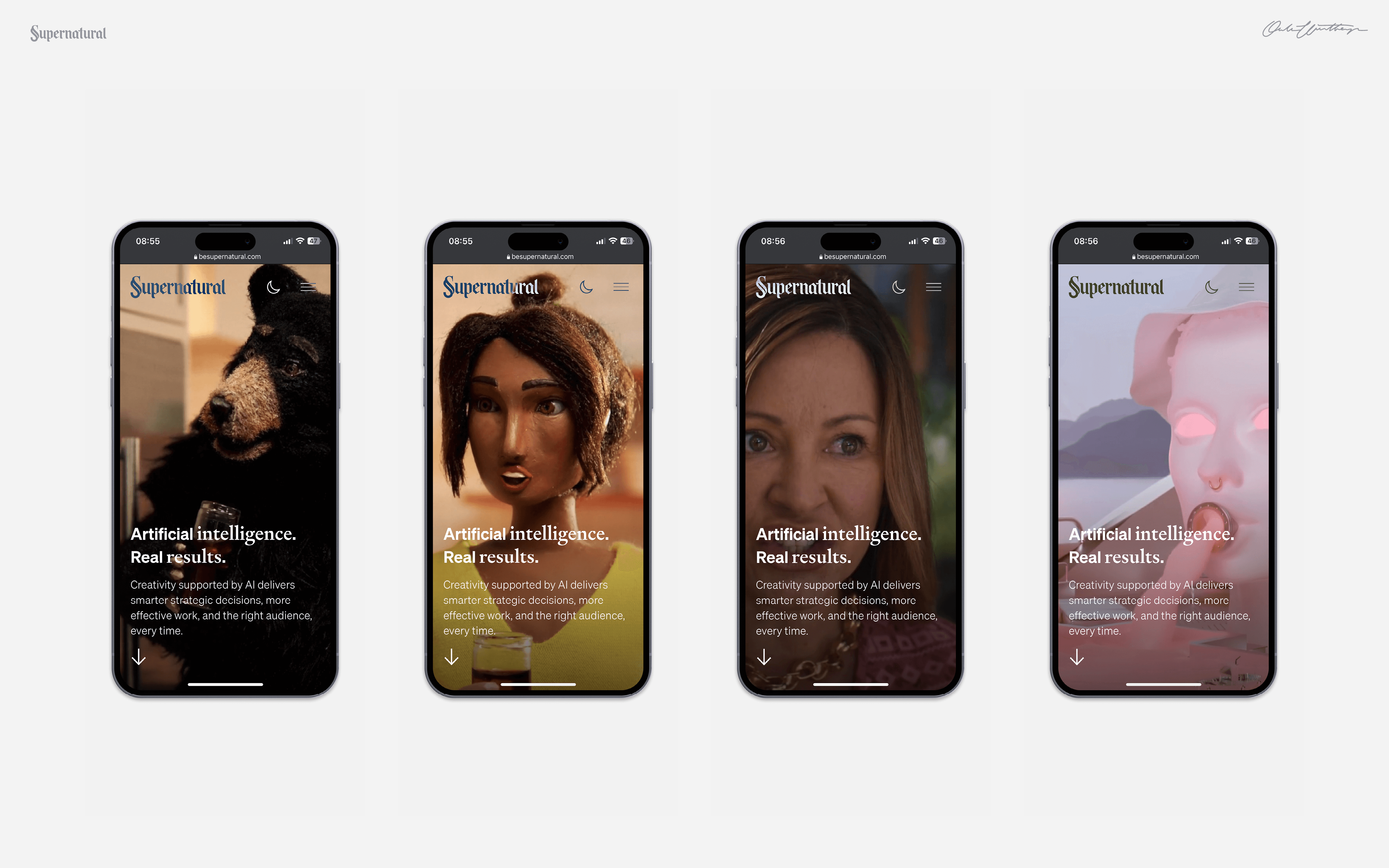
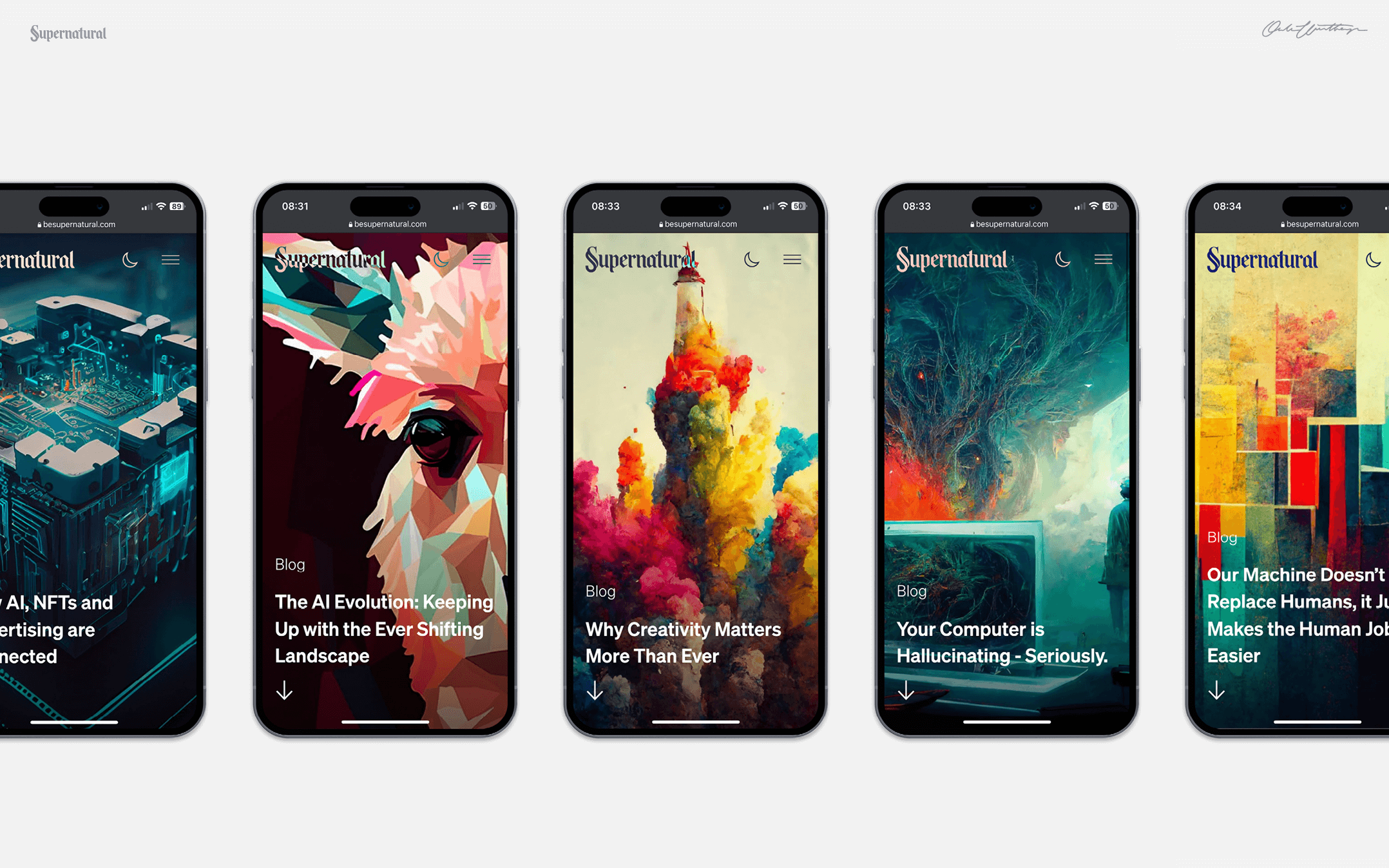
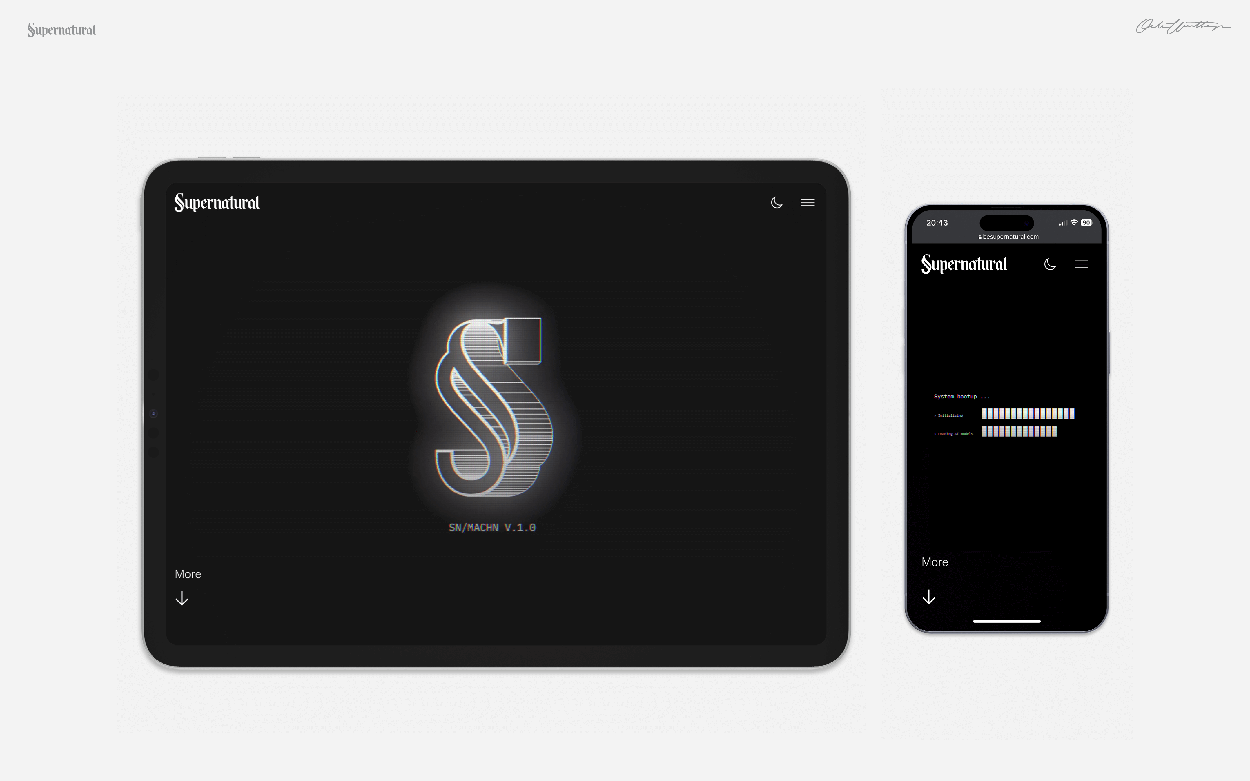
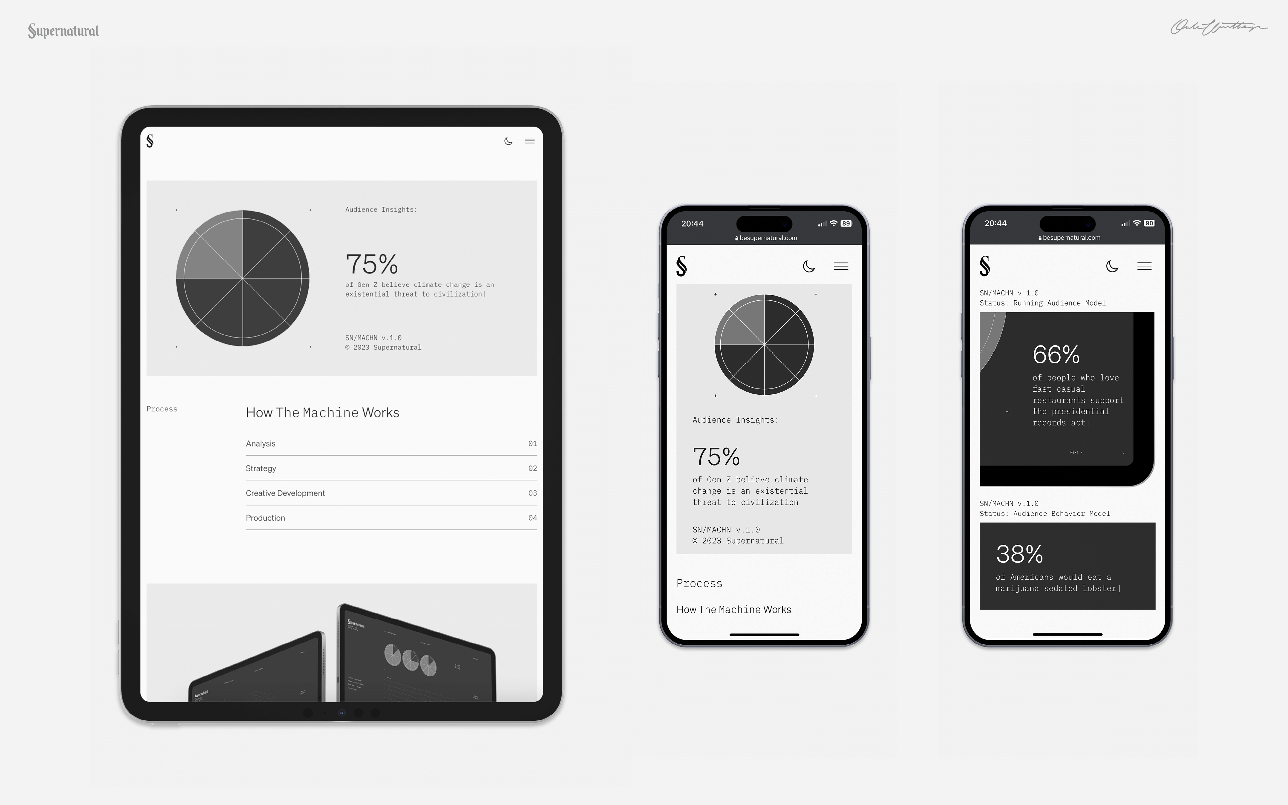
Be Supernatural
Supernatural
Branding / Digital design
Supernatural is an innovative New York advertising agency that utilize the power of AI to assist their creative process. I had the pleasure of working closely with their team to develop their new website. Together, our aim was to establish a unique and compelling visual language and framework that would showcase the agency's exceptional creative talent as well as their state-of-the-art AI technology.
Supernatural won Silver in Adage Small Agency of the year 2023 and has since split into two new ventures.


¯
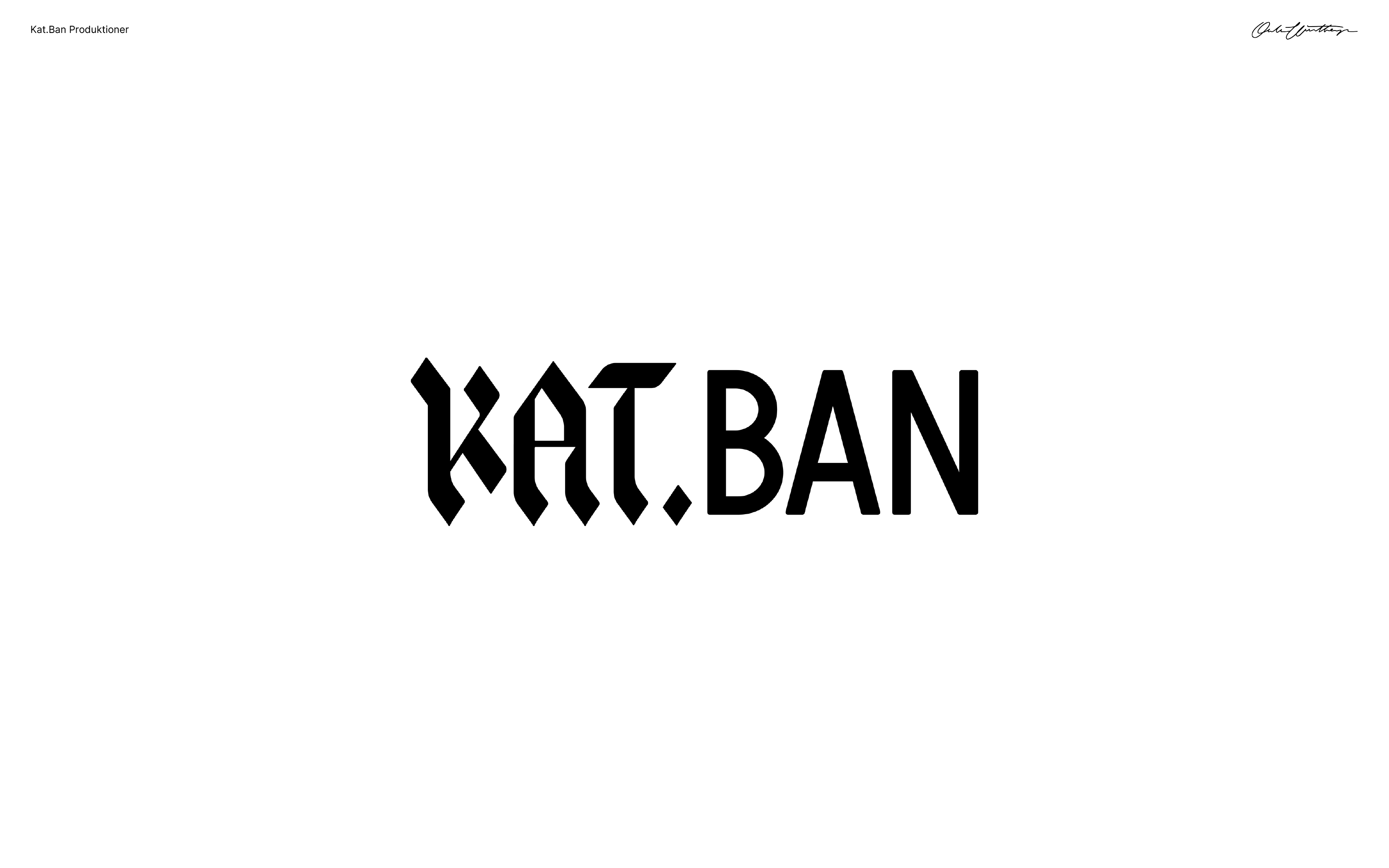
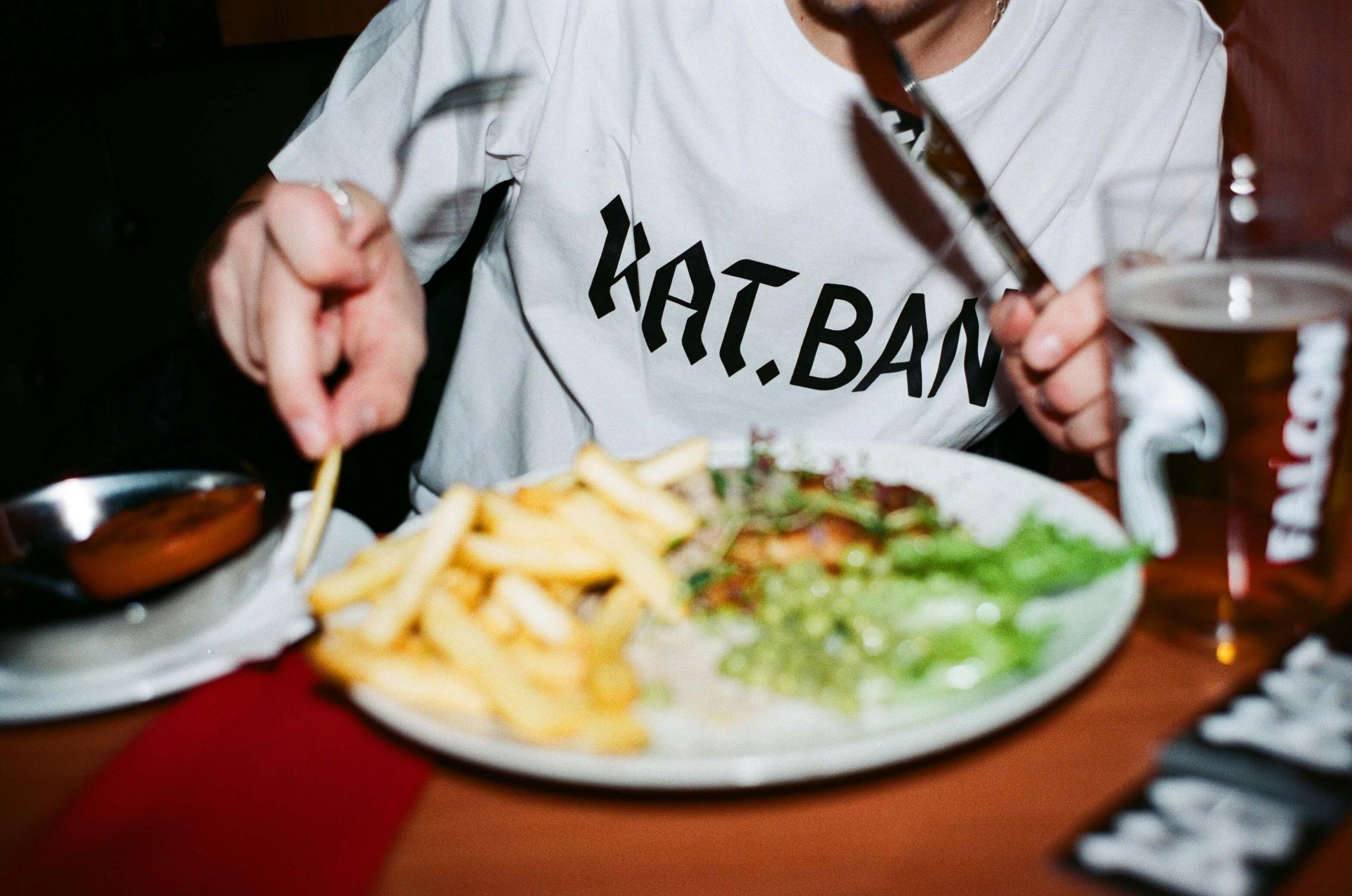
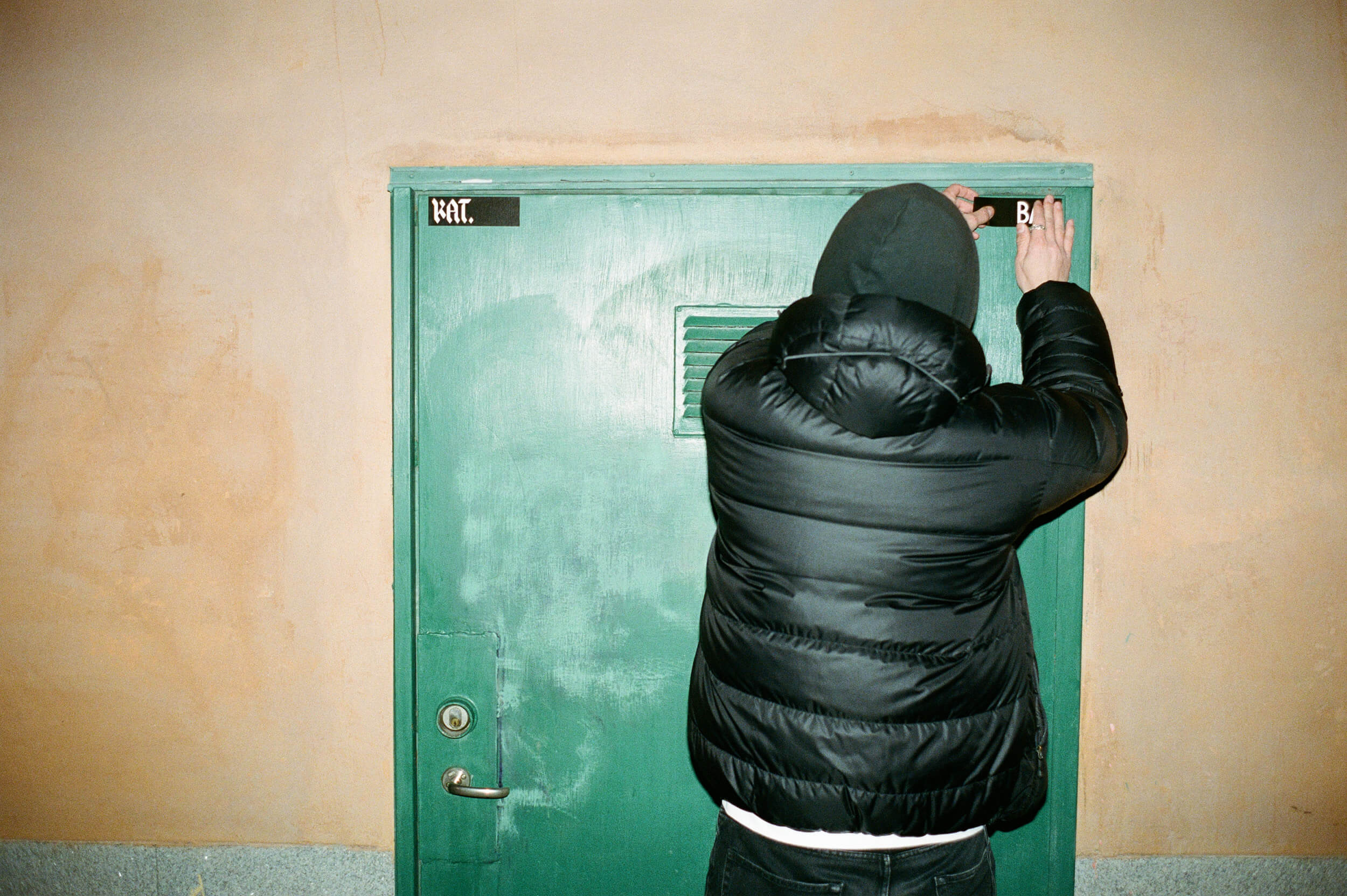
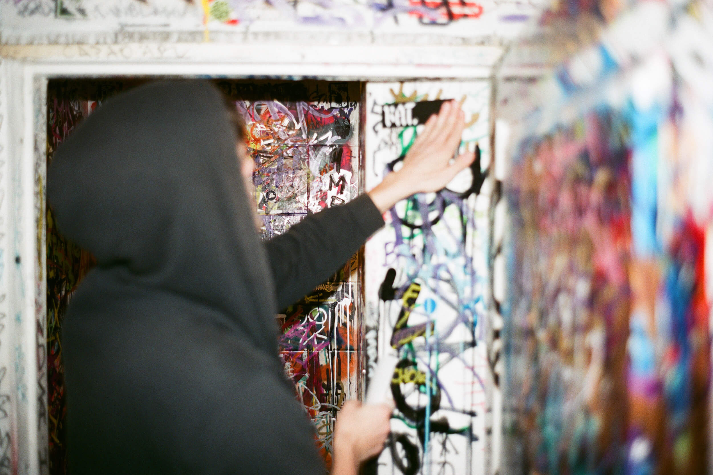
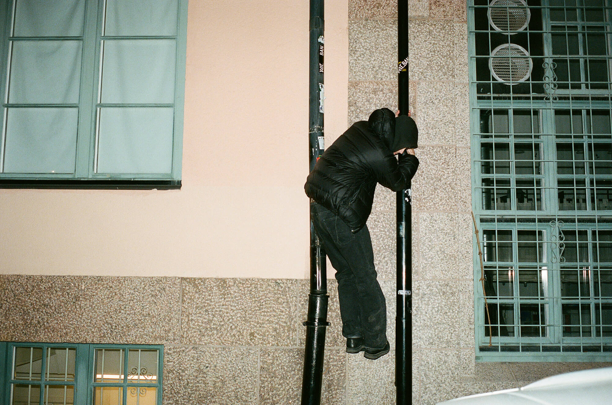
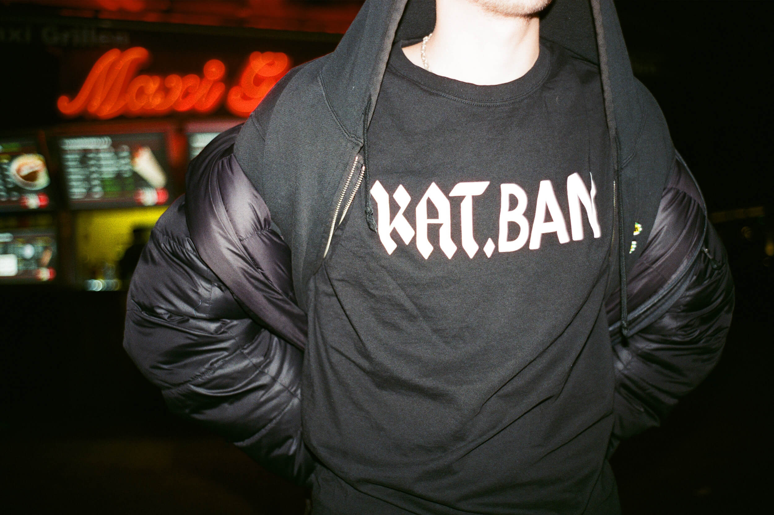
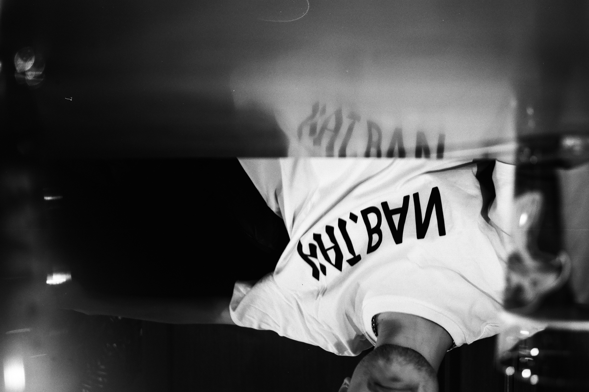
Kat.Ban Identity
Kat.Ban Produktioner
Branding / Digital design
Kat.Ban is a collective of writers, photgraphers and designers working for the archiving and paying tribute to local culture of Södermalm and southern Stockholm. I had the honor of creating their brand identity and site, basing the wordmark on a symbol of the contrastful change of the area - blackletter iron numerals to electrically lit sans serif. All typography is custom made.
Kat.Ban site →


¯
Victoria 3
Paradox Interactive
Type design
Victoria 3, Paradox Interactive's highly anticipated game, achieved remarkable success by selling 500,000 copies in just 30 days, making it one of Paradox's most successful releases ever. Martin Schmetzer and I designed a custom typeface in two weights, each comprising 450 glyphs. Martin crafted the glyphs, and I adapted and made them functional.
Victoria 3 site →


¯
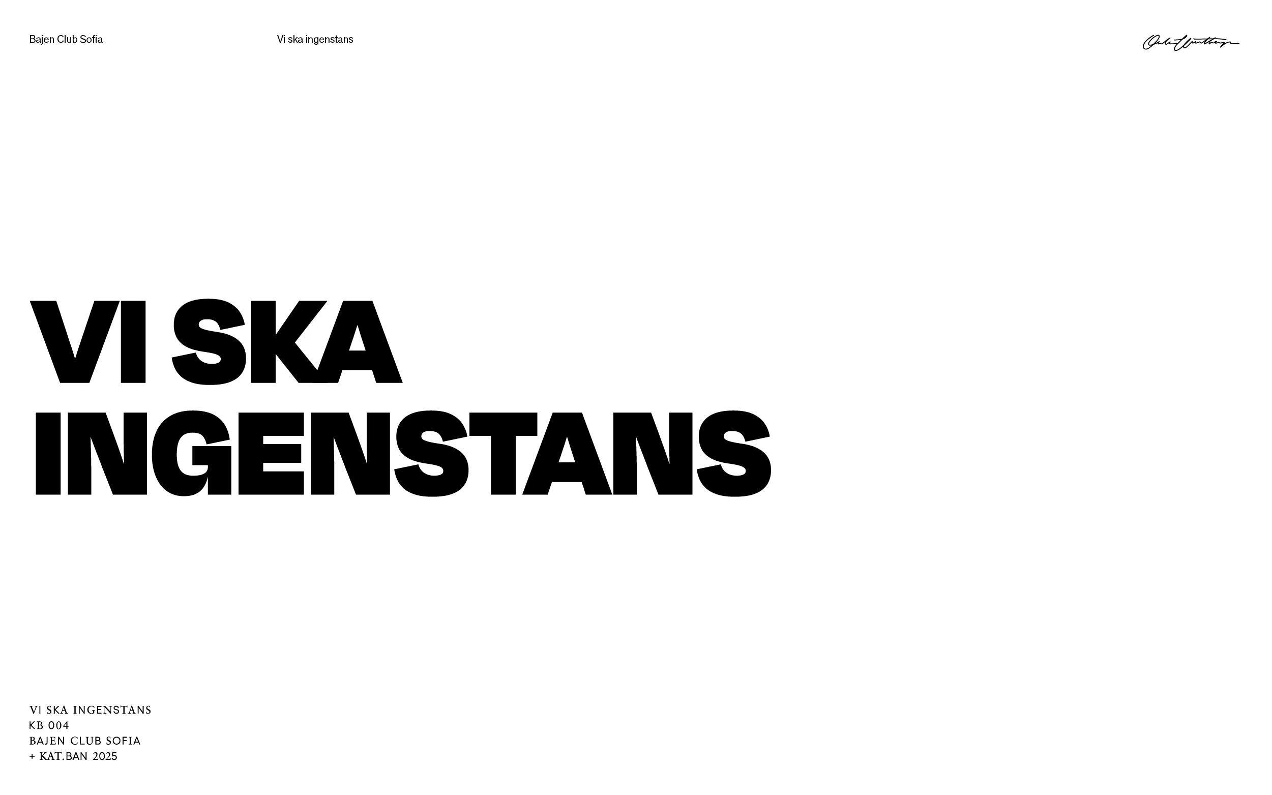
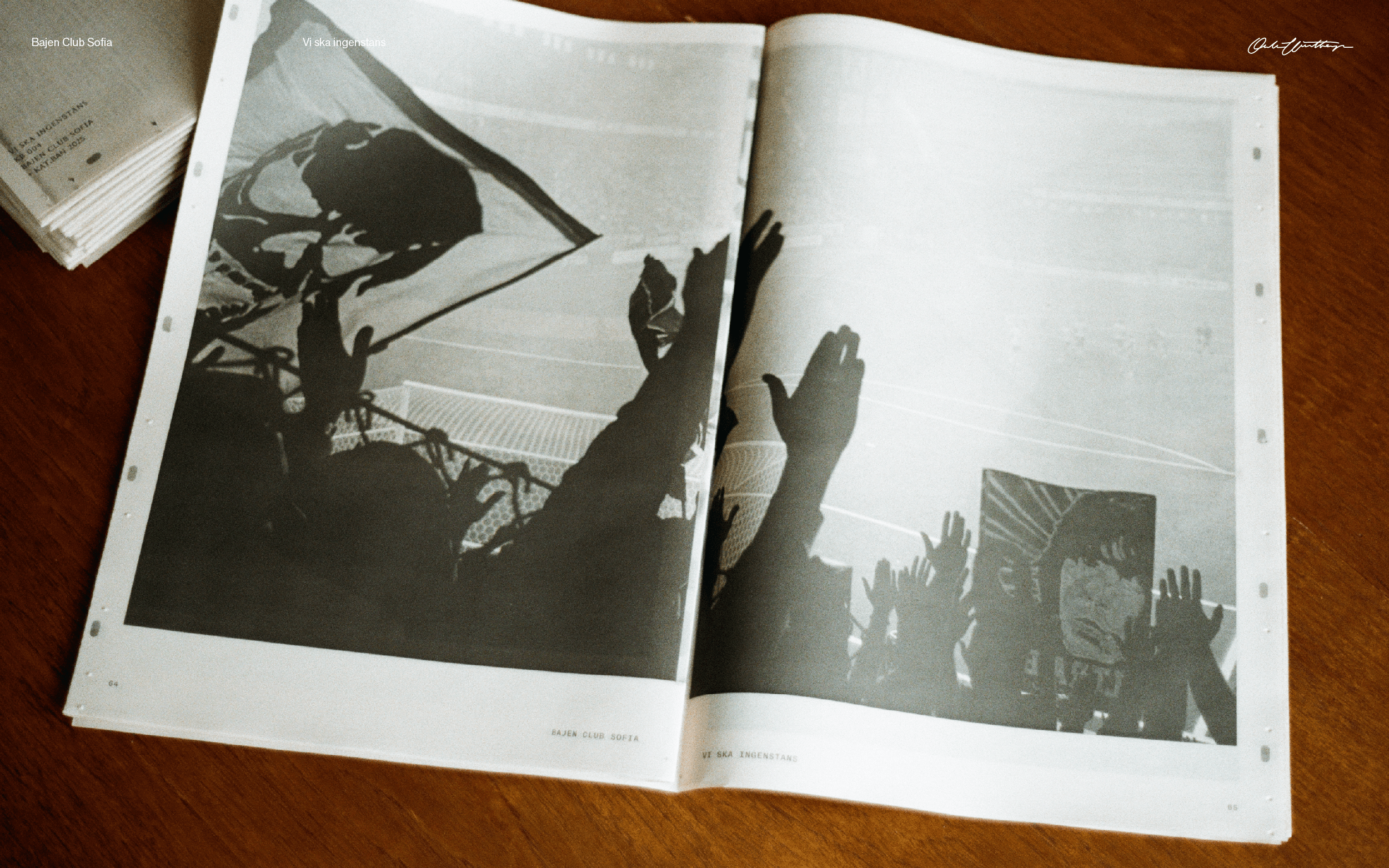
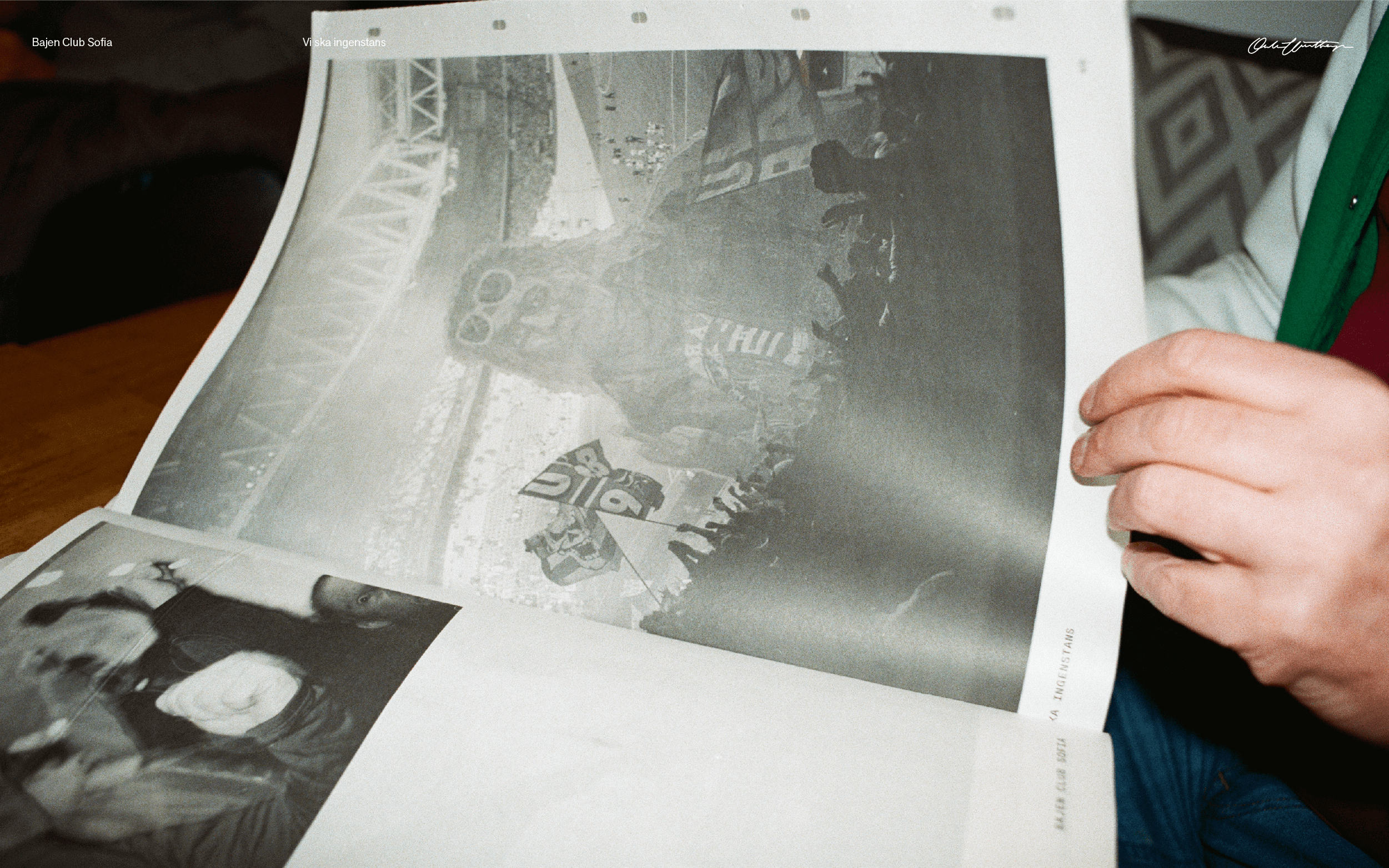
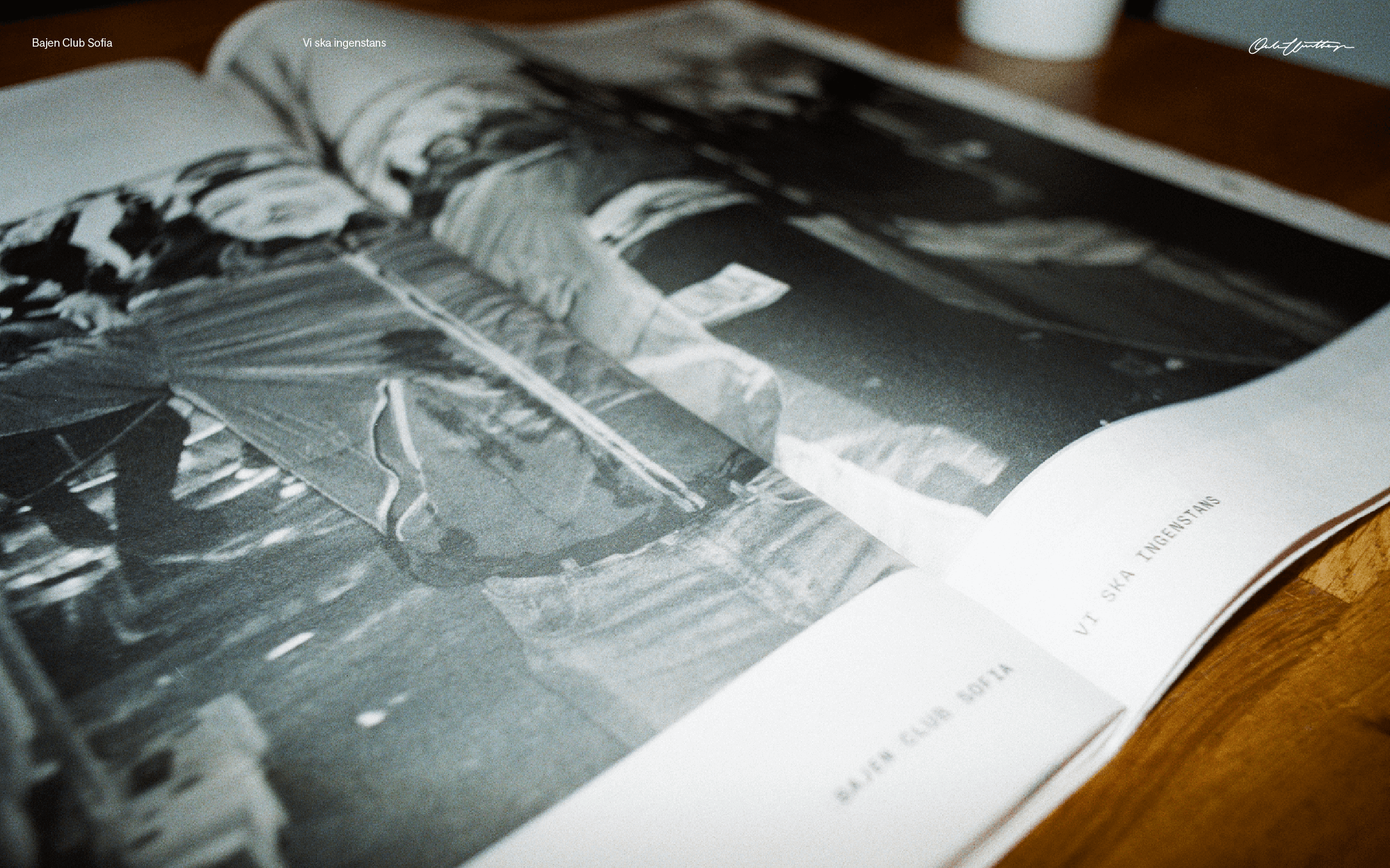
Vi ska ingenstans
Bajen Club Sofia
Editorial / Print
Vi ska ingenstans (We’re not going anywhere) is a fanzine of analogue photographs printed as a traditional tabloid newspaper of 88 pages. It is edited to convey the pure emotion of a year as a fan, living like the visceral memories created during a season. It being a physical product, a tactile experience, was vital. So was its size as well as being affordable. Created in close collaboration with BCS via Kat.Ban.
Vi ska ingenstans was released on Pelikan, is sold by Supportrarnas Matchprogram and on 69:ans Spel & Tobak, all three are Hammarby institutions. All proceeds goes back to the terrace or to new projects.
See more pictures →
Buy it here →
Vi ska ingenstans was released on Pelikan, is sold by Supportrarnas Matchprogram and on 69:ans Spel & Tobak, all three are Hammarby institutions. All proceeds goes back to the terrace or to new projects.
See more pictures →
Buy it here →


¯
CCJ Identity
Christian Carvajal Johansson
Branding
Christian Carvajal Johansson is a Stockholm based photographer. I was tasked with creating the branding for Christian. It needed to marry well with the feeling of modern and analogue style of photography s well as work well in many different sizes and media. I therefore created a monogram accompanied with a clean and legible wordmark, both based on a 3:2 ratio.


¯
Petra Monospace
Oklart Type Foundry
Type design
Petra Mono is a typeface that draws inspiration from vintage science fiction. It comes in 13 distinct widths, including all caps and numbers. The range of widths was developed to ensure Petra Mono's versatility in various settings, whether in cramped spaces or more spacious environments. The narrower weights offer excellent readability and legibility at smaller sizes, while the wider weights provide expressive and impactful typography in larger formats.
Type design


¯
Everything it takes
The Christ Hospital
Branding
To break down barriers between people and the care they need, The Christ Hospital of Cincinnati, Ohio, launched their campaign ‘Everything it takes’. I was tasked with creating a wordmark for the campaign. It was important to instill trust and that it felt like a promise and an act, and not just words. The solution is a bold typeface set with italicized every, to make it read as a promise and an action, while leaving the rest of the line upright. The wordmark is still in wide use and works as a brand promise. I also refined their typographic language, including stationary, internal and external messaging.


¯
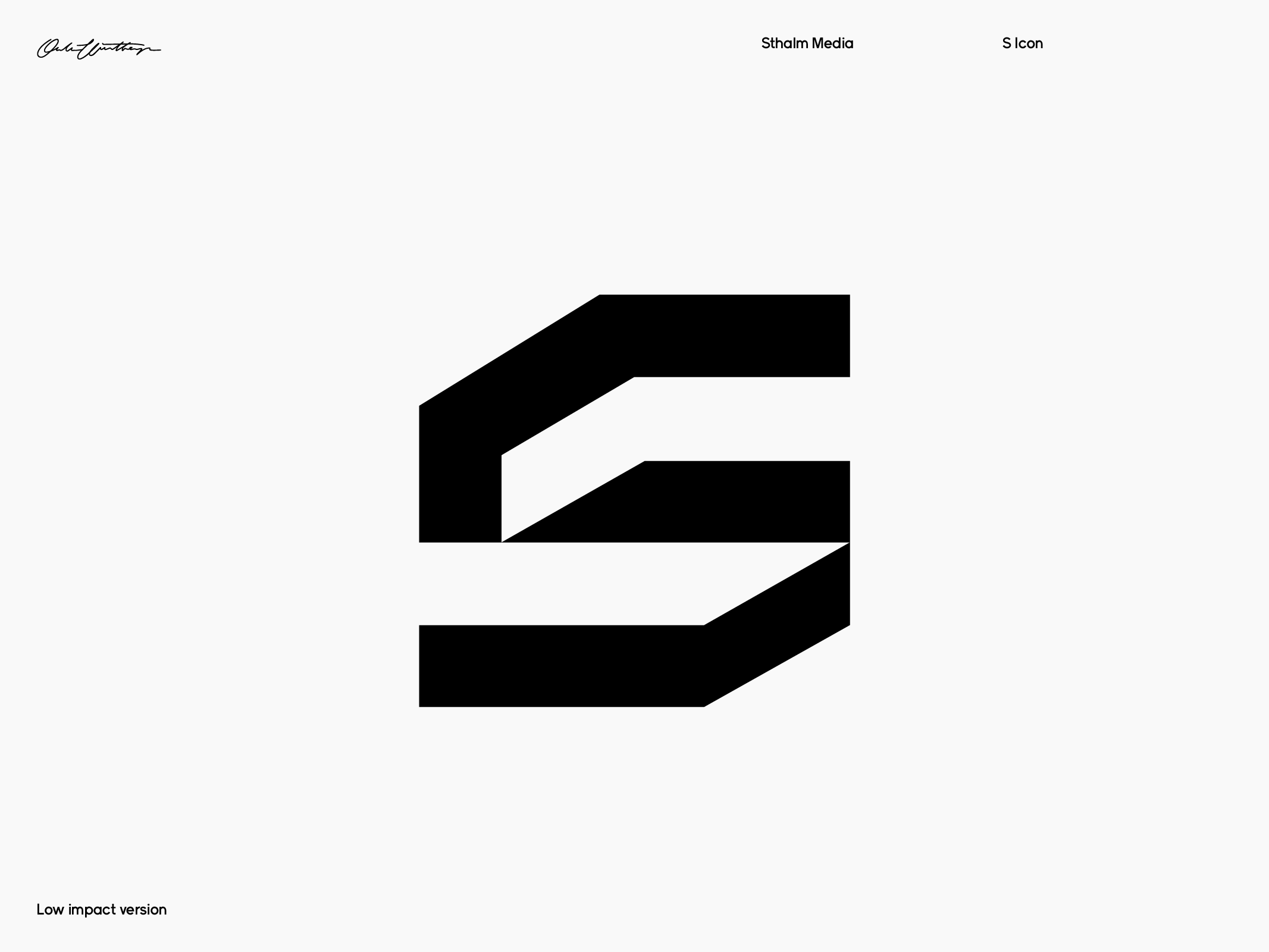
Sthålm Identity
Sthålm Media
Branding / Custom typography
Sthålm Media sought a design that would embody their core values of simplicity, minimalism. With a focus on clean lines and almost brutal lines, we aimed to create a design that appears masculine and has a sense of motion. Our goal was to achieve a design system that is as unobtrusive as possible, allowing Sthålm Media's message to speak for itself.


¯
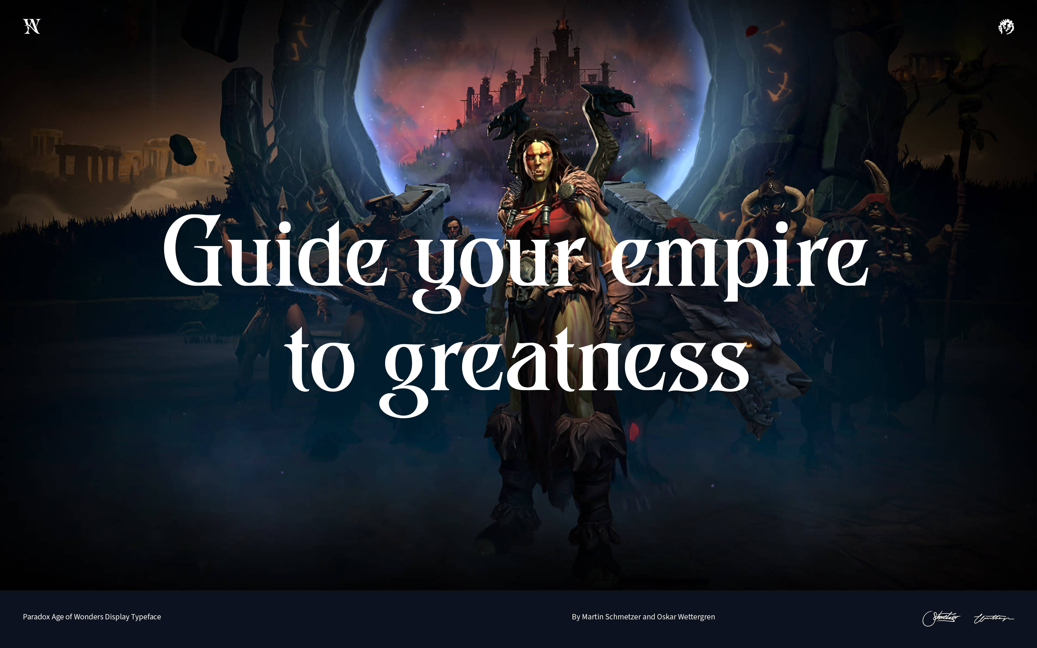
Age of Wonders 4
Paradox Interactive
Type design
Martin Schmetzer and I had the pleasure of creating a custom font with extended Latin characters for Age of Wonders 4, a highly-anticipated title by Paradox Interactive. Martin drew glyphs and I adapted and made functional. the font is specifically tailored to fit the theme and aesthetic of Age of Wonders 4, ensuring that it enhances the overall gaming experience for players.
Age of Wounders 4 site →


¯
Supernatural Identity
Supernatural
Branding
Supernatural is an innovative New York advertising agency that utilize AI to assist their creative process. I was tasked with creating the wordmark and branding for the agency. We wanted to play on the symbiotic relationship between human creativity and artificial intelligence in the wordmark, drawn by Martin Schmetzer. This was also taken to the typograpic expression, letting machine and human speak together. Serif repsresenting human, and sans the machine.
Supernatural won Silver in Adage Small Agency of the year 2023 and has since split into two new ventures.


¯
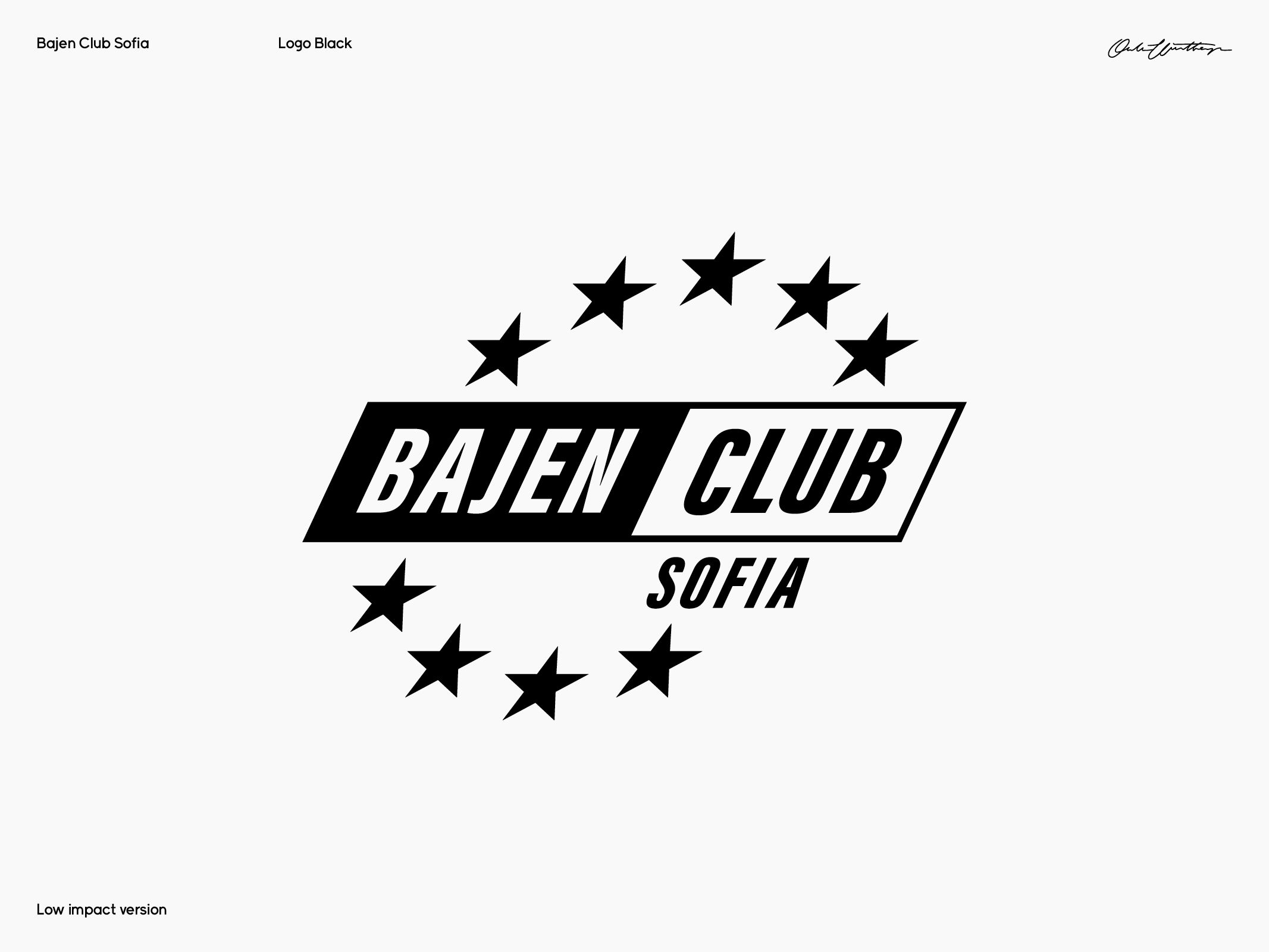
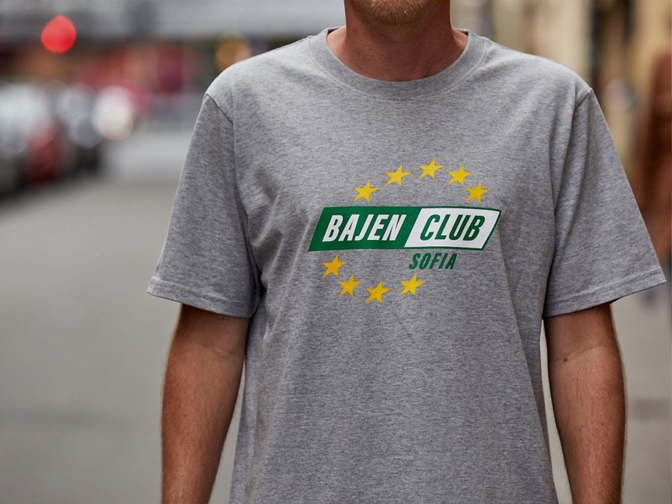
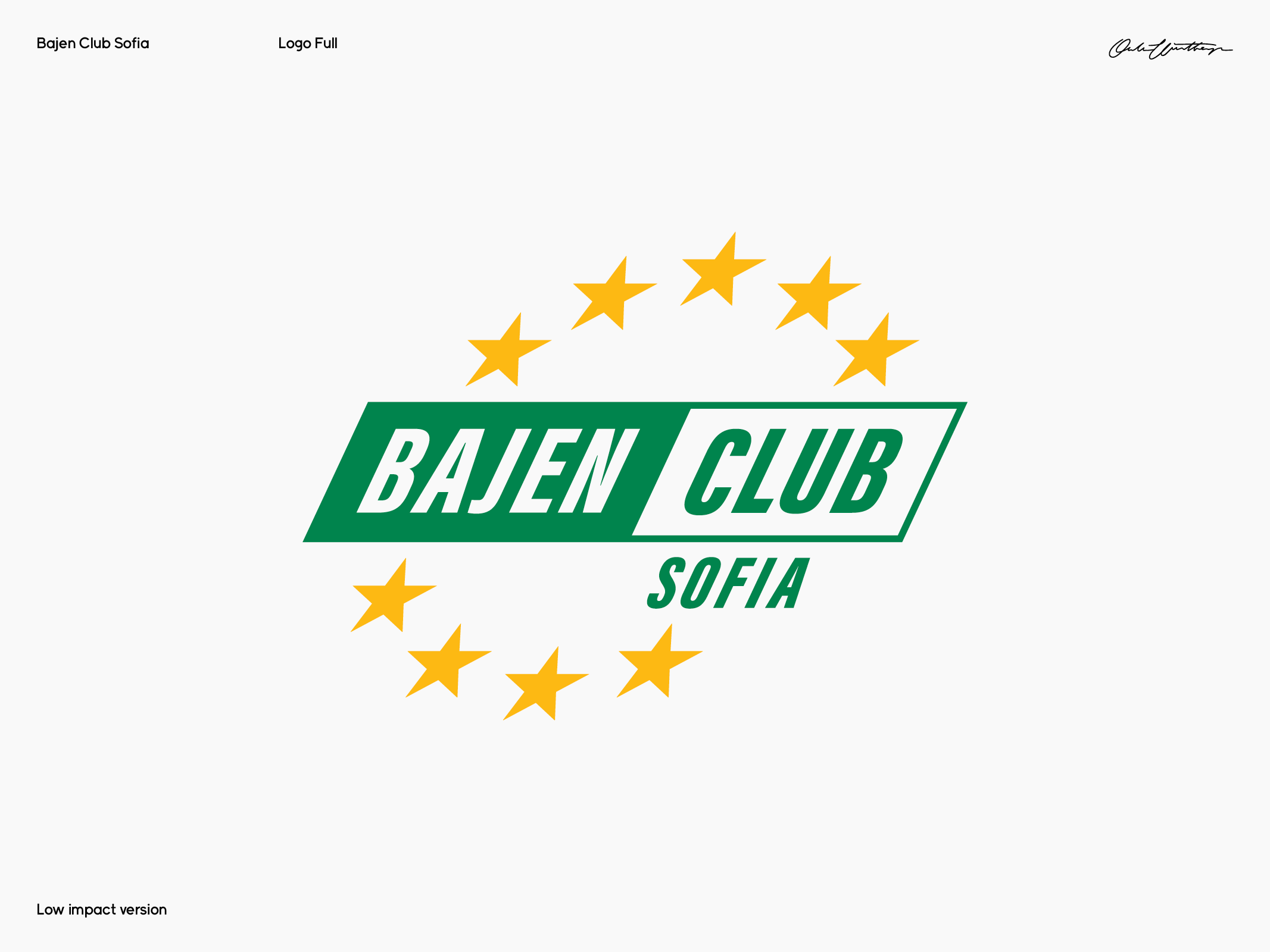
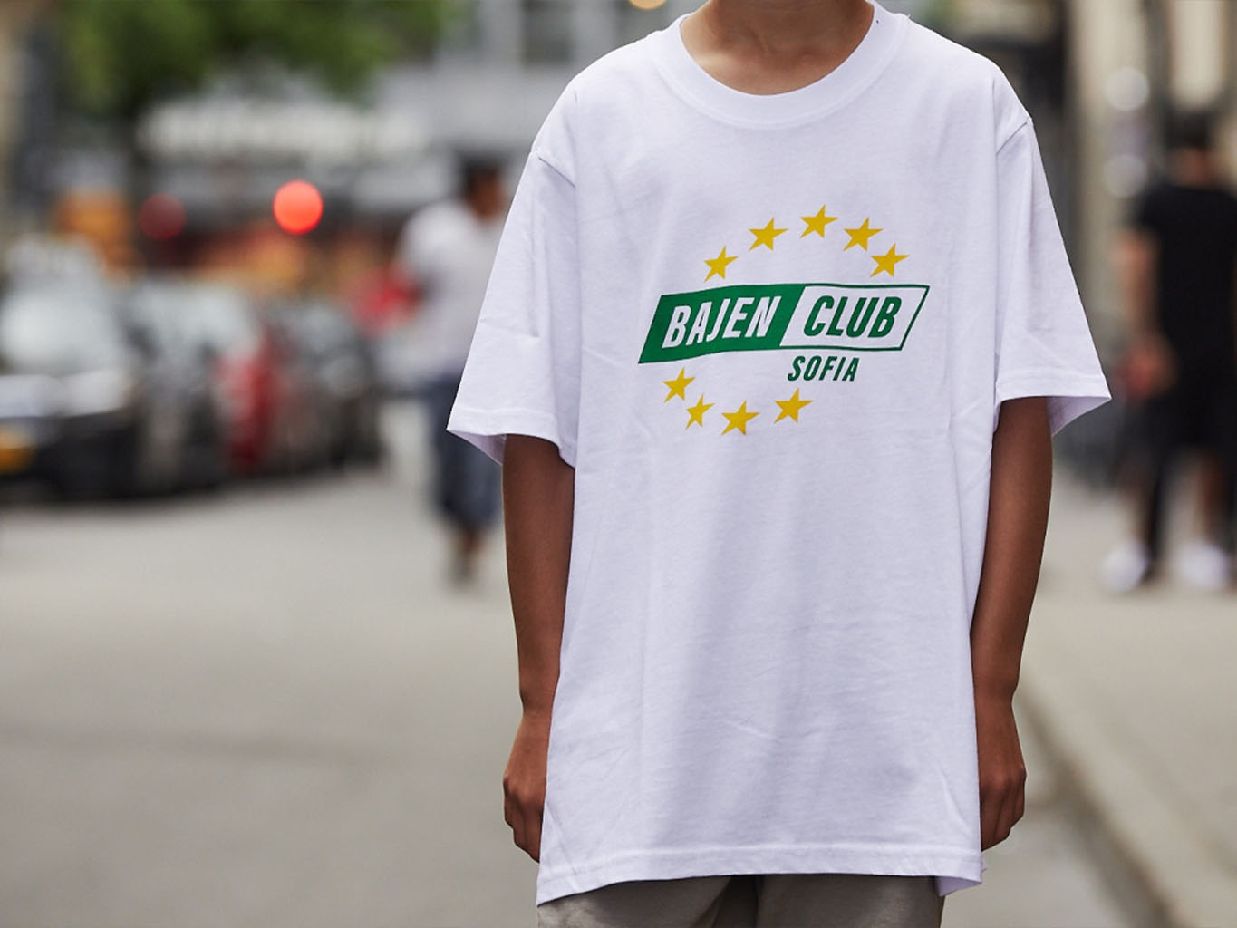
Bajen Club Sofia
BCS
Branding / Custom typography
Bajen Club Sofia is a dynamic community of football fans from Southern Stockholm. The group's mission is two-fold: to mobilize support for various sections of the club when necessary, and to pay tribute to the club's rich history and traditions. I was tasked with creating their logo as well as have since continually designed various projects together with them.
BCS Instagram →
BCS Website →
BCS Instagram →
BCS Website →


¯
Quermy Display
Oklart Type Foundry
Type design
Quermy Display is a one-of-a-kind experimental display font that prioritizes expression over legibility. This limited edition typeface was designed to feel otherworldly and unfamiliar upon first glance, but upon closer inspection reveals itself to be surprisingly easy to read. While it may challenge the viewer's expectations of what a typeface should be, Quermy Display rewards those who take the time to engage with it.
Buy here →


¯
Nextage Identity Redesign
Nextage Group
Redesign / Digital design
I was tasked with rebranding Nextage, a company dedicated to digitally modernizing their clients' workflows. My goal was to retain the essence of their old branding for client recognition while evolving and modernizing their design to reflect progress. Nextage offers three core solutions to digital modernization, symbolized by three forward-pointing arrows. In addition to refining their brand, I also collaborated with Niklas Rosén to design a framework for their digital presence.
See full case →
See full case →


¯
Hoboken
Oklart Type Foundry
Type design
Type design
Hoboken is a display font that embodies the boldness of graffiti. It features thick and blocky letters that demand attention, making it perfect for large-scale usage. Hoboken is offered in a single weight that is chunky and impactful, featuring all uppercase letters, numbers, and some punctuation.
Free Download →


¯
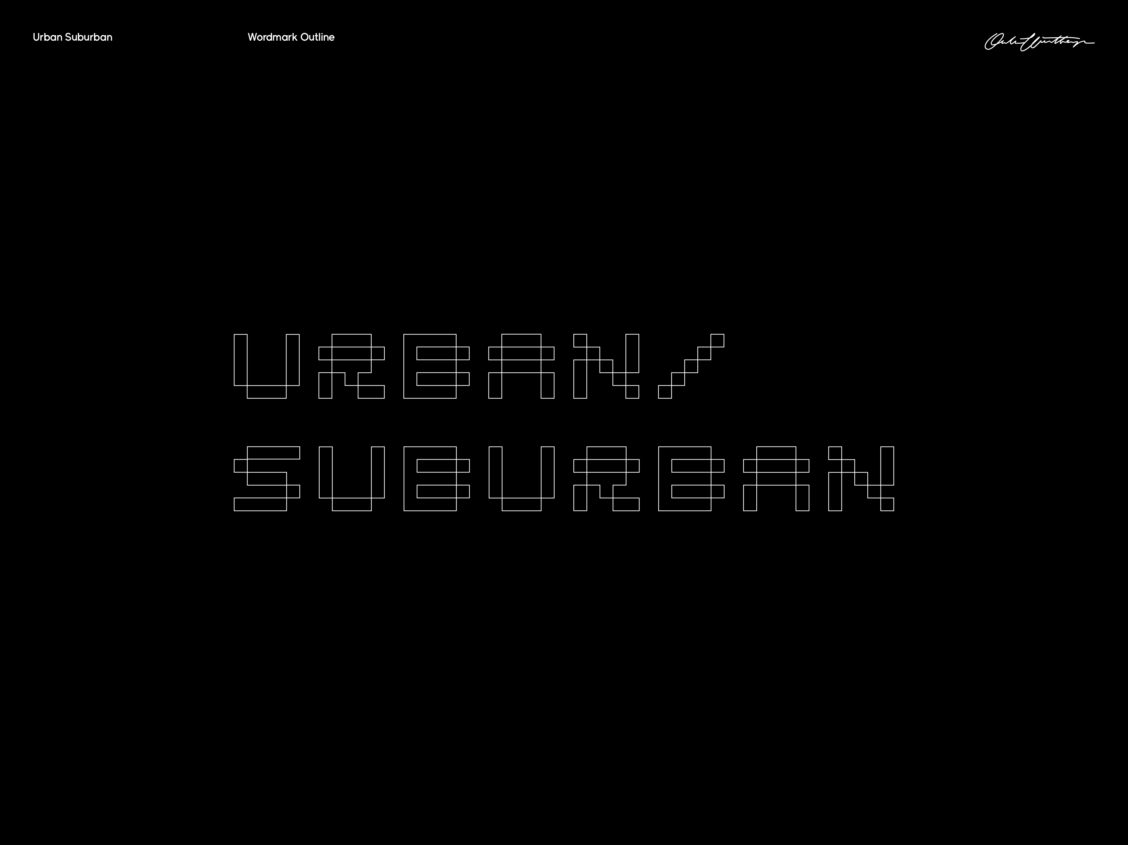
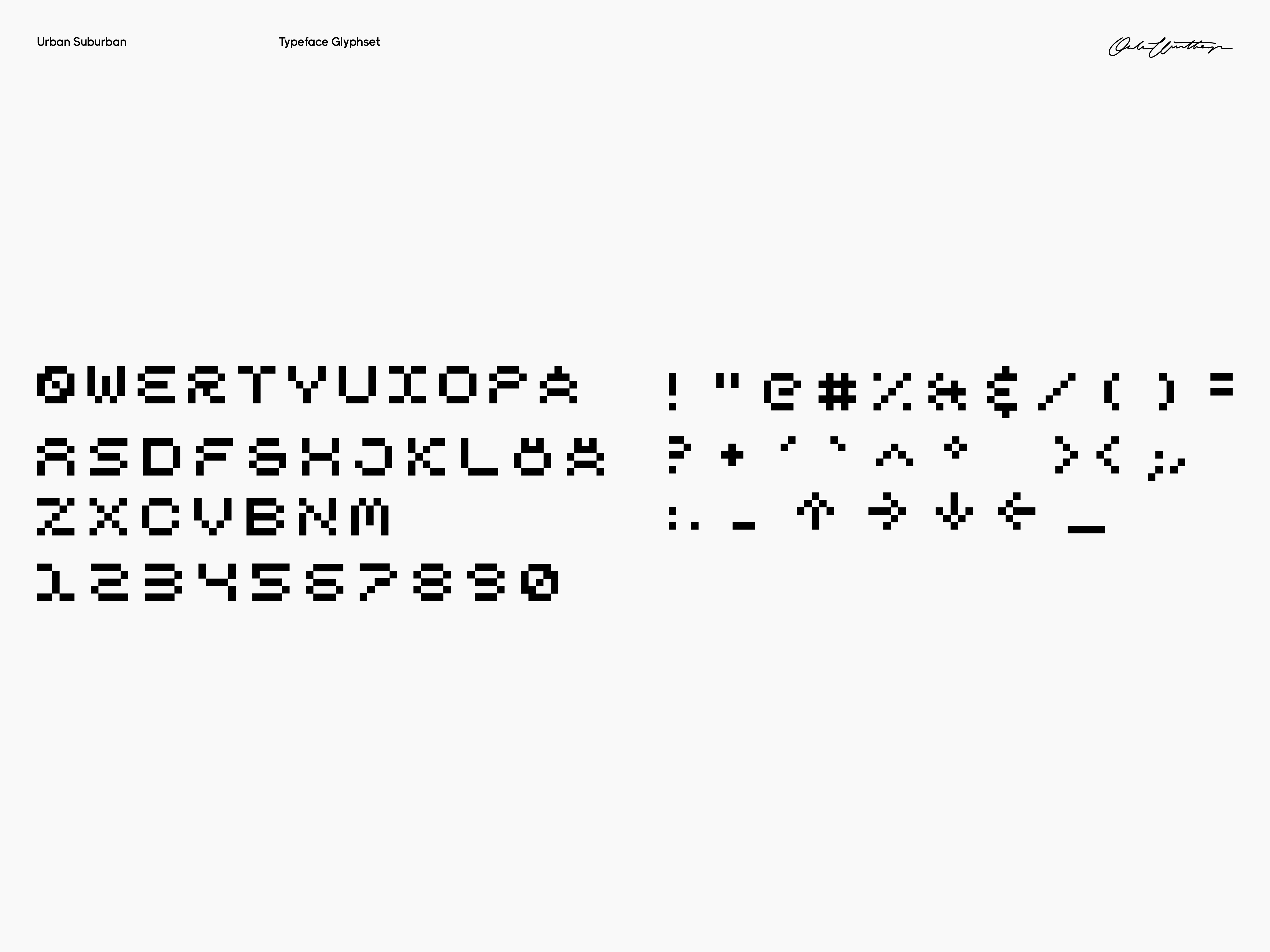
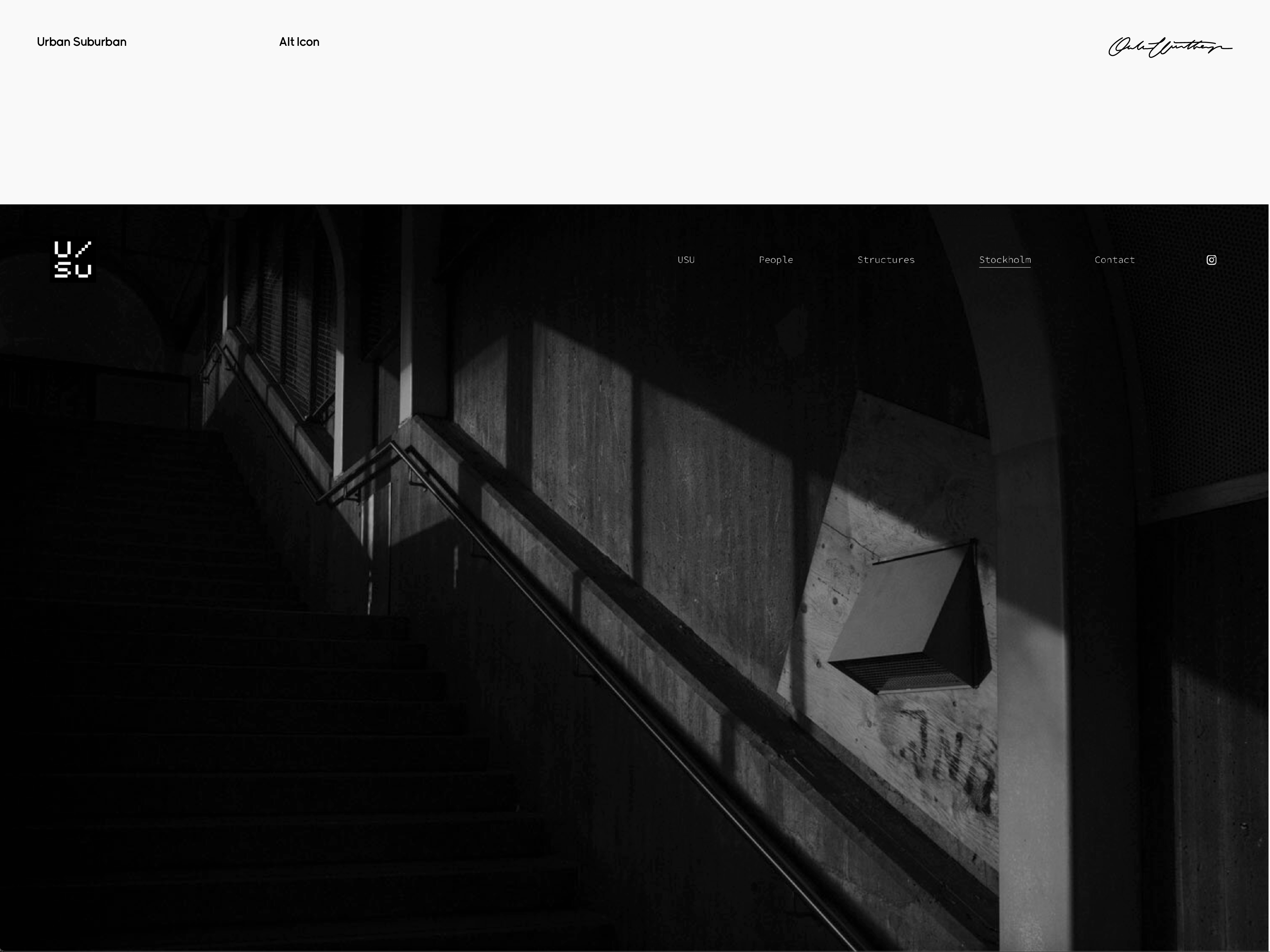
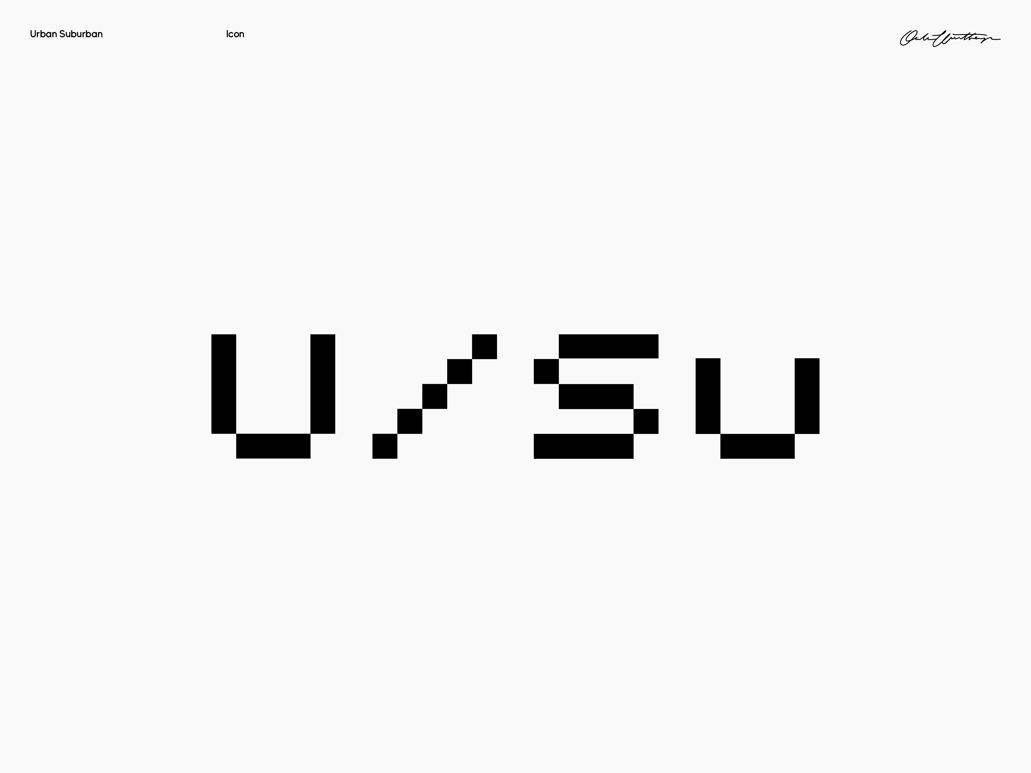
U/Su Identity
Urban/Suburban
Branding / Type design
Branding / Type design
Urban/Suburban is a project brought to life by Stockholm-based photographer Christian Carvajal Johansson. In creating its brand the goal was to create a minimalistic look, built by squares, inspired by the functionalism of Stockholm's urban design. To further streamline the project's visual identity, a custom font was created, unifying the elements and keeping clutter to a minimum.


¯
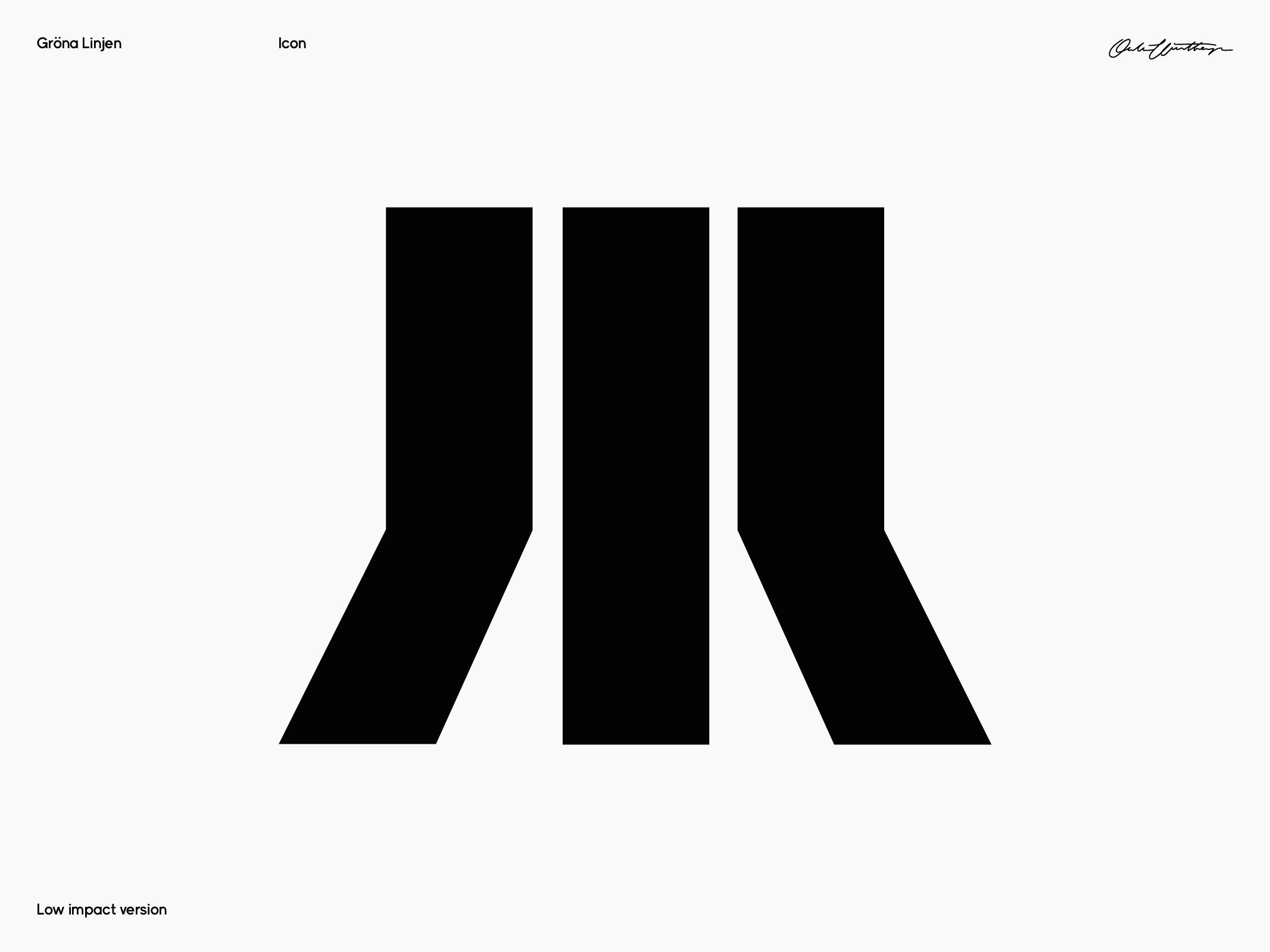
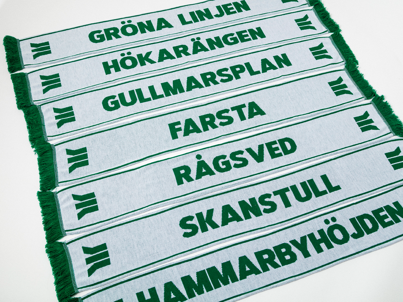
Gröna Linjen Identity
Mammut Kultur
Branding
Gröna Linjen (The Green Line) is a documentary film that aims to capture the essence of the diverse community of individuals surrounding the Swedish football club, Hammarby. The project's icon is inspired by the three green subway lines that split just south of the city, leading into the heartland of Hammarby culture, as well as the three stripes on the Hammarby flag. The icon is paired with a classic Hammarby typeface, further emphasizing the project's connection to the club and its history.
Visit Gröna Linjen→


¯
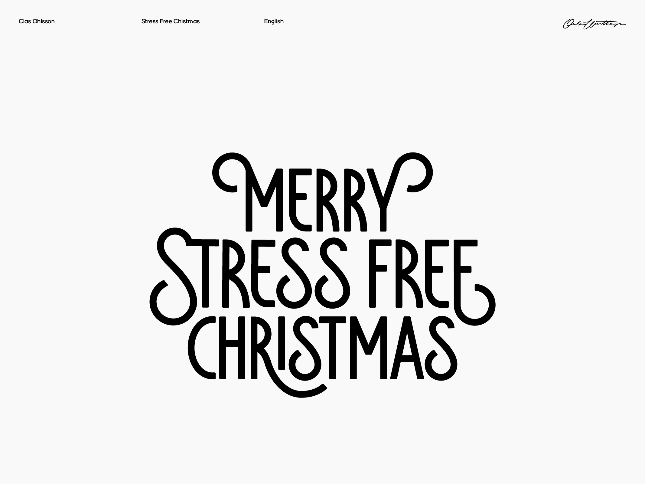
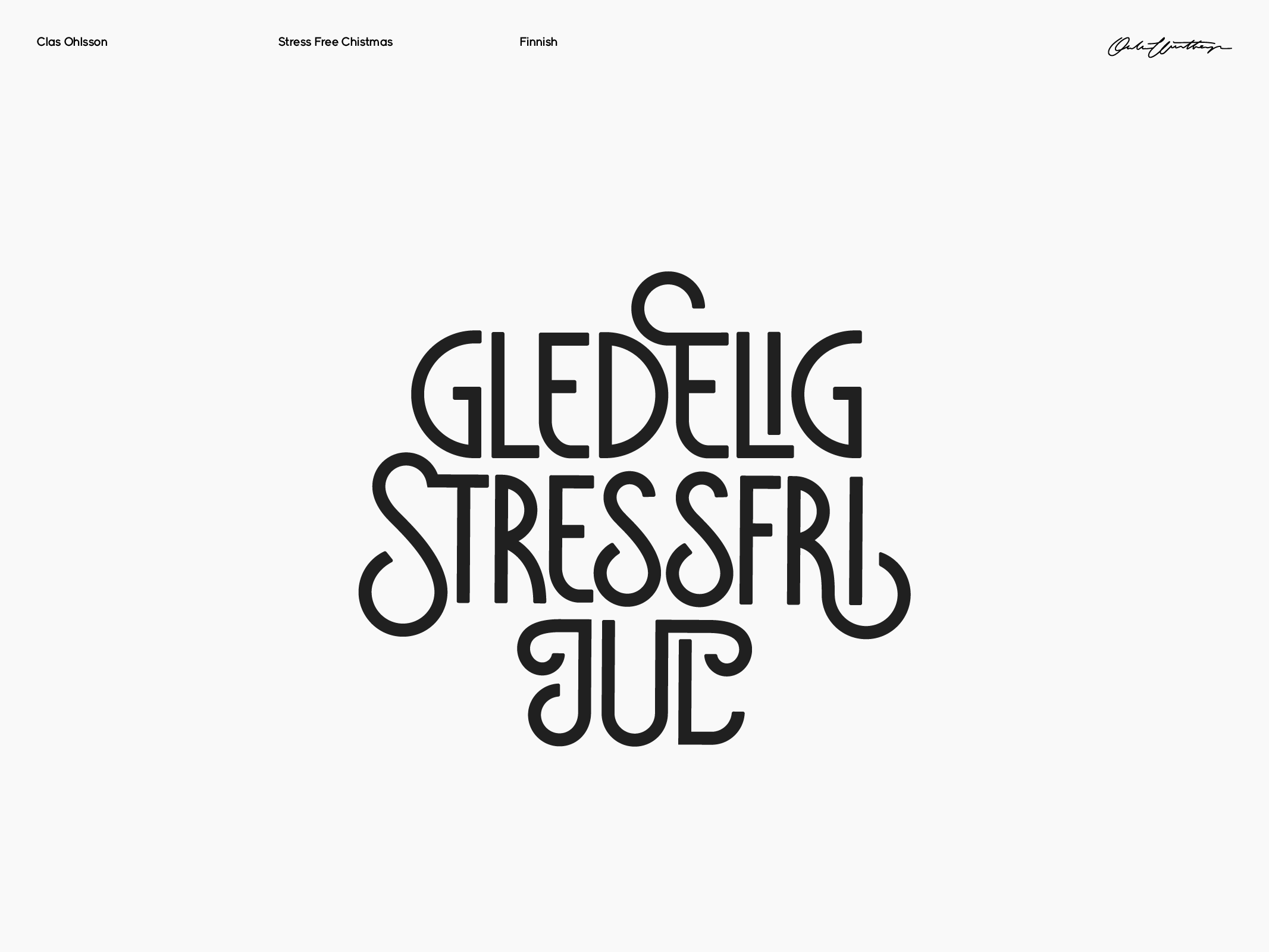
Stress free Christmas
Clas Ohlsson / King Solutions
Custom typography
For the Clas Ohlsson Christmas campaign, I was tasked with typesetting the title "Merry Stress Free Christmas" in five different languages. The typography was utilized across various mediums, including advertisements, in-store displays, and on their YouTube channel.


¯
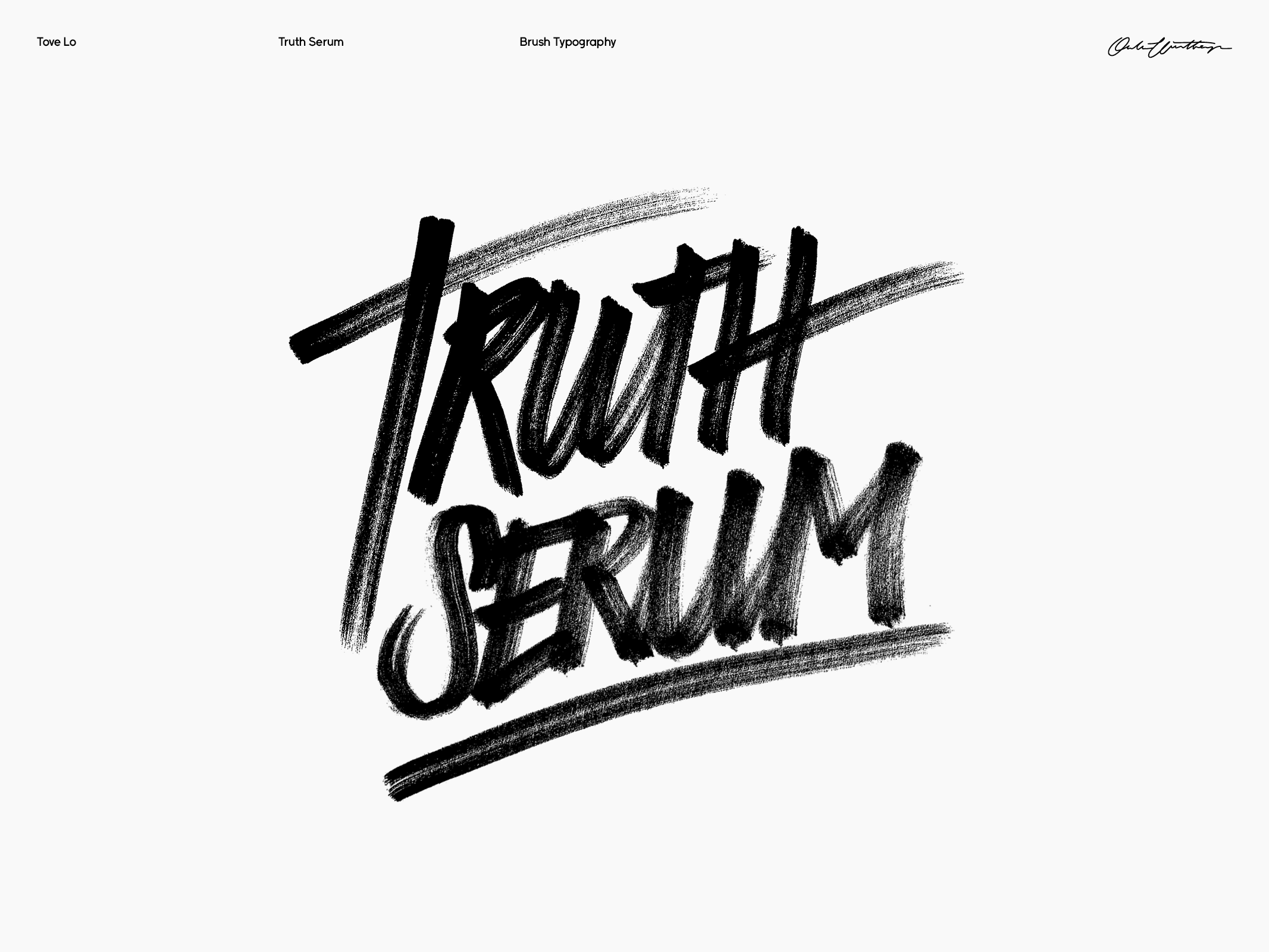
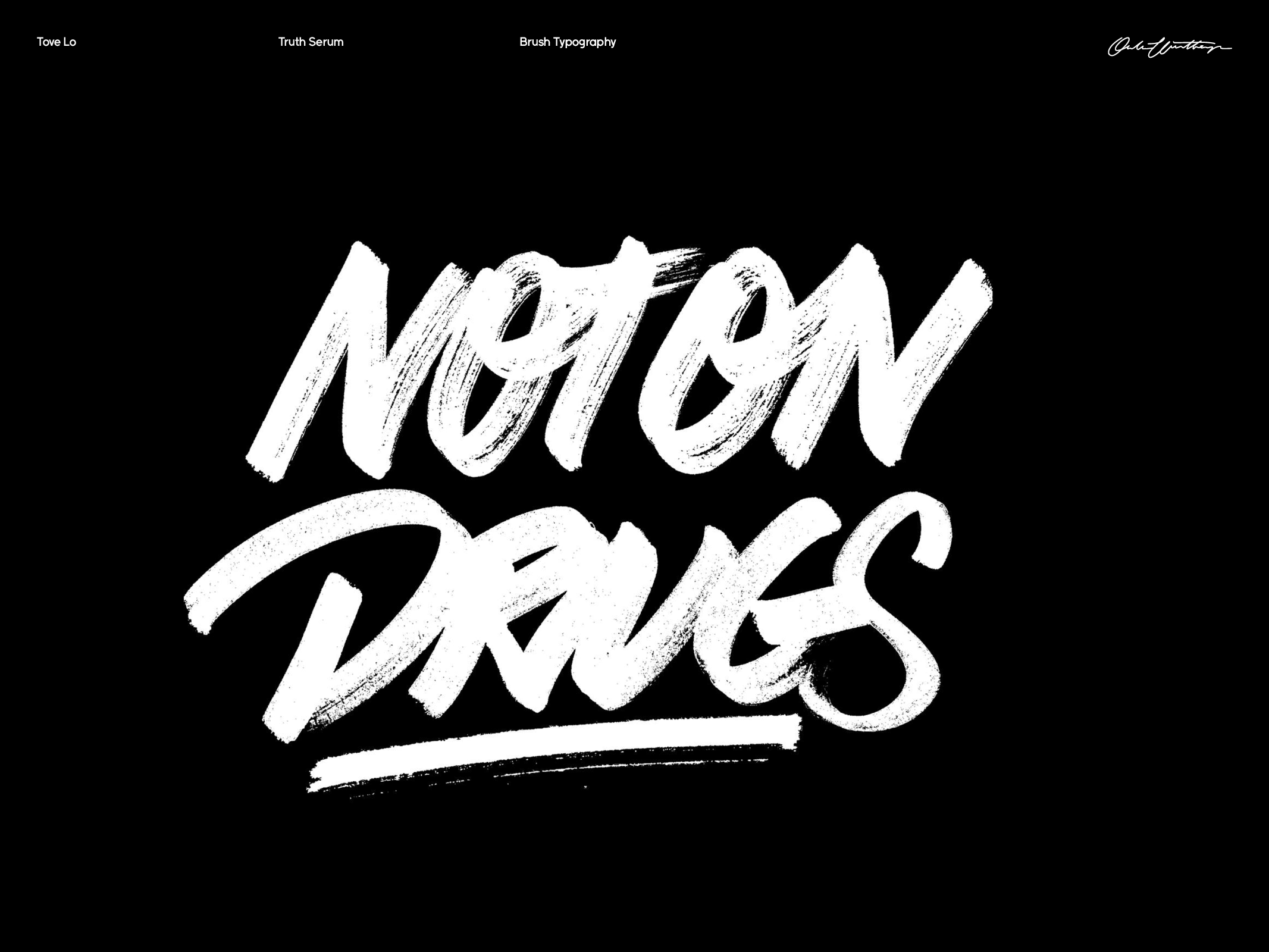
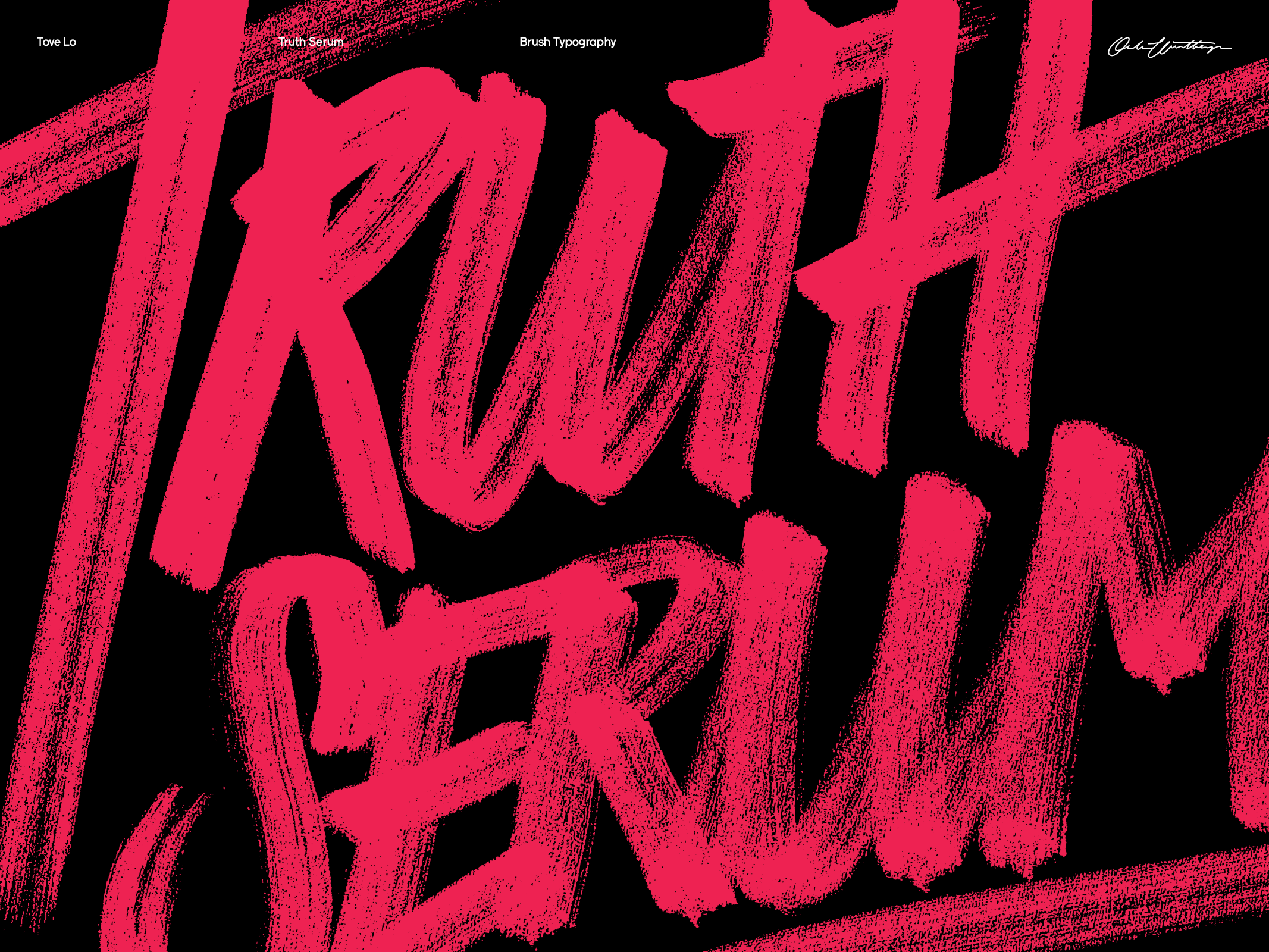
Tove Lo Title Typography
Universal Music
Custom typography
Tove Lo, prior to her singing career, was recognized as a proficient songwriter. However, she felt that certain compositions were too intimate to pass on to others, which led to the creation of the Truth Serum EP. Our objective was to convey the sensation of accessing a personal journal. I was tasked to create hand drawn typography for the cover and sinlges. Art directed by Daniel Åberg.


¯
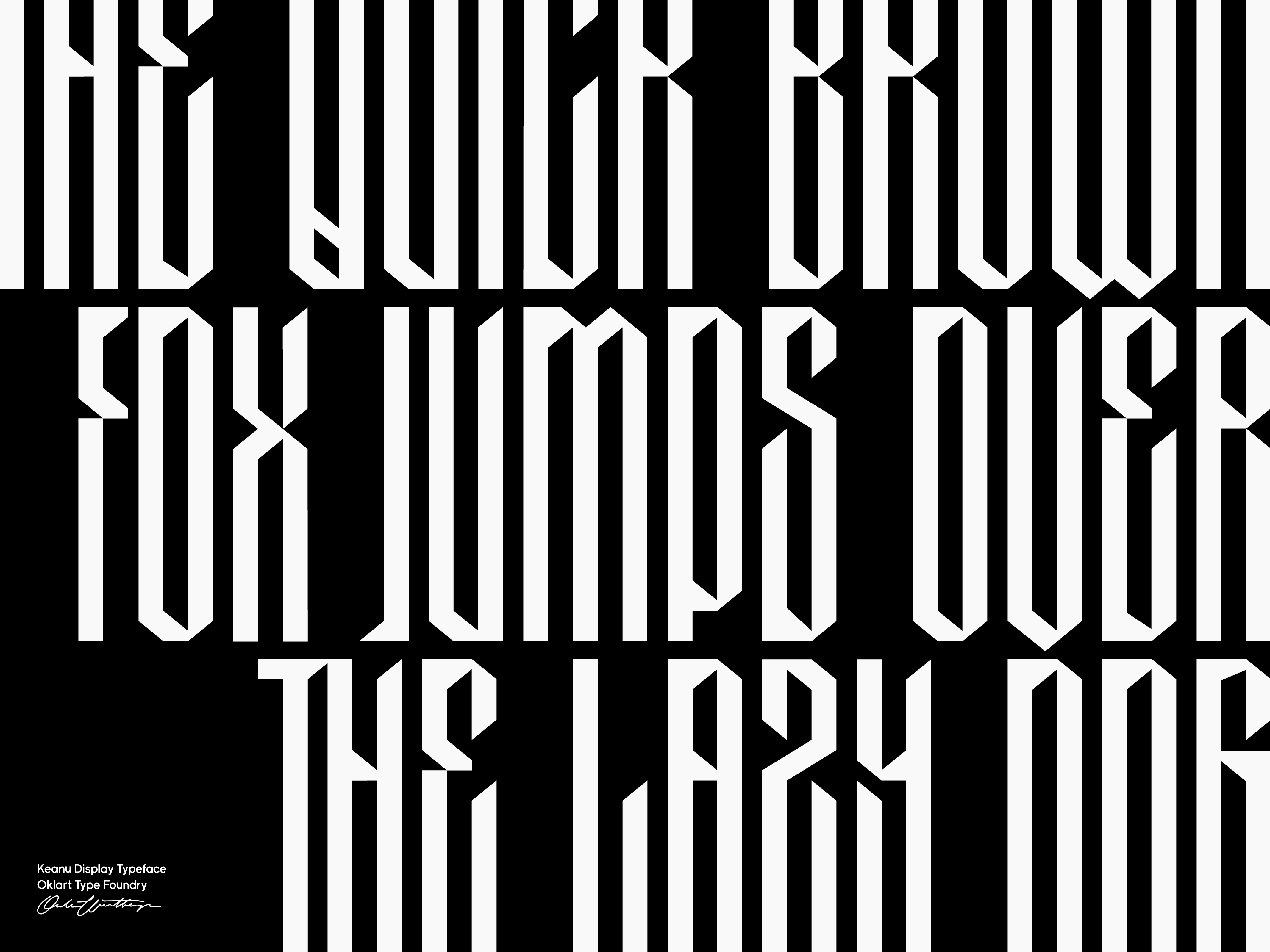
Keanu Display
Oklart Type Foundry
Type design
Oklart Type Foundry
Type design
Keanu is a display font that draws inspiration from Cholo writing. Aimed as a blackletter-esque typeface that would work well at large sizes, with long stems and sharp angles. The design is meant to convey a sense of edginess and coolness, while still being legible and visually striking.


¯
Jonas Rosén Identity
Jonas Rosén
Branding / Custom typography
Branding / Custom typography
Jonas Rosén, the veteran musician and founder of the grunge band Nancy's Dead, has been exploring a new sound in a solo project, shifting towards a Swedish-language style that reflects his roots and personal experiences. The first fruits of this new direction are two singles, "Som det är" and "Pandemi", both of which I created the branding and cover design for. All of the typography used in promotion and visual material for the singles is custom-made.


¯
Eskatos
Oklart Type Foundry
Type design
Type design
Eskatos is an experimental typeface where each weight, of which there are six, represent an escalating state of decay.


¯
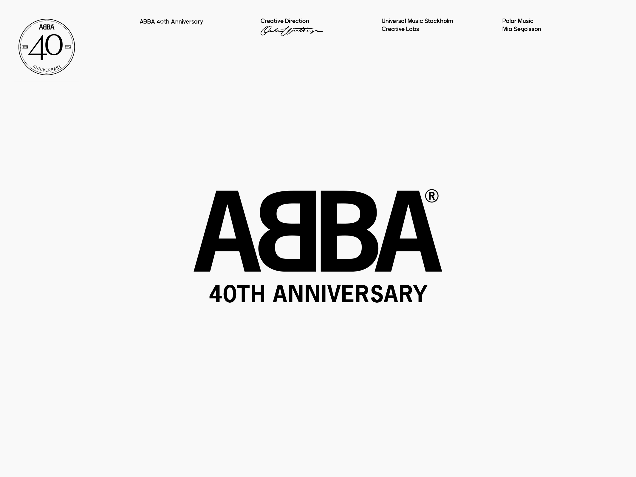
ABBA 40th Anniversary
Polar Music
Creative direction / Custom typography
Creative direction / Custom typography
In 2014, I had the privilege of leading the creative direction for ABBA's 40th Anniversary at Universal Music, working closely with Mia Segolsson CEO of Polar Music. Together, we dcreated a wide range of products and communication materials for the occasion, including a heart-warming greeting card (book), typography posters, a photo book, multiple releases, and even a custom Monopoly game.
¯
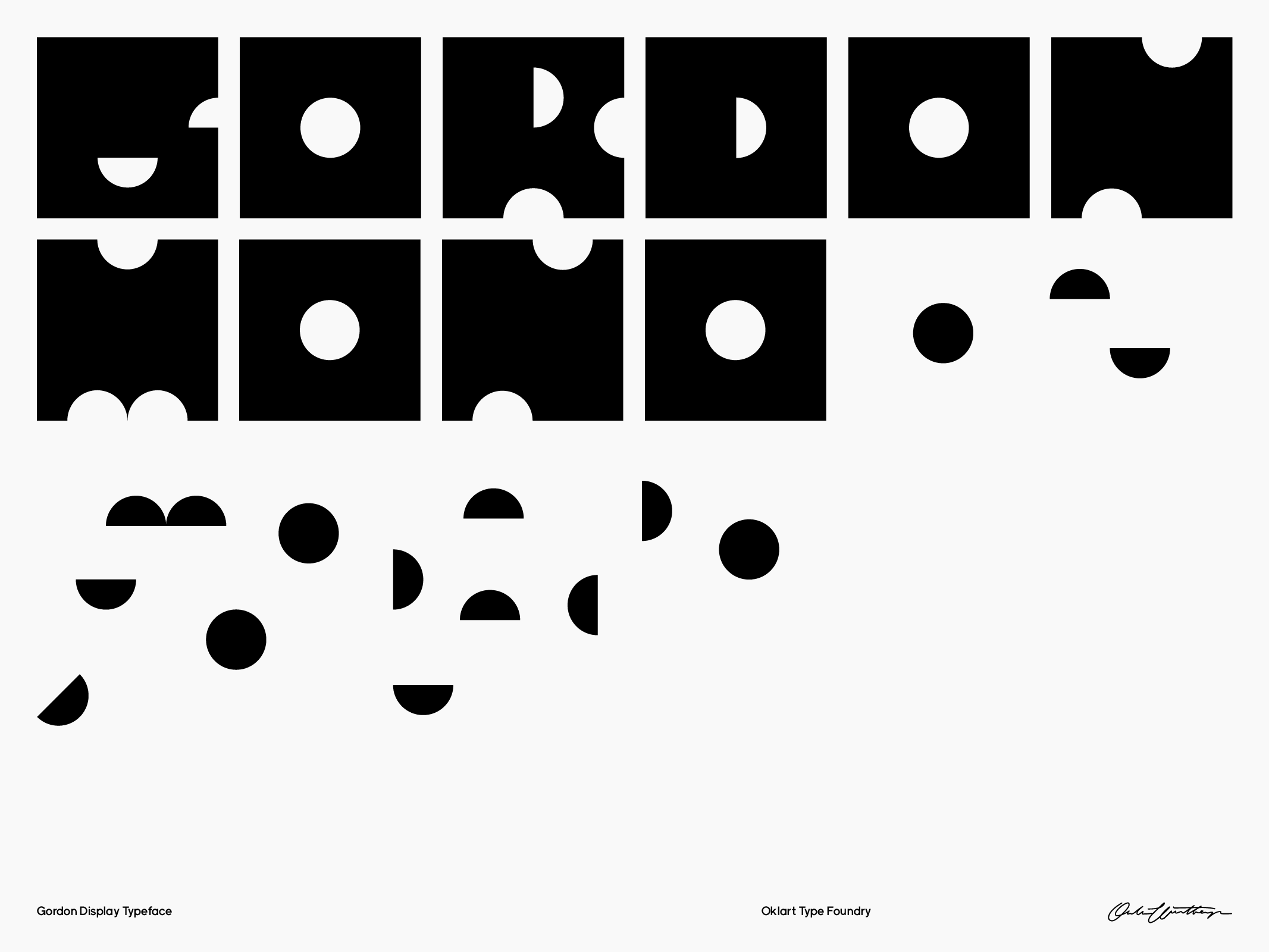
Gordon Display
Oklart Type Foundry
Type design
Type design
Gordon is a charming and playful font inspired by the joy of making things by hand. Each letterform is constructed from a basic square shape, with carefully placed round holes cut out to create negative space. It's as if each letter was crafted from a single piece of paper and a hole-cutter. The result is a delightful balance between the solidity of the square and the airiness of the negative space, giving the typeface a unique personality that is both playful and approachable.


¯
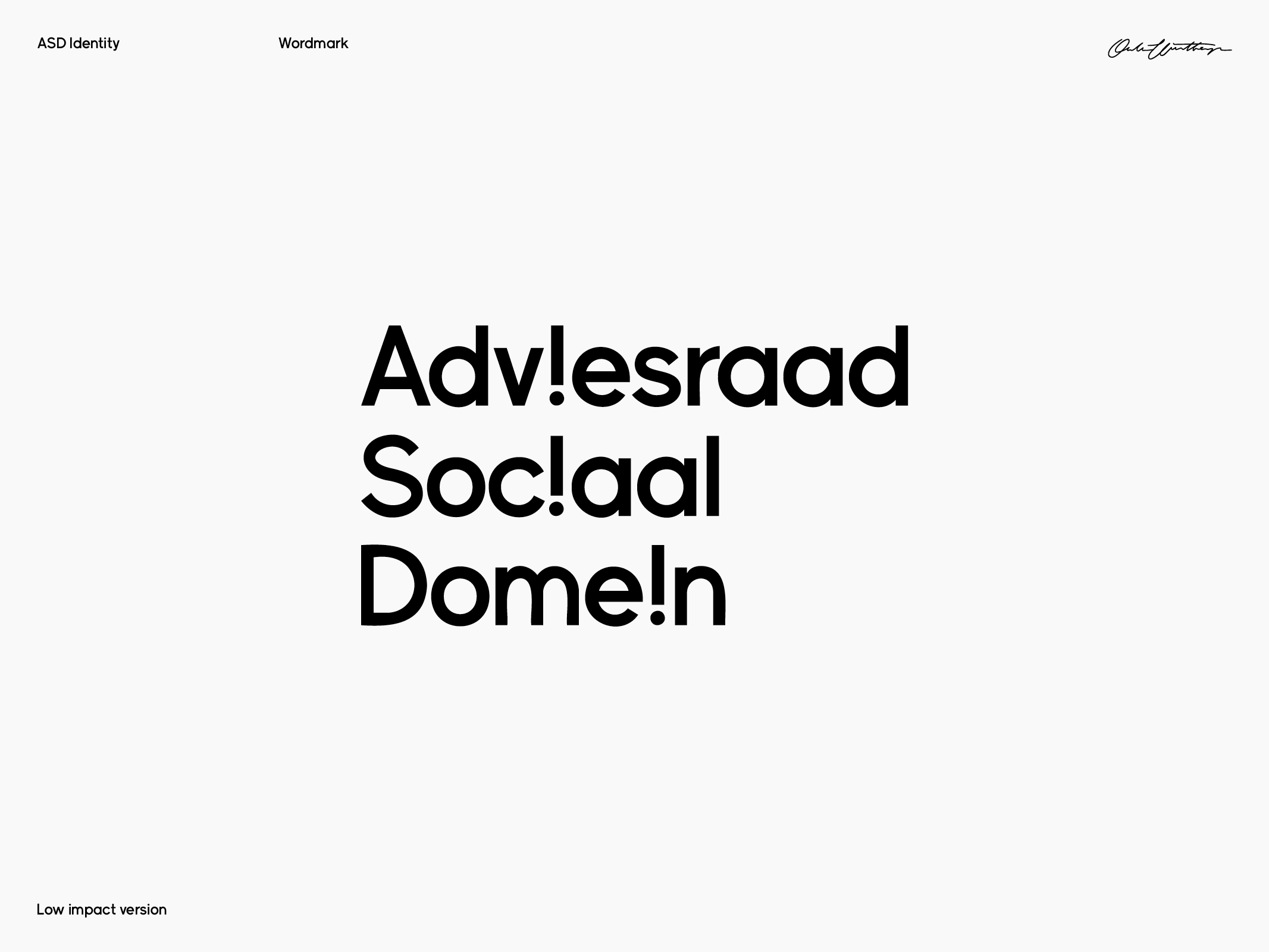
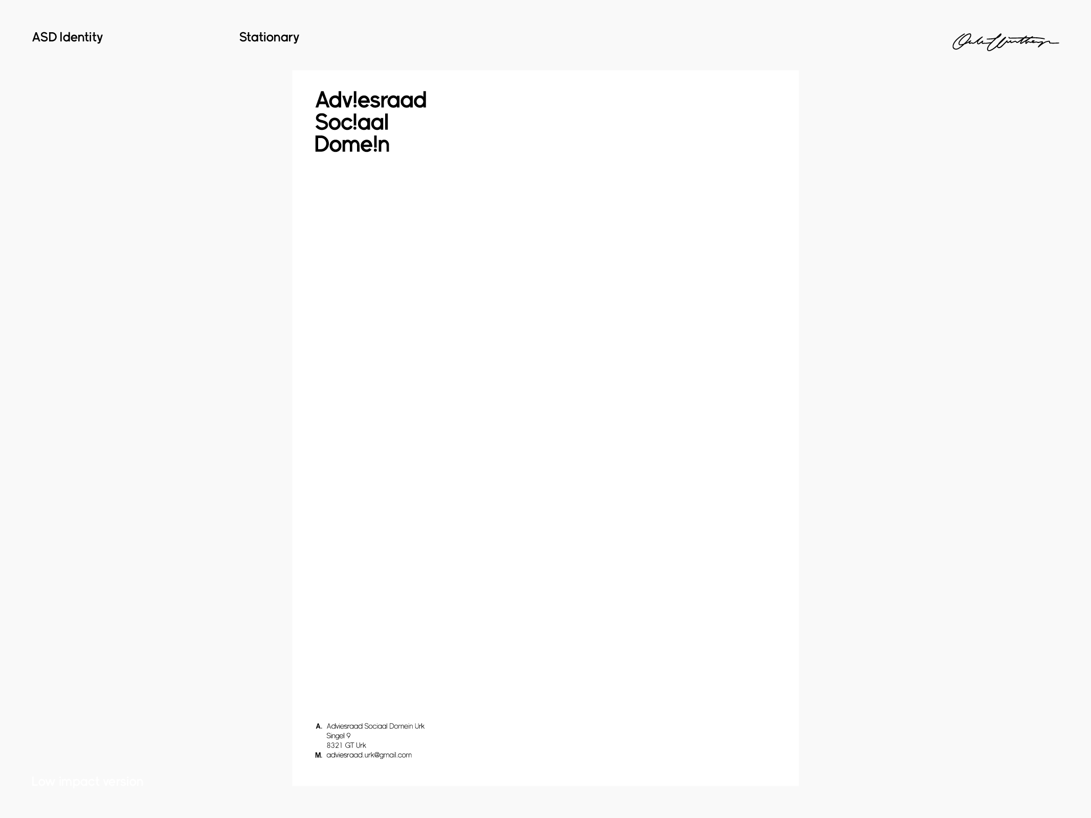
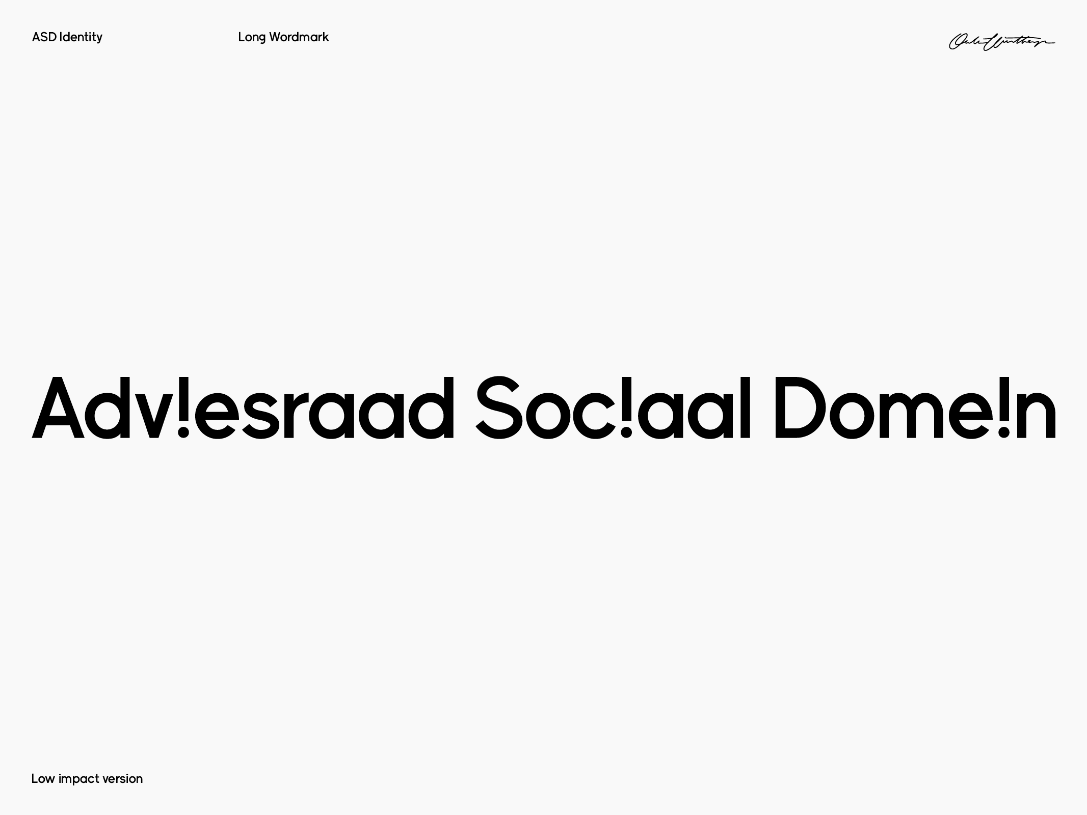
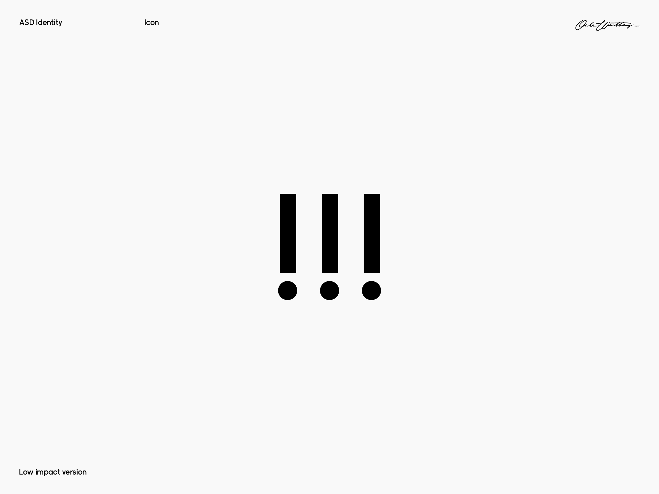
ASD Identity
Adviesraad Social Domein
Branding / Custom typography
Branding / Custom typography
ASD is a Dutch organization that maintains connections with various social disciplines concerning vulnerable citizens. Their duty is to provide counsel to the local government, whether requested or not. To emphasize the significance of ASD's mission in identifying potential societal issues, we decided to use an exclamation mark in place of the three i's in their name. All typography is custom.
¯
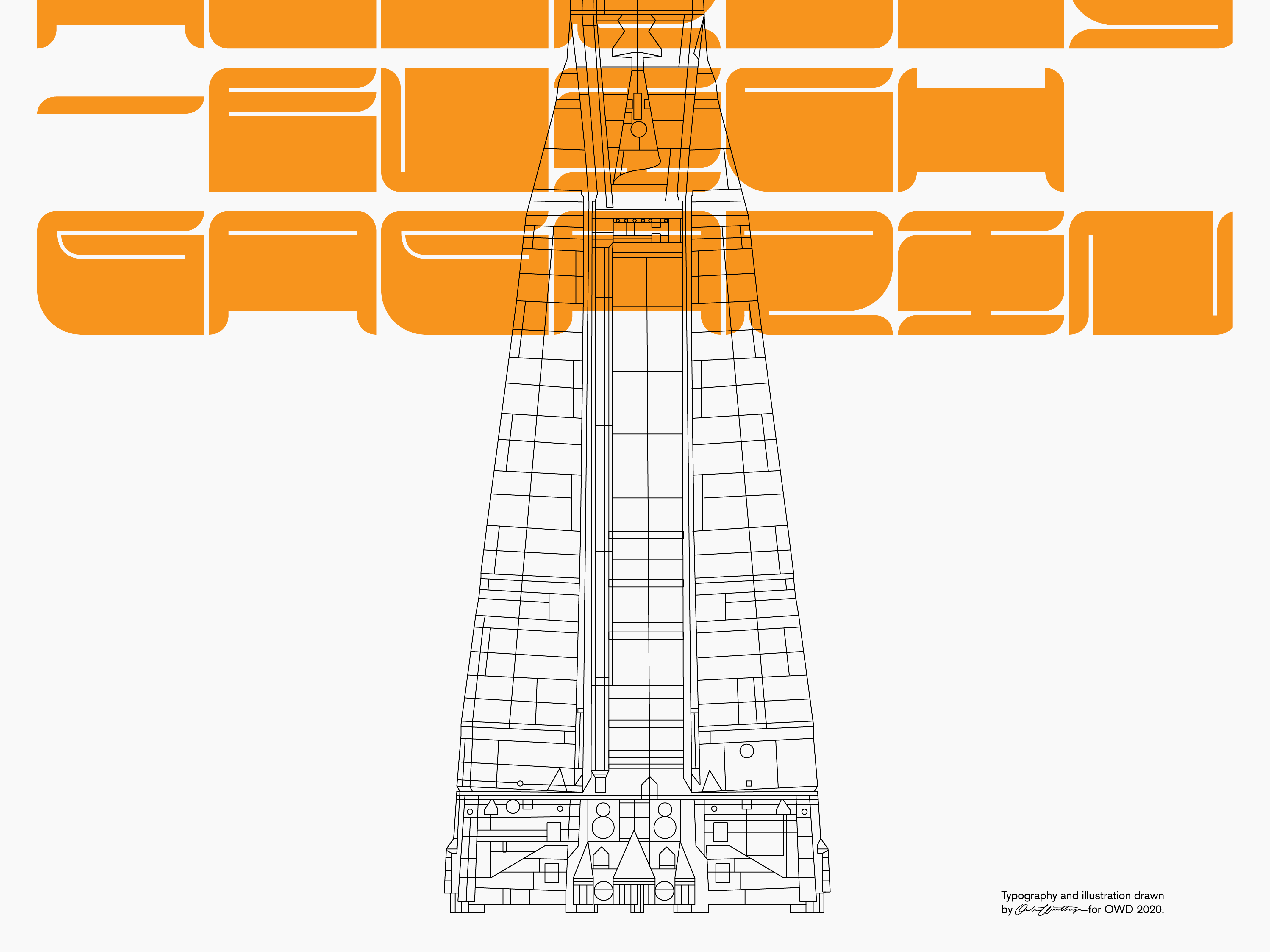
Yuri Alekseyevich Gagarin
OWD Sthlm
Poster design
In honor of Yuri Gagarin, the first human to cross into outer space in his vessel Vostok 1, I created a limited edition poster. It features the iconic cosmonaut orange color and is designed using Quermy Display. This commemorative poster is a humble tribute to Gagarin's bravery and pioneering spirit.
Sold out


¯
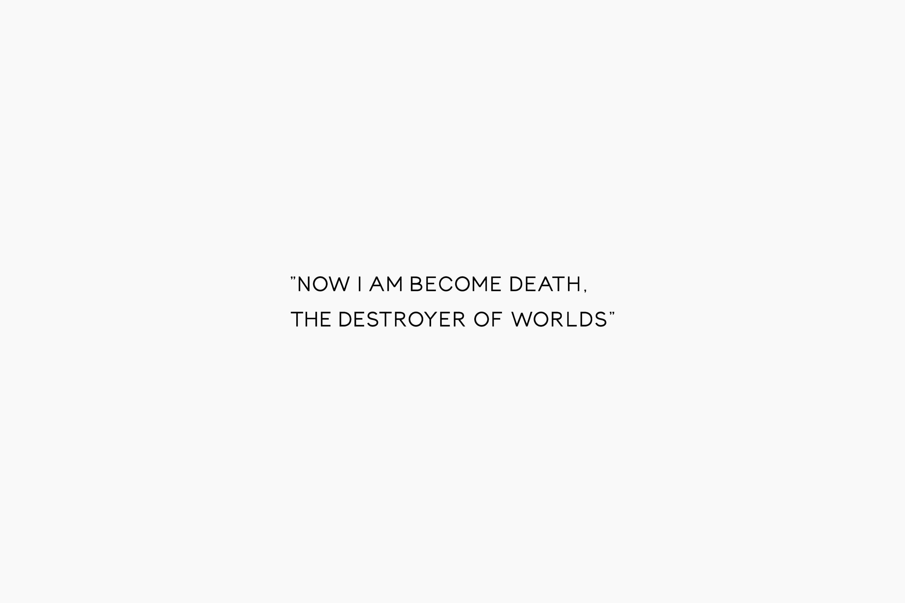
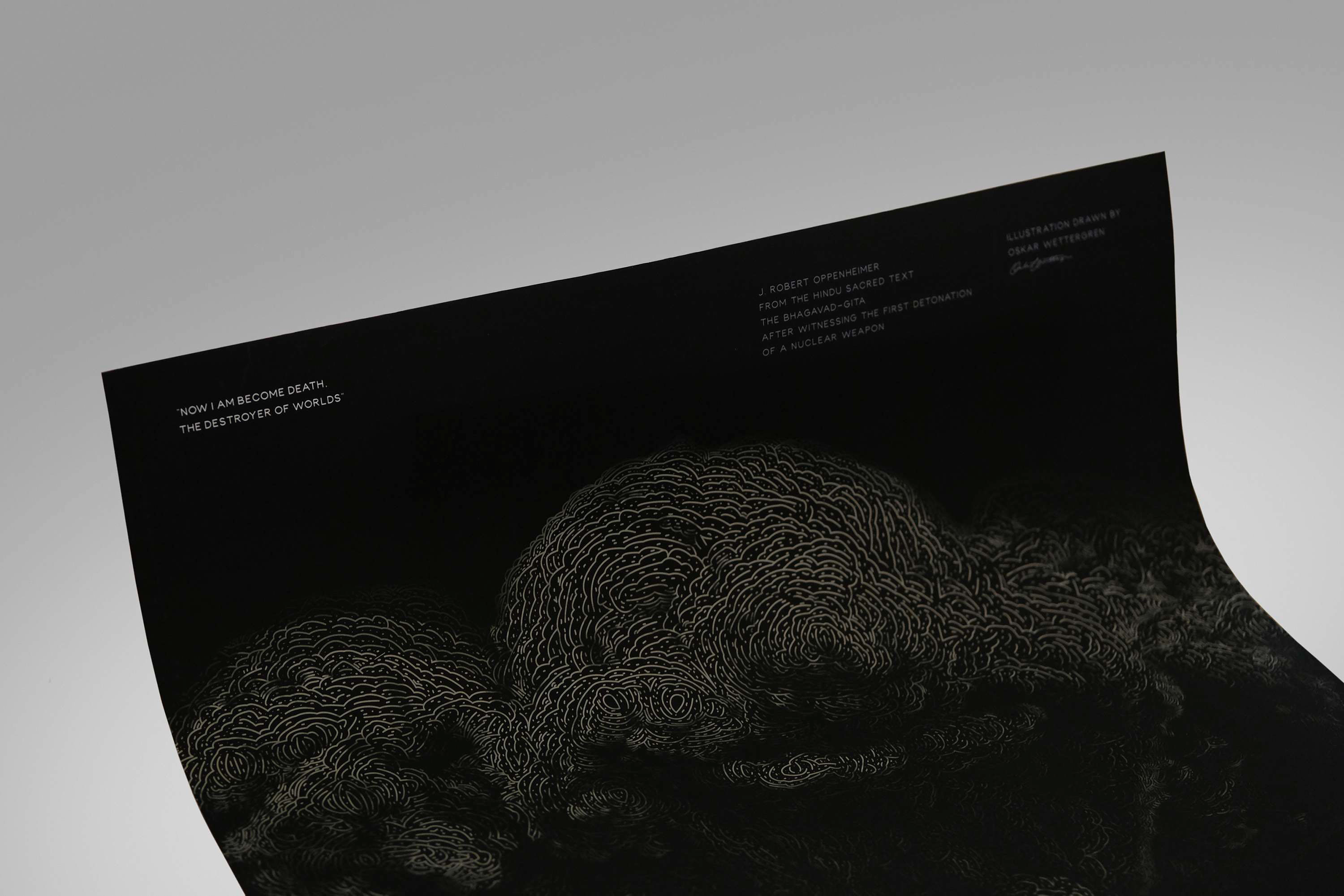
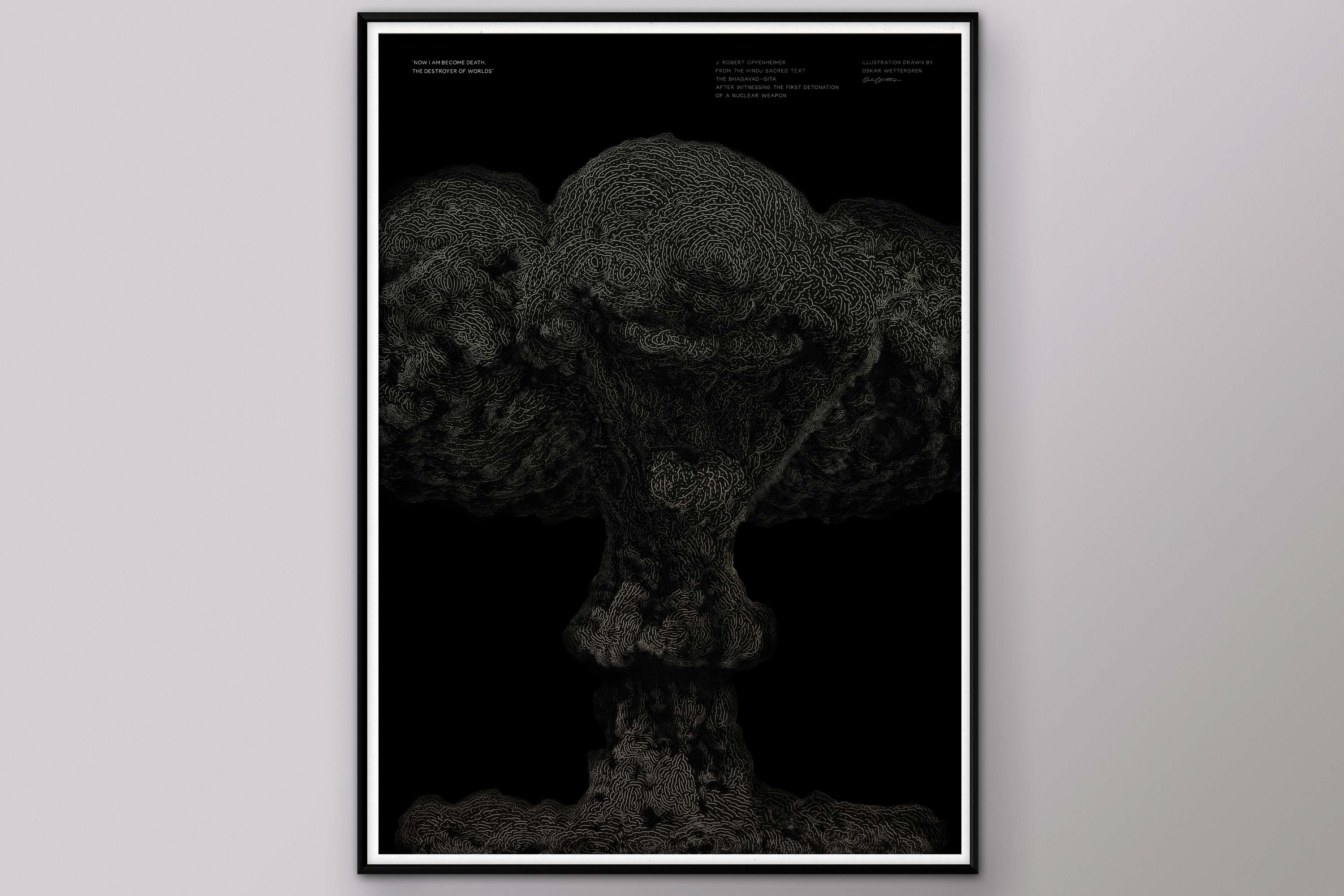
Now I am become death
OWD Sthlm
Poster design
Limited Edition Poster. Mushroom cloud drawn by thousands and thousands vector lines. Quoted is J. Robert Oppenenheimer saying 'Now I am become death, the destroyer of worlds" after witnessing the first detonation of a nuclear bomb. I wanted to explore making the ugliest thing I could think of beautiful. In making it as detailed as possible i wanted to envoke the incomprehensible scale of the cloud. Font used is Wetsans Regular.
50x70 cm, printed on matte paper.
Sold out
Sold out


¯
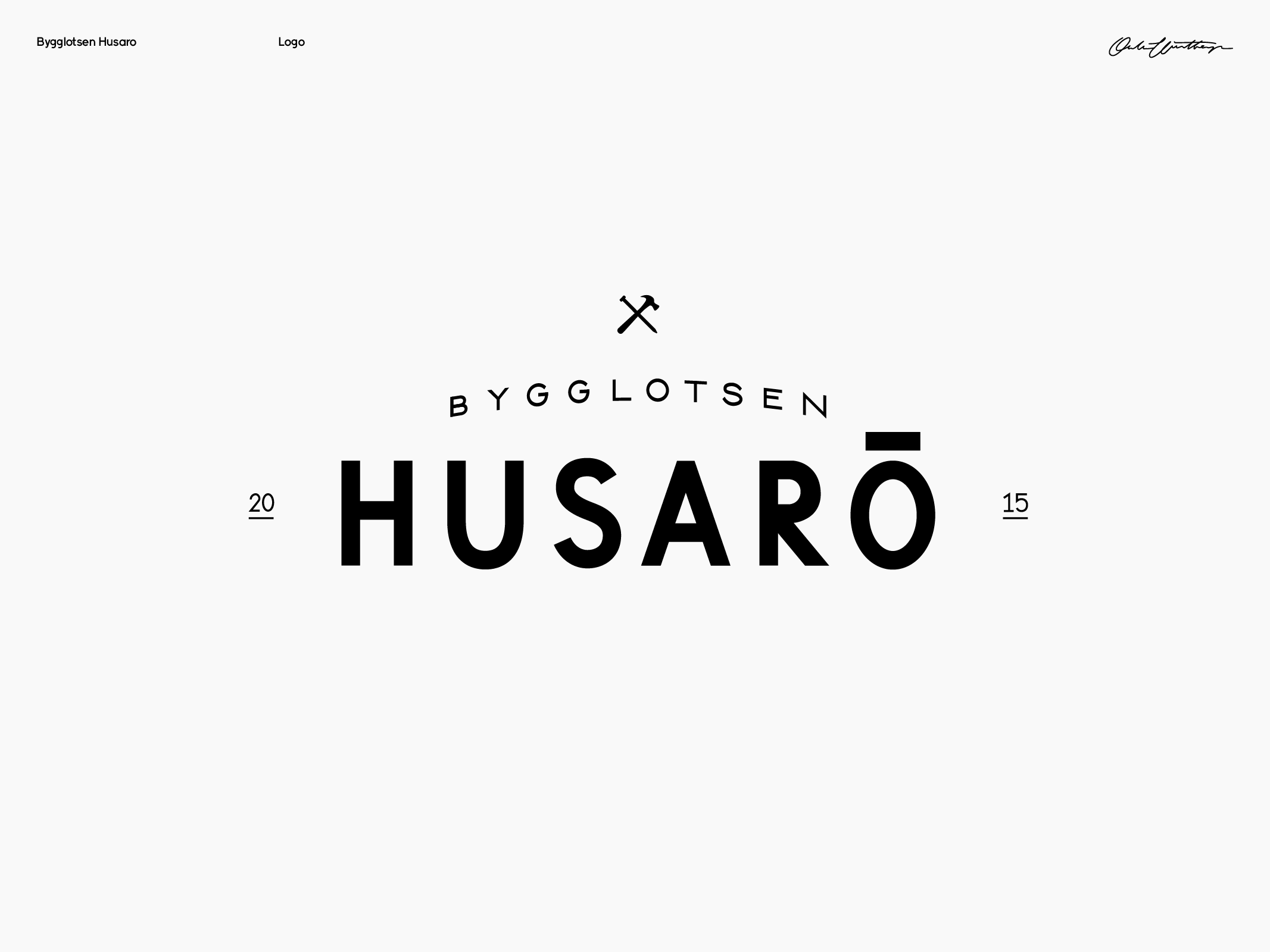
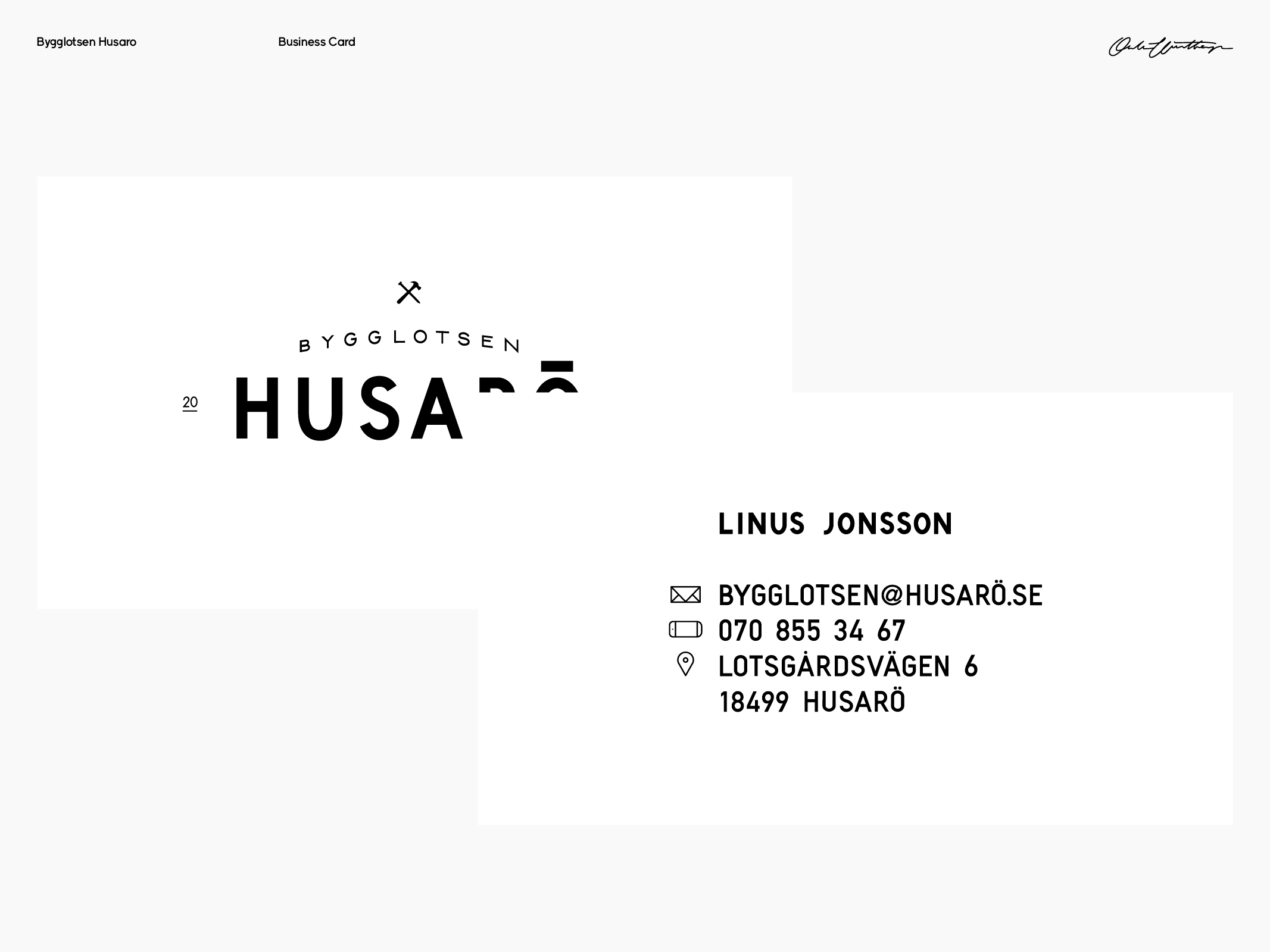
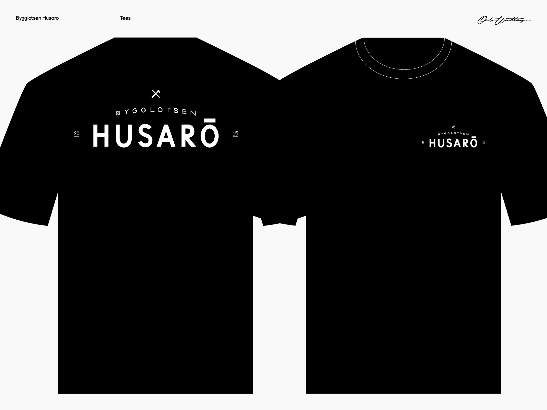
Bygglotsen Husarö Identity
Bygglotsen Husarö AB
Branding / Custom typography
Branding / Custom typography
Bygglotsen Husarö is a carpentry company located in the heart of the Stockholm archipelago. The custom typography is inspired by the classic boat letters found in the area, creating a sense of familiarity and tradition.

¯
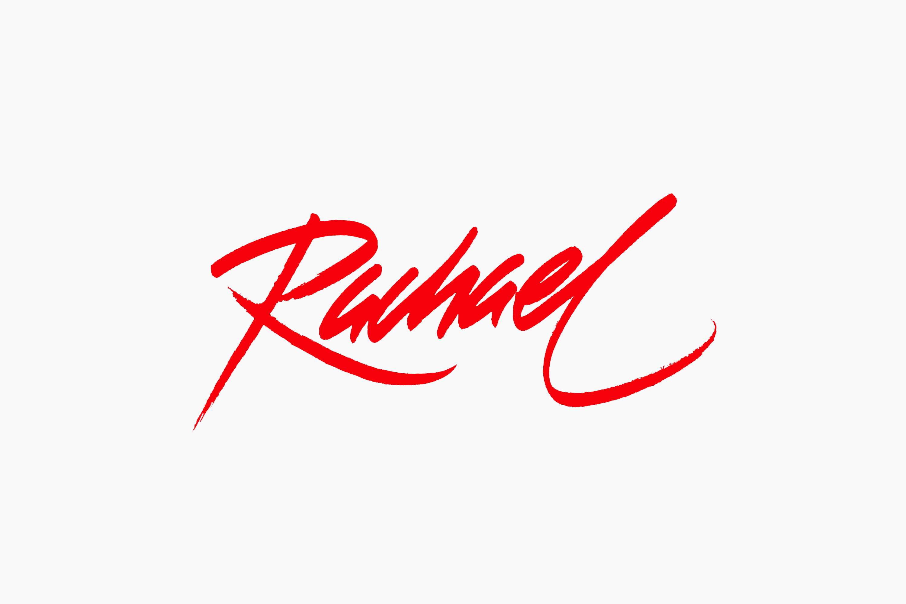
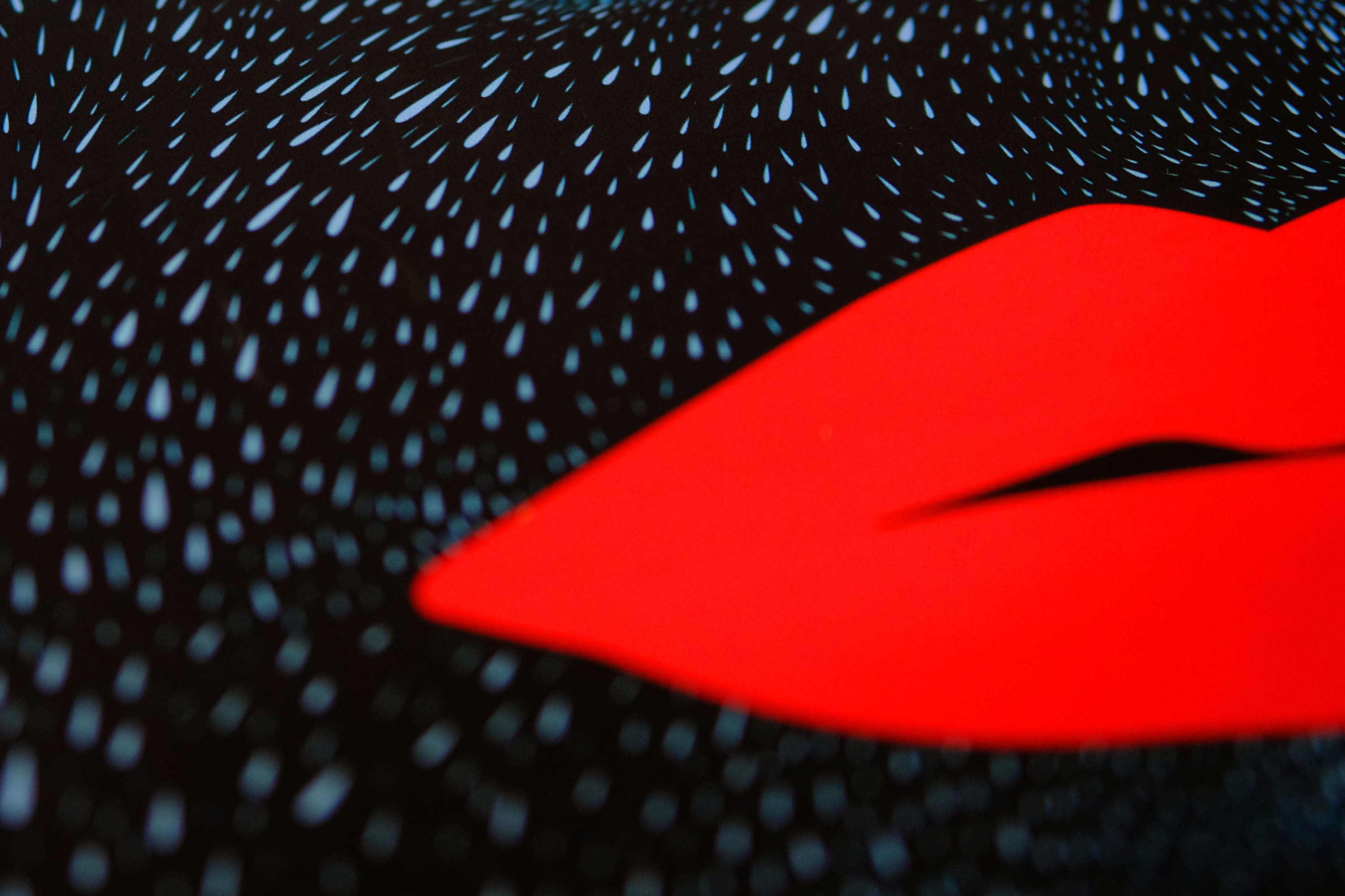
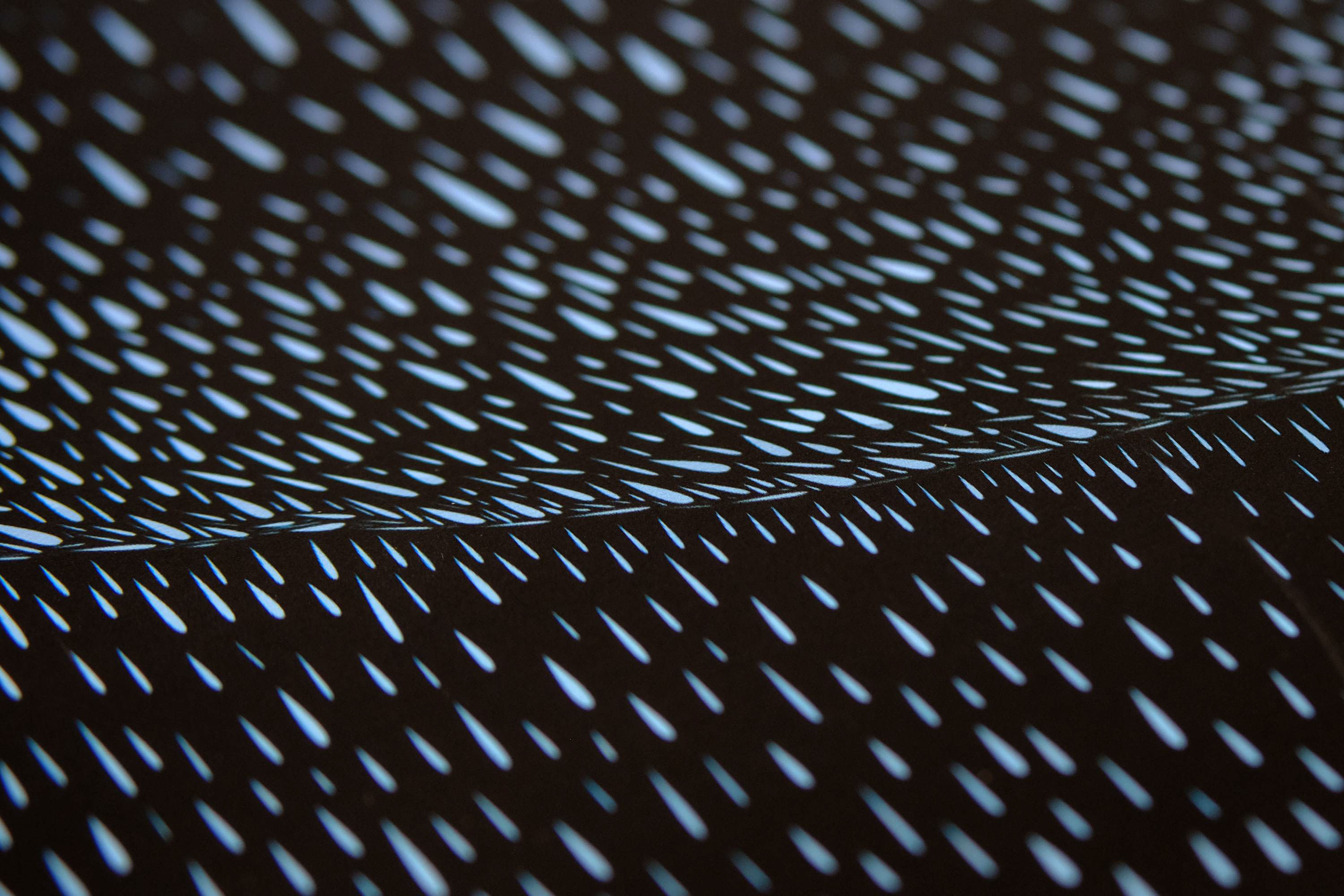
Rachael
OWD Sthlm
Poster design / Custom typography
Limited edition poster. With thousands of vector tear drops, drawn one by one, we built the face of Rachael Tyrell from the 1982 classic Blade Runner. All typography custom made.
50x70 cm, printed on matte paper.
Sold out
Sold out


¯
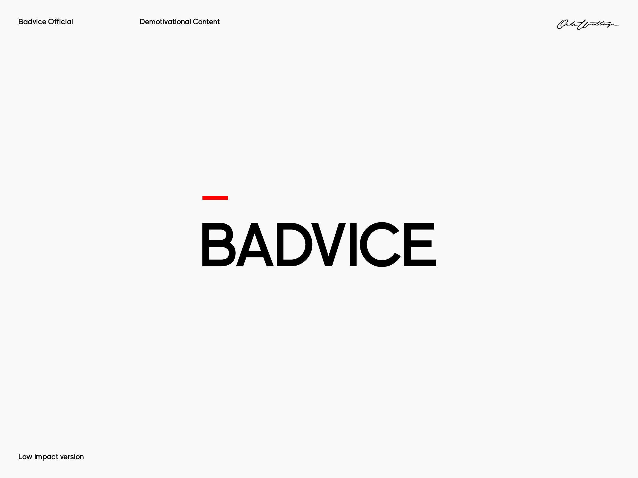
Badvice
Badvice Official
Social Media
Badvice is a tongue-in-cheek Instagram account where I posted sarcastic proverbs that I don't agree with. It was a playful exploration of what we consider to be deep and profound thoughts, especially in the context of a social media platform that often prioritizes surface-level content. Over the course of two months, I wrote, designed, and posted 111 grams that poked fun at social media ‘wisdom’.
See full content on Instagram →
See full content on Instagram →
¯
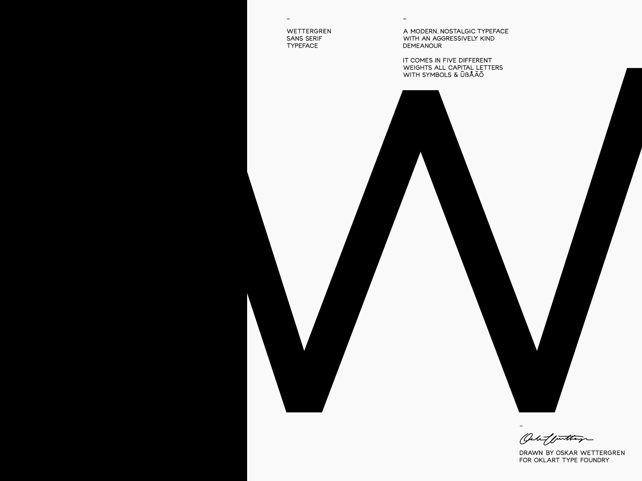
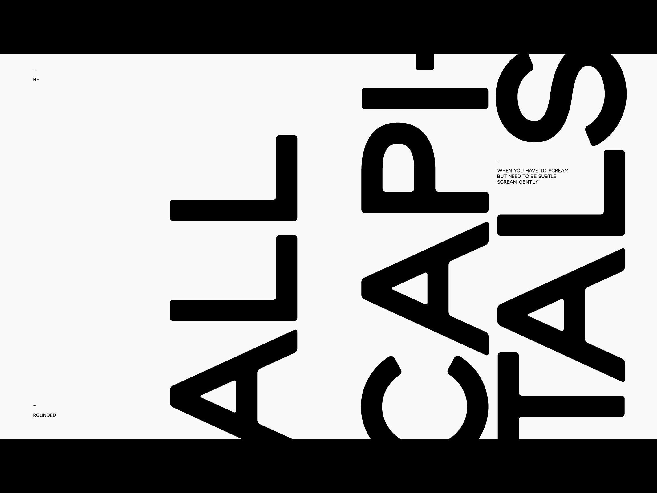
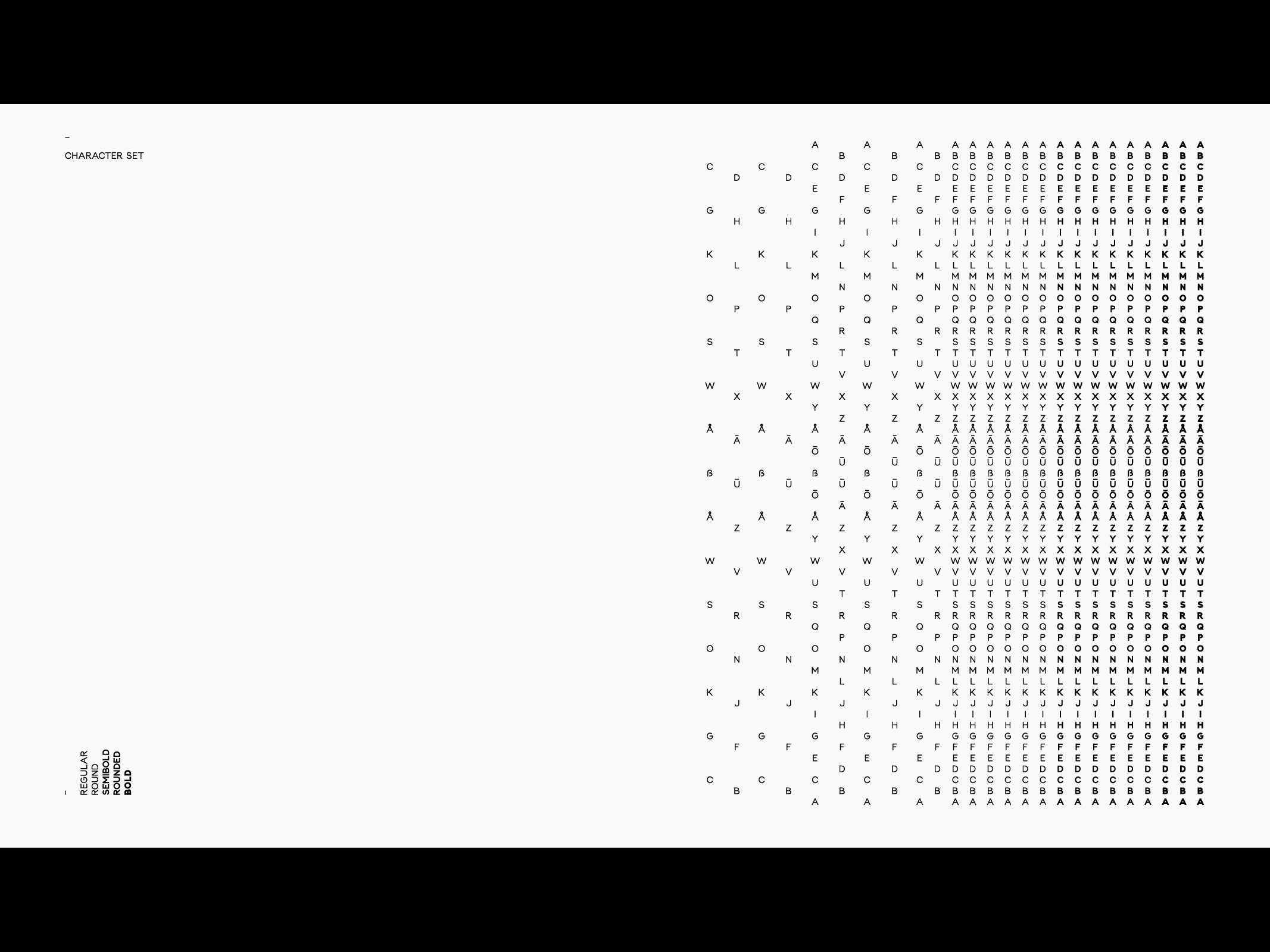
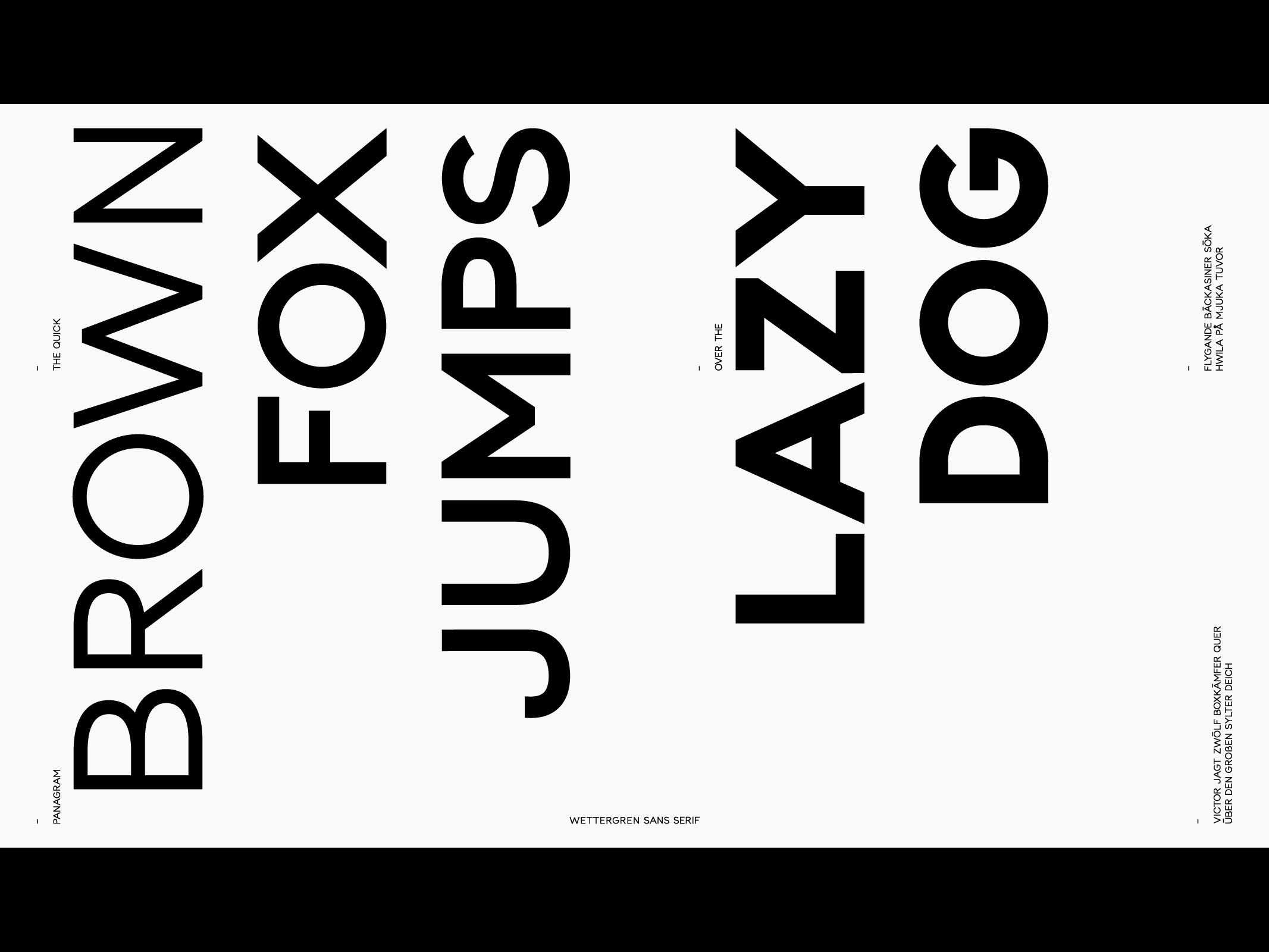
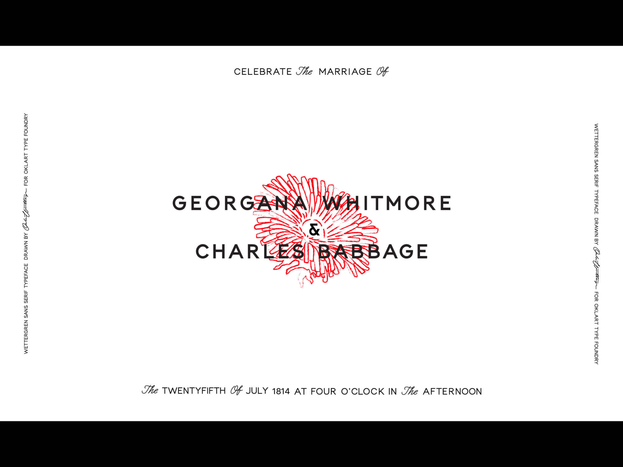
Wettergren Sans
Oklart Type Foundry
Type design
Wettergen Sans is a modern nostalgic typeface with anagressively kind demeanour. It comes in five different weights, all caps, with symbols and ÜßÅÄÖ.
Type design
Examples of use →