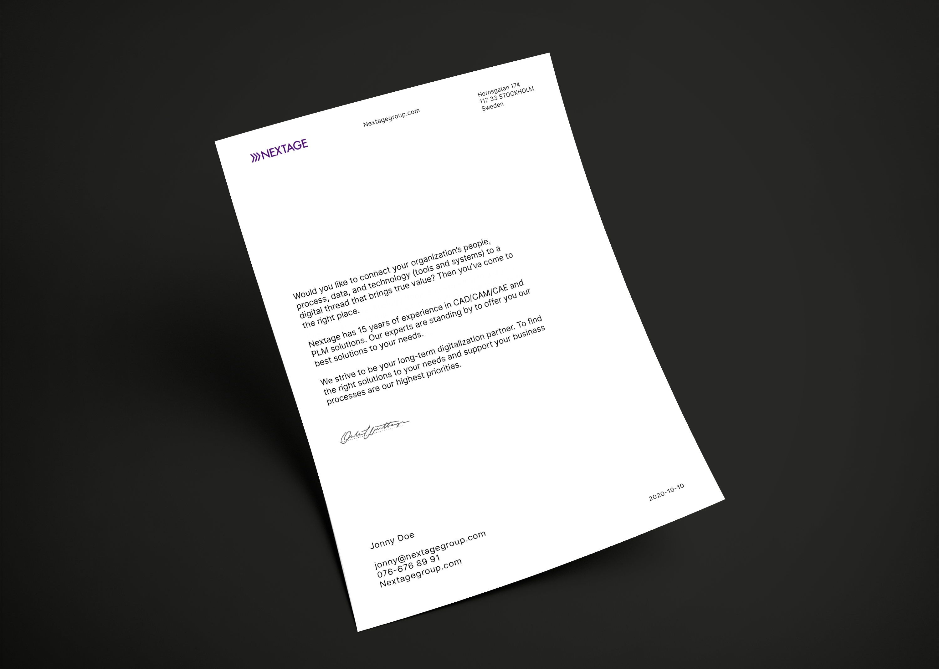
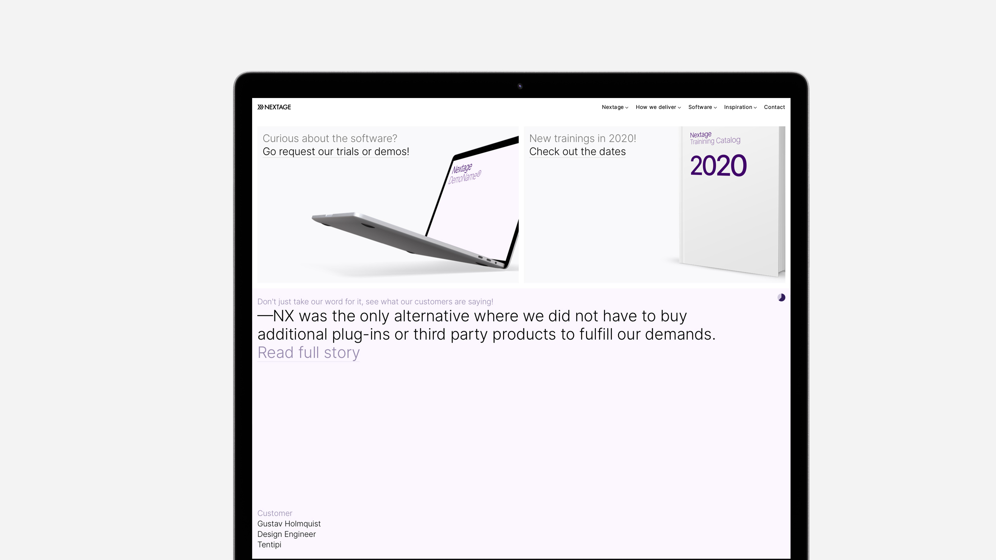
↓
Nextage
Role: Designer
Agency: OWD
For: Nextage
Branding / Identity
Background photography by:
Oleksii Drozdov
Ash Edmonds
Tobias van Schneider
Adrien Olichon
Oleksii Drozdov
Ash Edmonds
Tobias van Schneider
Adrien Olichon


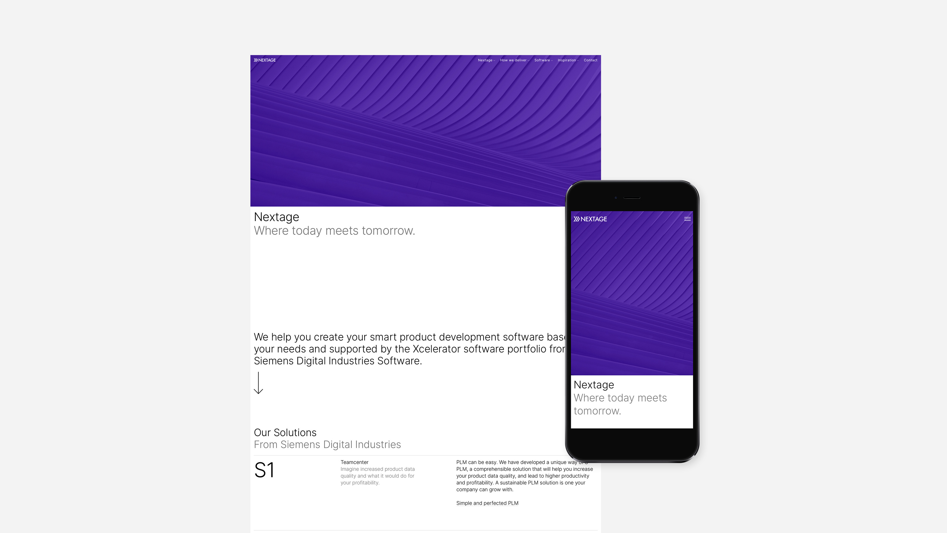
Nextage is a company with 15 years of experience in helping their clients digitally modernize their workflow by connecting an organisations, people, process, data and technology (tools and systems).
They mainly have three solutions to digital modernisation: Teamcenter PLM, CAD/CAM/CAE and Digital manufacturing.
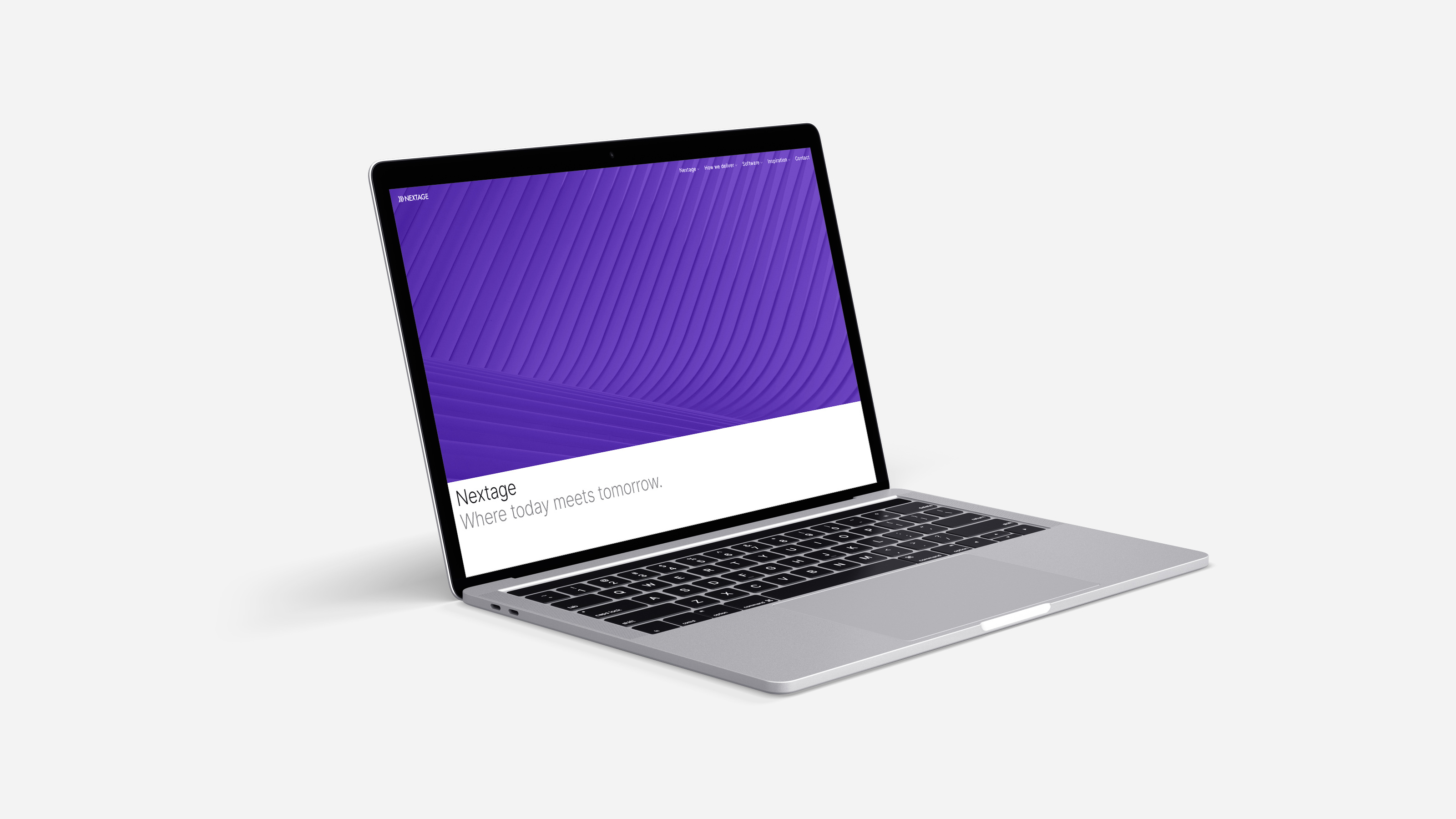
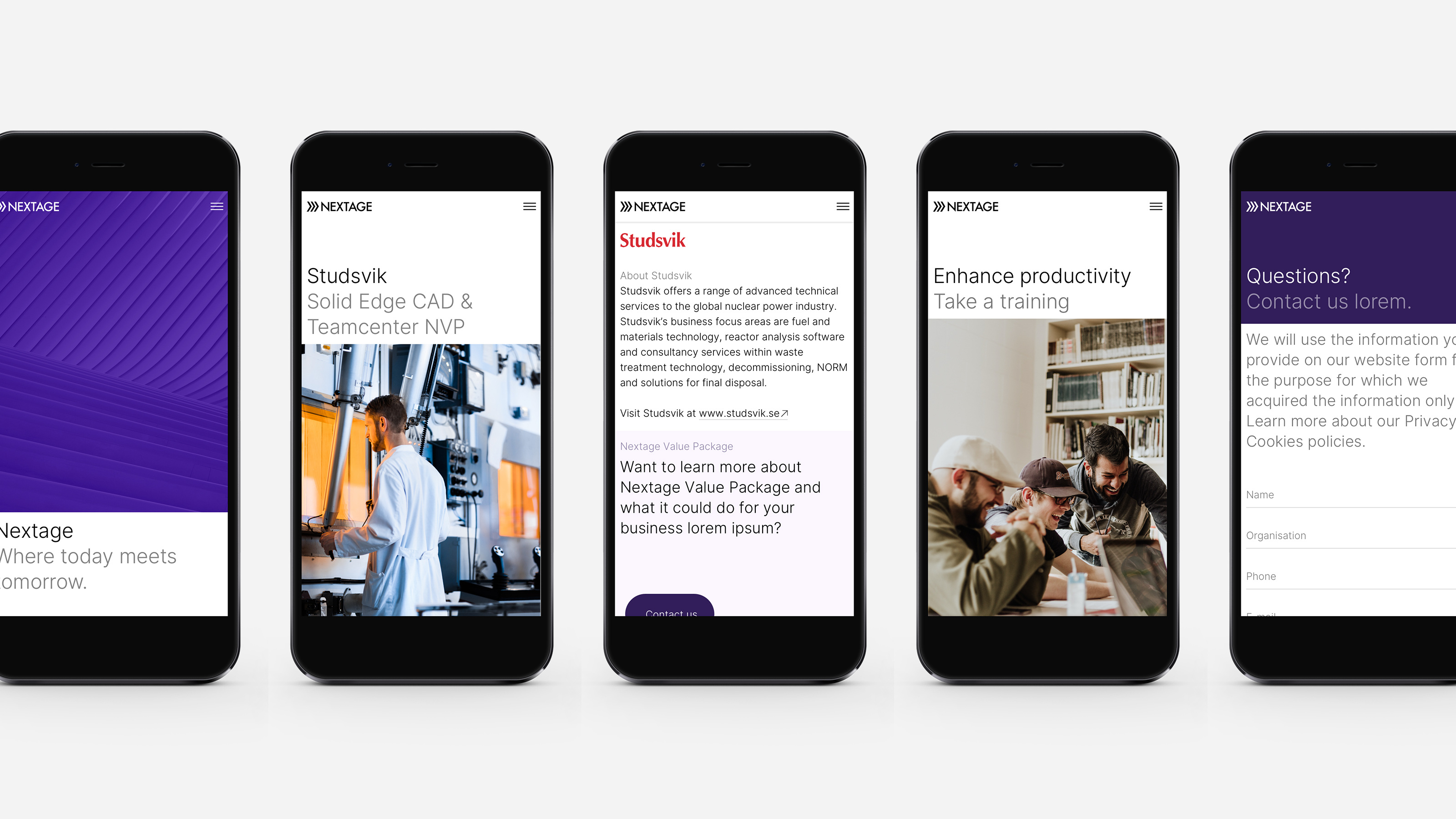
Redesigning the wordmark.
The challenge was to keep the familiarity to their brand but update and give it more structure. Existing clients should be able to recognize the brand while we bring it to a new, modern place.
A long lasting visual system where the logo is the main piece. A simple and clear, space efficient wordmark where all excess is removed.
Previous logomark.

New wordmark without the heavy block,
new tighter spacing to make to make it
read more a whole.
new tighter spacing to make to make it
read more a whole.


Making the icon.
To companion the wordmark we decided to create an icon. One that would summarize Nexages ideals, can be used as a clear identifier and symbolize an enhanced, sped up work process.
Use existing DNA to create something that would play well with the wordmark.
Icon origin is the Futura X.

Adjusted and three times, one for each USP:
Teamcenter PLM, CAD/CAM/CAE
and Digital manufacturing.
Teamcenter PLM, CAD/CAM/CAE
and Digital manufacturing.


Typography
Inter is a typeface carefully crafted & designed for computer screens. It gives a serious and competent impression, comes in 2,5k glyphs, 18 styles with 33 features, is free and open source. This gives a very wide variety and adaptability.
The typography is dynamic and varied, built on three columns. It’s important to let the typography breathe and take up space. Contrast between enhanced bits and bodycopy. That gives a clear hierarchy, makes it easy to follow and take in the information.

Colours
The primary Nextage Purple is visible but restrictive, supported by a tint. Otherwise a white, clear and reliable framework that gain colour from photography.


Website
Together with Niklas Rosén, we were asked to implement the visual identity on a number of key page templates. These sketches was used as a design vision forward with the new website, that was done in-house.
We wanted to do what Teamcenter does for their clients for them: simplify, clarify, and modernize. Give it a clear hierarchy and functionality, letting the content breathe. Clearing clutter and non-essential information.
Imagery were to show the results of Nextages product rather than the product itself. Humanise the process and make room for a little warmth.


Stationary / Branding
Following the rules set with clear and functional typography. Dare to keep it airy and let the content breathe. Sparingly used colour.


Presentations
A common point of contact for Nextage employees, besides their webside, are presentations. An important tool to explain their process and how they can help you specifically.
It needed to be clear and easy to follow. Be adaptable and have clear rules so that Nextage representatives can change and adapt the content themselves.


A lot of the work was about clearing out unnecessary information and graphics, leaving only the essential bits. Splitting higly dense spreads into multiple. Focusing more on the spoken presentation and using clarifying visuals. This gives a clearer message and is easier to digest as a listener/participant.


Icons
Simple and clean icons were made to emphasize big words in Nexage´s business.

